The Panel control is used as a container for other controls. It serves several functions:
To control the visibility of the controls it contains
To control the appearance of the controls it contains
To make it easier to generate controls programmatically
The Panel control is derived from WebControl and adds the properties shown in Table 4-16. The Panel control has no methods or events not inherited from the Control or WebControl classes. Specifically, there are no events raised by user interaction.
Table 4-16. Properties of the Panel control not inherited from Control or WebControl
|
Name |
Type |
Get |
Set |
Values |
Description |
|---|---|---|---|---|---|
|
|
String |
✗ |
✗ |
The URL of an image to display as background of the panel. If the image is smaller than the panel, it will be tiled. | |
|
|
ContentDirection |
✗ |
✗ |
|
Direction to display text in a container control. Default is |
|
|
string |
✗ |
✗ |
Causes the Panel to render to the browser as | |
|
|
HorizontalAlign |
✗ |
✗ |
|
Specifies the horizontal alignment of the contents. Default is |
|
|
ScrollBars |
✗ |
✗ |
|
Specifies the visibility and location of scrollbars. The default value is |
|
|
Boolean |
✗ |
✗ |
|
If |
The next example, PanelDemo, shown in Figure 4-20, contains two Panel controls. The first demonstrates how to control the appearance and visibility of child controls and how to add controls programmatically. The second panel demonstrates the use of the GroupingText, ScrollBars, and Wrap properties to control the appearance of the control.
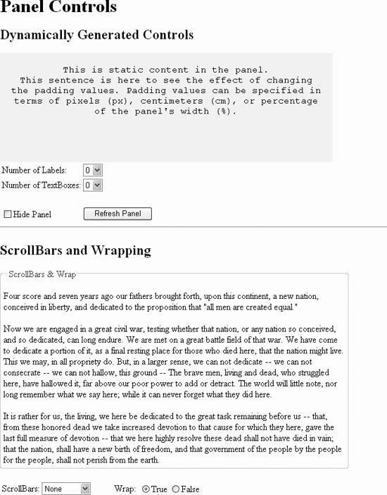
The two Panel declarations in this example are highlighted in Example 4-34. The first one, with an ID of pnlDynamic, has some static content between the opening and closing Panel tags. The remainder of the content of this panel is added dynamically, depending on the values selected in the two drop-downs, ddlLabels, and ddlBoxes.
Example 4-34. default.aspx for PanelDemo
<%@ Page Language="C#" AutoEventWireup="true" CodeFile="Default.aspx.cs"
Inherits="_Default" %>
<!DOCTYPE html PUBLIC "-//W3C//DTD XHTML 1.1//EN"
"http://www.w3.org/TR/xhtml11/DTD/xhtml11.dtd">
<html xmlns="http://www.w3.org/1999/xhtml" >
<head runat="server">
<title>Panel Control</title>
</head>
<body>
<form id="form1" runat="server">
<div>
<h1>Panel Controls</h1>
<h2>Dynamically Generated Controls</h2>
<asp:Panel ID="pnlDynamic" runat="server"
Height="150"
Width="80%"
BackColor="Beige"
Font-Names="Courier New"
HorizontalAlign="Center"
Style="padding:20px"
ScrollBars="Auto">
This is static content in the panel.
<br />This sentence is here to see the effect of changing
the padding values. Padding values can be specified in terms of
pixels (px), centimeters (cm), or percentage of the panel's
width (%).
<p /> <p />
</asp:Panel>
<table>
<tr>
<td>
Number of Labels:
</td>
<td>
<asp:DropDownList id=ddlLabels runat="server">
<asp:ListItem text="0" value="0" />
<asp:ListItem text="1" value="1" />
<asp:ListItem text="2" value="2" />
<asp:ListItem text="3" value="3" />
<asp:ListItem text="4" value="4" />
</asp:DropDownList>
</td>
</tr>
<tr>
<td>
Number of TextBoxes:
</td>
<td>
<asp:DropDownList id=ddlBoxes runat="server">
<asp:ListItem text="0" value="0" />
<asp:ListItem text="1" value="1" />
<asp:ListItem text="2" value="2" />
<asp:ListItem text="3" value="3" />
<asp:ListItem text="4" value="4" />
</asp:DropDownList>
</td>
</tr>
<tr>
<td colspan=2>
</td>
</tr>
<tr>
<td>
<asp:CheckBox id="chkHide" runat="server"
text="Hide Panel" />
</td>
<td>
<asp:Button ID="Button1" runat="server"
text="Refresh Panel" />
</td>
</tr>
</table>
<hr/>
<h2>ScrollBars and Wrapping</h2>
<asp:Panel ID="pnlScroll" runat="server"
Height="200px"
Width="90%"
GroupingText="ScrollBars & Wrap">
<asp:Label ID="lblPanelContent" runat="server"></asp:Label>
</asp:Panel>
<br />
<table >
<tr>
<td align=right>
ScrollBars:
</td>
<td>
<asp:DropDownList id=ddlScrollBars runat="server"
AutoPostback=true
OnSelectedIndexChanged=
"ddlScrollBars_SelectedIndexChanged">
<asp:ListItem text="None" Selected=True/>
<asp:ListItem text="Auto" />
<asp:ListItem text="Both" />
<asp:ListItem text="Horizontal" />
<asp:ListItem text="Vertical" />
</asp:DropDownList>
</td>
<td align=right width=75>
Wrap:
</td>
<td>
<asp:RadioButtonList ID="rblWrap" runat="server"
AutoPostBack=true
RepeatDirection=Horizontal
OnSelectedIndexChanged=
"rblWrap_SelectedIndexChanged">
<asp:ListItem Text="True" Value="true" Selected=True/>
<asp:ListItem Text="False" Value="false" />
</asp:RadioButtonList>
</td>
</tr>
</table>
</div>
</form>
</body>
</html>This first panel has several attributes defined, including BackColor, Height (in pixels), Width (in percentage of the browser window), the font name (Font-Name), and the horizontal alignment (HorizontalAlign). (Note that this control does not have a property for vertical alignment.)
The Style attribute sets the padding to 20 pixels along each of the four sides. Alternatively, you can specify the padding along each side by including multiple values in the Style attribute, according to Table 4-17. So, for example, the following attribute would set the top, right, bottom, and left padding values to 20, 40, 60, and 20 pixels, respectively.
Style="padding:20px 40px 60px 20px"
The padding shortcuts from Table 4-17 work equivalently in Style attributes setting the border and margin values as well.
Table 4-17. Effect of multiple Padding values
|
Number of values |
Effect |
|---|---|
|
1 |
All four sides |
|
2 |
First value sets top and bottom, second value sets left and right |
|
3 |
First value sets top, second sets left and right, third sets bottom |
|
4 |
First value sets top, second sets right, third sets bottom, fourth sets left |
The Scrollbars attribute is set to Auto, which causes a horizontal or vertical scrollbar, or both, to be present only if necessary. Since the Wrap property is true by default, the static text will wrap within the space available; hence this first panel control will never require a horizontal scrollbar. However, as you add enough labels and/or text boxes to the panel, a vertical scrollbar will appear as necessary.
The value for the Height attribute is an integer representing the number of pixels. The px as part of the value is optional but does serve to self-document. For example, the following two lines are equivalent:
Height="250px"
Height="250"
Alternatively, the Height can be expressed as a percentage, if it is contained within a fixed-size container, such as another Panel control. If it is not within a fixed-size container and it has no content, the panel will only be a single line high, no matter what percentage value is used.
If the Height attribute is missing, then the Panel control automatically sizes itself vertically to contain all of its children controls.
The Width attribute can be either an integer number of pixels or a percentage of the browser window. The latter is shown in this example. If the Width attribute is missing, the Panel control will default to a width of 100 percent.
Two static HTML tables are defined in PanelDemo to lay out the controls that will control the two panels. The first table, associated with the first panel control, contains two DropDownList controls, a CheckBox control, and a Button control.
None of the controls in the table associated with the first panel have its AutoPostBack property set. Therefore, to see any of the changes take effect, you need to click the button, which posts the form. When the form is posted, the Page_Load method, contained in Example 4-35, is run.
Example 4-35. Default.aspx.cs for PanelDemo
using System;
using System.Data;
using System.Configuration;
using System.Web;
using System.Web.Security;
using System.Web.UI;
using System.Web.UI.WebControls;
using System.Web.UI.WebControls.WebParts;
using System.Web.UI.HtmlControls;

public partial class _Default : System.Web.UI.Page
{
   protected void Page_Load(object sender, EventArgs e)
   {
      //  First do the panel w/ the dynamically generated controls
      // Show/Hide Panel Contents
      if (chkHide.Checked)
      {
         pnlDynamic.Visible = false;
      }
      else
      {
         pnlDynamic.Visible = true;
      }

      // Generate label controls
      int numlabels = Int32.Parse(ddlLabels.SelectedItem.Value);
      for (int i = 1; i <= numlabels; i++)
      {
         Label lbl = new Label();
         lbl.Text = "Label" + (i).ToString();
         lbl.ID = "Label" + (i).ToString();
         pnlDynamic.Controls.Add(lbl);
         pnlDynamic.Controls.Add(new LiteralControl("<br />"));
      }

      // Generate textbox controls
      int numBoxes = Int32.Parse(ddlBoxes.SelectedItem.Value);
      for (int i = 1; i <= numBoxes; i++)
      {
         TextBox txt = new TextBox();
         txt.Text = "TextBox" + (i).ToString();
         txt.ID = "TextBox" + (i).ToString();
         pnlDynamic.Controls.Add(txt);
         pnlDynamic.Controls.Add(new LiteralControl("<br />"));
      }

      // Next take care of the Scrollbar panel.
 string strText = "<p>Four score and seven years ago our fathers brought forth,
upon this continent, a new nation, conceived in liberty, and dedicated to the
proposition that \"all men are created equal.\"</p>";
 strText += "<p>Now we are engaged in a great civil war, testing whether that
nation, or any nation so conceived, and so dedicated, can long endure. We are met on a
great battle field of that war. We have come to dedicate a portion of it, as a final
resting place for those who died here, that the nation might live. This we may, in all
propriety do. But, in a larger sense, we can not dedicate -- we can not consecrate --
we can not hallow, this ground -- The brave men, living and dead, who struggled here,
have hallowed it, far above our poor power to add or detract. The world will little
note, nor long remember what we say here; while it can never forget what they did
here.</p>";
 strText += "<p>It is rather for us, the living, we here be dedicated to the
great task remaining before us -- that, from these honored dead we take increased
devotion to that cause for which they here, gave the last full measure of devotion --
that we here highly resolve these dead shall not have died in vain; that the nation,
shall have a new birth of freedom, and that government of the people by the people for
the people, shall not perish from the earth.</p>";

      lblPanelContent.Text = strText;
   }


   protected void ddlScrollBars_SelectedIndexChanged(object sender,
                                                     EventArgs e)
   {
      DropDownList ddl= (DropDownList)sender;
      string strValue = ddl.SelectedValue;


      ScrollBars scrollBar =
         (ScrollBars)Enum.Parse(typeof(ScrollBars), strValue);
      pnlScroll.ScrollBars = scrollBar;
   }


   protected void rblWrap_SelectedIndexChanged(object sender, EventArgs e)
   {
      RadioButtonList rbl = (RadioButtonList)sender;
      pnlScroll.Wrap = Convert.ToBoolean(rbl.SelectedValue);
   }
}
The first half of the Page_Load method takes care of the first panel control, and the second half deals with the second panel control. Still focusing on the first panel, an if-else block turns on or off the visibility of the panel. When the panel is not visible, it contents are not visible either. Likewise, when the panel is visible, all of its contents are visible.
There are two for loops, one each for labels and text boxes, which generate the contained controls. After converting the entry in the appropriate DropDownList control to an integer, the for loop iterates through the procedure the specified number of times.
The procedure is similar in each of the two cases. A new control is instantiated, then the Text and ID properties are assigned. The control is added to the Controls collection of the panel, and finally a LiteralControl containing some HTML is added to the collection as well.
The font name specified inside the Panel tags affected the static text and labels in the panel but not the contents of the text boxes.
The second panel, pnlScroll, has only three attributes declared (other than ID and runat): Height, Width, and GroupingText. The first two were described previously. GroupingText has the effect of putting a border around the panel with the string value of the GroupingText property as a caption within the border.
In this panel, the only content is a Label control, lblPanelContent. The Text property of lblPanelContent is set in the Page_Load method to the rather lengthy text string contained in the variable strText. This text string contains some HTML paragraph elements to force line breaks.
The two controls associated with this panel are a drop-down list setting the value of the Scrollbars property, and a radio button list setting the Wrap property. AutoPostback is set to true for both of these, so no further user action is required to see them take effect.
In the event handler for the SelectedIndexChanged event of the drop-down list, ddlScrollBars_SelectedIndexChanged, highlighted in Example 4-35, the Scrollbars property of the panel is set. The technique of setting the value from the ScrollBars enumeration is exactly as described previously in Example 4-31 for the BulletedListDemo example.
In the event handler method for the SelectedIndexChanged event of the radio button list, also highlighted in Example 4-35, a reference to the radio button list is obtained by casting sender to a variable of type RadioButtonList. Then the Wrap property of pnlScroll is set appropriately by converting the SelectedValue of the control to a Boolean.
If the text string in strText did not have any HTML tags in it, then it would display a single, very long line if Wrap is set to false. As it is, with each “line” enclosed in the paragraph tags, when Wrap is set to false, it displays as three separate lines.
Get Programming ASP.NET, 3rd Edition now with the O’Reilly learning platform.
O’Reilly members experience books, live events, courses curated by job role, and more from O’Reilly and nearly 200 top publishers.

