Tables are very important in web page design as they are one of the primary means of controlling the layout on the page. In pure HTML, several tags create and format tables, and many of those have analogs in ASP.NET server controls. If you don’t need server-side capabilities, then you will be fine using the static HTML tags. But when you need to control the table at runtime, then server controls are the way to go. (You could also use HTML server controls, described in the previous chapter, but they don’t offer the consistency of implementation and object model offered by ASP.NET controls.)
Table 4-10 summarizes the ASP.NET server controls used to create tables in web pages.
Table 4-10. ASP.NET server controls used to create tables in web pages
|
ASP.NET server control |
HTML Analog |
Description |
|---|---|---|
|
|
<table> |
Parent control for |
|
|
<tr> |
Parent control for |
|
|
<td> |
Contains content to be displayed. The |
|
|
<th> |
Derived from the |
|
|
<thead> |
Creates header row element. |
|
|
<tfoot> |
Creates footer row element. |
There is some overlap in the functionality of Table controls and the Data controls. These controls, covered in detail in Chapter 9, including the GridView, Repeater, DataList, and DataGrid controls, are primarily used to display data from a data source, such as a database, XML file, or array. Both the Table control and the Data controls can be used to display data in a table or list-formatted layout. In fact, all of these controls render to a desktop browser (or have the option to render) as HTML tables. (You can verify this by going to your browser and viewing the source of the page displayed.) Table 4-11 summarizes the differences between these five controls.
Table 4-11. Differences between the Table control and DataList controls
|
Control |
Usage |
Description |
|---|---|---|
|
|
General layout |
|
|
|
Read-only data |
|
|
|
List output with editing |
|
|
|
List output with editing |
|
|
|
List output with editing |
Similar to |
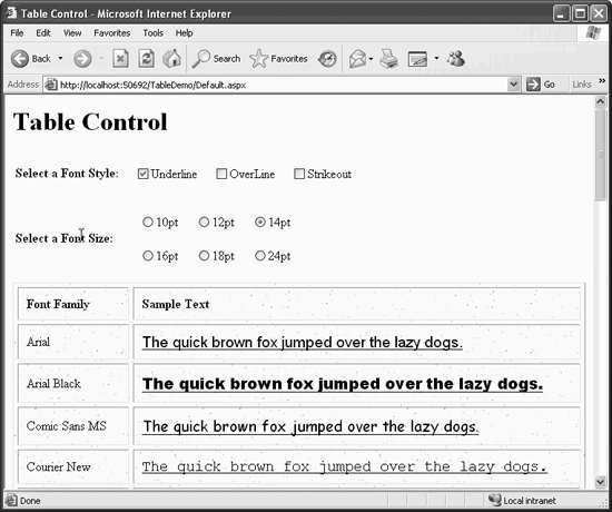
TableDemo, shown in Figure 4-19, demonstrates most of the basic table functionality of the Table control. This example uses a CheckBoxList control and a RadioButtonList control to set attributes of the font samples displayed in the table. Then a table is created that contains a sample of every font installed on your system.
The content file shown in Example 4-32, uses a static HTML table to position the font style and size selection controls. After some opening headers, there is a standard, plain vanilla HTML table. This uses the familiar <table> tags enclosing table rows (<tr>), which enclose table cells (<td>). There is nothing dynamic going on here, just the common technique of using a table to control the layout of the page.
The second cell of the first row contains a CheckBoxList server control, and the second cell of the second row contains a RadioButtonList server control, both of which have been discussed earlier in this chapter. Both of these controls have several things in common: an id attribute, the all-important runat attribute, and AutoPostBack set to true, so any changes will take effect immediately. Both controls also have various other attributes to give the desired layout.
Example 4-32. default.aspx for TableDemo
<%@ Page Language="C#" AutoEventWireup="true"  CodeFile="Default.aspx.cs"
         Inherits="_Default" %>

<!DOCTYPE html PUBLIC "-//W3C//DTD XHTML 1.1//EN"
   "http://www.w3.org/TR/xhtml11/DTD/xhtml11.dtd">

<html xmlns="http://www.w3.org/1999/xhtml" >
<head runat="server">
    <title>Table Control</title>
</head>
<body>
   <form id="form1" runat="server">
   <div>
      <h1>Table Control</h1>
      <table>
         <tr>
            <td>
               <strong>Select a Font Style:</strong>
            </td>
            <td>
               <asp:CheckBoxList ID="cblFontStyle" runat="server"
                                 AutoPostBack="True"
                                 CellPadding="5"
                                 CellSpacing="10"
                                 RepeatColumns="3"

                                 OnInit="cblFontStyle_Init">
               </asp:CheckBoxList>
            </td>
         </tr>
         <tr>
            <td>
               <strong>Select a Font Size:</strong>
            </td>
            <td>
               <asp:RadioButtonList ID="rblSize" runat="server"
                                    AutoPostBack="True"
                                    CellSpacing="20"
                                    RepeatColumns="3"
                                    RepeatDirection="Horizontal">
                 <asp:ListItem text="10pt" value="10"/>
                 <asp:ListItem text="12pt" value="12" selected = "true"/>
                 <asp:ListItem text="14pt" value="14"/>
                 <asp:ListItem text="16pt" value="16"/>
                 <asp:ListItem text="18pt" value="18"/>
                 <asp:ListItem text="24pt" value="24"/>
               </asp:RadioButtonList>
            </td>
         </tr>
      </table>


      <asp:Table ID="tbl" runat="server"
                 BackImageUrl="Sunflower Bkgrd.jpg"
                 Font-Names="Times New Roman"
                 Font-Size="12"
                 GridLines="Both"
                 CellPadding="10"
                 CellSpacing="5"
                 HorizontalAlign="Left"
                 Width="100%">
         <asp:TableHeaderRow HorizontalAlign="Left">
            <asp:TableHeaderCell>Font Family</asp:TableHeaderCell>
            <asp:TableHeaderCell Width="80%">
               Sample Text
            </asp:TableHeaderCell>
         </asp:TableHeaderRow>
      </asp:Table>
   </div>
   </form>
</body>
</html>
The CheckBoxList control has an event handler defined for initialization, onInit (highlighted in Example 4-32), which points to the method cblFontStyle_Init, which is contained in the code behind file, shown in Example 4-33.
Example 4-33. default.aspx.cs for TableDemo
using System;
using System.Data;
using System.Configuration;
using System.Web;
using System.Web.Security;
using System.Web.UI;
using System.Web.UI.WebControls;
using System.Web.UI.WebControls.WebParts;
using System.Web.UI.HtmlControls;

using System.Drawing;              //  necessary for FontFamily
using System.Drawing.Text;         //  necessary for Fonts

public partial class _Default : System.Web.UI.Page
{
    protected void Page_Load(object sender, EventArgs e)
    {
      string str = "The quick brown fox jumped over the lazy dogs.";
      int i = 0;

      //  Get the style checkboxes.
      bool boolUnder = false;
      bool boolOver = false;
      bool boolStrike = false;

      foreach(ListItem li in cblFontStyle.Items)
      {
         if (li.Selected == true)
         {
            switch (li.Value)
            {
               case "u":
                  boolUnder = true;
                  break;
               case "o":
                  boolOver = true;
                  break;
               case "s":
                  boolStrike = true;
                  break;
            }
         }
      }

      //  Get the font size.
      int size = Convert.ToInt32(rblSize.SelectedItem.Value);

      //  Get a list of all the fonts installed on the system
      //  Populate the table with the fonts and sample text.
      InstalledFontCollection ifc = new InstalledFontCollection();
      foreach( FontFamily ff in ifc.Families )
      {
         TableRow r = new TableRow();

         TableCell cFont = new TableCell();
         cFont.Controls.Add(new LiteralControl(ff.Name));
         r.Cells.Add(cFont);

         TableCell cText = new TableCell();
         Label lbl = new Label();
         lbl.Text = str;

         //  ID not necessary here. This just to show it can be set.
         i++;
         lbl.ID = "lbl" + i.ToString();

         //  Set the font name
         lbl.Font.Name = ff.Name;

         //  Set the font style
         if (boolUnder)
            lbl.Font.Underline = true;
         if (boolOver)
            lbl.Font.Overline = true;
         if (boolStrike)
            lbl.Font.Strikeout = true;

         //  Set the font size.
         lbl.Font.Size = size;

         cText.Controls.Add(lbl);
         r.Cells.Add(cText);

         tbl.Rows.Add(r);
      }
   }

    protected void  cblFontStyle_Init(object sender, EventArgs e)
   {
      // create arrays of items to add
      string[] FontStyle = {"Underline","OverLine", "Strikeout"};
      string[] Code = {"u","o","s"};

      for (int i = 0; i < FontStyle.GetLength(0); i++)
      {
         //  Add both Text and Value
         this.cblFontStyle.Items.Add(new ListItem(FontStyle[i],Code[i]));
      }
   }
}
This code is very similar to the code shown in Example 4-18 for filling a CheckBoxList from an array. Here you create two string arrays, FontStyle and Code, to fill the ListItem properties Text and Value, respectively.
The RadioButtonList control, on the other hand, does not have an onInit event handler, but rather the ListItems it contains are defined right within the control itself. This example uses self-closing ListItem tags with attributes specifying both the Text property and the Value property. In the case of the 12-point radio button, the Selected property is set to true, which makes this the default value on initialization.
Neither of these controls has any other event handler. Specifically, no event handler exists for OnSelectedIndexChanged, as there are in previous examples in this chapter. Yet, AutoPostBack is true. As you will see, the ASP.NET Table control is rebuilt every time the page is loaded, which occurs every time the CheckBoxList or the RadioButtonList control is changed. The current value for the font style is obtained from the CheckBoxList control, and the current font size is obtained from the RadioButtonList control.
Notice the two using statements (highlighted in Example 4-33) in the code-behind file, in addition to those inserted by default by VS2005. These are necessary to enable usage of the Font and FontFamily classes without typing fully qualified member names.
The Table control is the heart of this page:
<asp:Table ID="tbl" runat="server"
           BackImageUrl="Sunflower Bkgrd.jpg"
           Font-Names="Times New Roman"
           Font-Size="12"
           GridLines="Both"
           CellPadding="10"
           CellSpacing="5"
           HorizontalAlign="Left"
           Width="100%">
   <asp:TableHeaderRow HorizontalAlign="Left">
      <asp:TableHeaderCell>Font Family</asp:TableHeaderCell>
      <asp:TableHeaderCell Width="80%">
         Sample Text
      </asp:TableHeaderCell>
   </asp:TableHeaderRow>
</asp:Table>
Like all ASP.NET server controls, the Table control inherits from WebControl and therefore has the standard set of properties, methods, and events from that class and the classes above it in the hierarchy. In addition, the Table control has properties of its own, which are listed in Table 4-12. Most of these properties are demonstrated in TableDemo.
Table 4-12. Properties of the Table control not derived from other classes
|
Name |
Type |
Get |
Set |
Values |
Description |
|---|---|---|---|---|---|
|
|
String |
✗ |
✗ |
The URL of an image to display behind the table. If the image is smaller than the table, it will be tiled. | |
|
|
String |
✗ |
✗ |
The text to render to an HTML caption element. Use of this property makes the control more accessible to Assistive Technology device users. | |
|
|
TableCaptionAlign |
✗ |
✗ |
|
Specifies the formatting of the HTML caption element. |
|
|
Integer |
✗ |
✗ |
Distance, in pixels, between the border and the contents of a table cell. | |
|
|
Integer |
✗ |
✗ |
Distance, in pixels, between adjacent table cells. | |
|
|
GridLines |
✗ |
✗ |
|
Determines which, if any, gridlines will be drawn in the table. Default is |
|
|
HorizontalAlign |
✗ |
✗ |
|
Specifies the horizontal alignment of the table within the page. Default is |
Note the following information about the Table control in TableDemo:
The
BackImageUrlattribute in theTablecontrol points to an image file located in the same directory as the .aspx file itself, so the URL does not need to be fully qualified. In these code examples we used SunflowerBkgrd.jpg, which was copied from the c:\ProgramFiles\CommonFiles\MicrosoftShared\Stationery directory. You can use any .jpg file you want or simply omit theBackImageUrlattribute. For a complete discussion of relative and absolute addressing, see the sidebar "File Locations" in the section "Button Controls.”The syntax for font name and size attributes is
Font-NameandFont-Sizewhen declared as part of the ASP.NET server control using its declarative syntax, butFont.NameandFont.Sizewhen used in the code-behind file.If the
Widthattribute is set as an integer with no units, it causes the table to be the specified number of pixels in width, irrespective of the width of the browser window. The table can be made wider than the browser window.If the
Widthattribute is not specified, then the table will automatically be as wide as necessary to display the contents of the cells. If the browser window is not wide enough, the cell contents will wrap. Once the browser window is made wide enough that all the cells can display without wrapping, the table will not get any wider.
Nested inside the Table control is a single TableHeaderRow control. This row contains the header cells, indicated by TableHeaderCell controls.
The TableRow control is used to represent a single row in a Table control. It is derived from the WebControl class like the Table control. As Table 4-13 shows, it has several properties not shared with all its other sibling controls.
Table 4-13. Properties of the TableRow control not shared by other ASP.NET server controls
|
Name |
Type |
Get |
Set |
Values |
Description |
|---|---|---|---|---|---|
|
|
HorizontalAlign |
✗ |
✗ |
|
Specifies the horizontal alignment of the contents of all the cells in the row. Default is |
|
|
VerticalAlign |
✗ |
✗ |
|
Specifies the vertical alignment of the contents of all the cells in the row. Default is |
|
|
TableCellCollection |
✗ |
Collection of | ||
|
|
TableRowSection |
✗ |
✗ |
|
Specifies where the row is placed in a table. |
The TableRow class has six other controls, or classes, derived from it as described in Table 4-14.
Table 4-14. Controls derived from TableRow
|
Derived control |
Description |
|---|---|
|
|
A row in a |
|
|
A row within a |
|
|
A row within a |
|
|
A row within a |
|
|
A footer row in a |
|
|
A header row in a |
There are two types of table cell controls: a TableCell control for the body of the table and a TableHeaderCell for header cells. Both are used in TableDemo.
The TableHeaderCell control represents a heading cell in a Table control. It is derived from the TableCell control class. In fact, all of its properties, events, and methods are exactly the same as for the TableCell control. The single difference between the TableCell and TableHeaderCell controls is that the TableHeaderCell control renders to the browser as a <th> element rather than a <td>. Most browsers display <th> cells in a centered, bold font. As can be seen in Figure 4-19, the header cells are bold, but the HorizontalAlign attribute in the TableRow declaration in Example 4-32 overrides the default text alignment. Perhaps more fundamentally, TableHeaderCells are a distinctly different type of control in the Controls collection of the page.
None of the nested TableHeaderCell controls in this example have an id or a runat attribute. These attributes are unnecessary here since these controls are not accessed programmatically elsewhere in the code.
Only a single row is defined statically. The rest of the rows are defined dynamically in the Page_Load method in the code-behind file shown in Example 4-33.
In Example 4-32, the content of the header cells is the literal text strings between the opening and closing control tags. Alternatively, you may use self-closing tags and specify the content as a Text property:
<asp:TableHeaderCell text="Font Family"/>
The TableCell control is used to contain the actual content of the table. Like the Table and TableRow controls, it is derived from the WebControl class. The TableCell and the TableHeaderCell controls have the properties shown in Table 4-15, which are not shared with its siblings.
Table 4-15. Properties of the TableCell and TableHeaderCell controls not shared with other table controls
|
Name |
Type |
Get |
Set |
Values |
Description |
|---|---|---|---|---|---|
|
|
String |
✗ |
✗ |
A comma-separated list of table header cells associated with a cell, used by non-visual browsers to aid in navigation. | |
|
|
Integer |
✗ |
✗ |
Number of columns in the table that the cell spans. | |
|
|
HorizontalAlign |
✗ |
✗ |
|
Specifies the horizontal alignment of the content of the cell. Default is |
|
|
Integer |
✗ |
✗ |
Number of rows in the Table that the cell spans. | |
|
|
String |
✗ |
✗ |
The text content of the cell. | |
|
|
VerticalAlign |
✗ |
✗ |
|
Specifies the vertical alignment of the contents of the cell. Default is |
|
|
Boolean |
✗ |
✗ |
|
If |
In TableDemo, you have a Table control containing a single TableRow object that contains a pair of TableHeaderCell objects. The Page_Load method in the code-behind file, which is run every time the page is loaded, creates the balance of the table rows dynamically.
Often times, the Page_Load method will examine the IsPostBack property to test if the page is being loaded for the first time. If the load is the result of a postback, you may not want certain code to execute, either because it is unnecessary and expensive, or because you will lose or change state information. (See Chapter 3 for a full discussion of the IsPostBack property.)
In this example, however, you want the code to run every time the page loads. In fact, the CheckBoxList and the RadioButtonList controls have their AutoPostBack properties set to true to force the page to post. This forces the table to be regenerated. Each time the table is regenerated, the font styles are obtained from the CheckBoxList control, and the font size is obtained from the RadioButtonList control.
The Page_Load method begins by initializing a couple of variables:
string str = "The quick brown fox jumped over the lazy dogs.";
int i = 0;
str is the text displayed in the table, and i is a counter used later on.
You get the style or styles from the CheckBoxList control. To do so, you initialize three Boolean variables to use as flags, one for each style:
bool boolUnder = false;
bool boolOver = false;
bool boolStrike = false;
Then, using a foreach loop to test each of the ListItem objects in the cblFontStyle CheckBoxList in turn, you set the Boolean variable for each font style to true if that checkbox has been selected. That is done by testing to see if the Selected property of the ListItem object is true:
foreach(ListItem li in cblFontStyle.Items)
{
    if (li.Selected == true)
    {
        switch (li.Value)
        {
            case "u":
                boolUnder = true;
                break;
           case "o":
                boolOver = true;
                break;
            case "s":
                boolStrike = true;
                break;
        }
    }
}
Getting the font size selected in the RadioButtonList rblSize is much simpler since all you have to do is get the Value property of the ListItem object returned by the SelectedItem property. You put that integer into the size variable:
int size = Convert.ToInt32(rblSize.SelectedItem.Value);
Now comes the meat of the method. You need to get a list of all the fonts installed on the machine. To do this, instantiate a new InstalledFontCollection object:
InstalledFontCollection ifc = new InstalledFontCollection();
Iterate over that collection, using a foreach loop, looking at each of the FontFamily objects in turn:
foreach( FontFamily ff in ifc.Families )
For each font family in the collection of FontFamilies, you create a new TableRow object:
TableRow r = new TableRow();
Within that TableRow object, you create two TableCell objects: one called cFont to hold the font name and a second called cText to hold the sample text string defined earlier. The following code implements the cFont cell:
TableCell cFont = new TableCell();
cFont.Controls.Add(new LiteralControl(ff.Name));
r.Cells.Add(cFont);
The cFont TableCell object makes use of an ASP.NET server control called the LiteralControl. This control is used to insert text and HTML elements into the page. The only property of the LiteralControl, other than those inherited from Control, is the Text property.
For the cell containing the sample text, you will use a slightly different technique, because you want to be able to manipulate the font and size properties of the text string. After instantiating a new TableCell object named cText, you will instantiate a Label control and assign the variable str, defined earlier, to its Text property:
TableCell cText = new TableCell();
Label lbl = new Label();
lbl.Text = str;
You increment the counter defined earlier and use it by assigning an ID property to the Label control:
i++;
lbl.ID = "lbl" + i.ToString();
Actually, this step is unnecessary because nowhere in this example do you need to refer back to any specific cell, but it was added to demonstrate how it can be done.
You now assign the font name:
lbl.Font.Name = ff.Name;
The syntax used here differs from the syntax for setting the font name within the tags of a ASP.NET server control (Font.Name versus Font-Name).
Use the flags set earlier to set the font styles:
if (boolUnder)
    lbl.Font.Underline = true;
if (boolOver)
    lbl.Font.Overline = true;
if (boolStrike)
    lbl.Font.Strikeout = true;
Since the table is being recreated from scratch each time the page is loaded and the defaults for each of these styles is no style (i.e., false), there is no need to set the properties explicitly to false.
Set the font size, add the Label object to the TableCell object, add the TableCell object to the TableRow object, and add the TableRow object t the Table object:
lbl.Font.Size = size;
cText.Controls.Add(lbl);
r.Cells.Add(cText);
tbl.Rows.Add(r);
There you have it.
Controlling the width of the cells merits special mention. It is similar to controlling table width but different enough to cause some confusion. Looking at the HTML in Example 4-32, you can see that the second cell in the header row has a Width attribute set to 80%:
<asp:TableHeaderCell Width="80%">
   Sample text
</asp:TableHeaderCell>
Browsers make all the cells in a column the same width. If none of the cells have any width specification, the column will automatically size to best accommodate all the cells, taking into account any width specifications for the table and the size of the browser window.
If multiple cells in a column have a width specification, then the widest cell specification is used. For easiest readability, include a width specification in only one row, generally the first row of the table. Hence, the Width attribute appears in the header row of this example.
When the width is specified declaratively as part of a ASP.NET server control tag, it can be given either as a percentage of the entire table, as was done in this example, or it can be given as a fixed number of pixels, as in the following:
Width="400"
Cell width can also be specified programmatically, in which case the syntax is somewhat different. In C#, the code is the following:
TableCell cText = new TableCell();
The variable cText, of type TableCell, is assigned to the new cell instance. The Width property can be applied to this TableCell instance, either as pixels or as a percentage of the table width. To specify the Width property as 80 percent of the table width, use the following line of code:
cText.Width = Unit.Percentage(80);
To specify a fixed number of pixels, use either of the following lines of code:
cText.Width = Unit.Pixel(400);
cText.Width = 400;
There is an interaction between the cell Width property and the Wrap property. The default value for the Wrap property is true. If the Wrap property is set to false, one of the following situations will occur:
If there is no
Widthproperty specified, then the contents of the cell will not wrap and the column width expands to accommodate the largest cell.If the
Widthproperty is set to a pixel value, theWrapproperty will be overridden and the cell contents wrap to honor theWidthproperty.If the
Widthproperty is set to a percentage value, it will be overridden and the column will be made wide enough to preclude any wrapping.
Get Programming ASP.NET, 3rd Edition now with the O’Reilly learning platform.
O’Reilly members experience books, live events, courses curated by job role, and more from O’Reilly and nearly 200 top publishers.

