Basic and advanced calendar scenarios
The calendar component is used to provide date input with customizable features such as localization, paging of months and restriction mechanisms on the date selection.
How to do it...
The simplest component declaration for a basic date selection would be as follows:
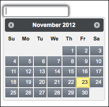
<p:calendar value="#{calendarController.date}" />This renders an input text that opens up a pop-up date selection dialog when clicked, as shown in the following screenshot:
The pop-up visual of the calendar can also be configured to render as an inline visual on the page with the mode attribute, as follows:
<p:calendar value="#{calendarController.date}" ...Get PrimeFaces Cookbook now with the O’Reilly learning platform.
O’Reilly members experience books, live events, courses curated by job role, and more from O’Reilly and nearly 200 top publishers.

