Typography in Numeric Graphics
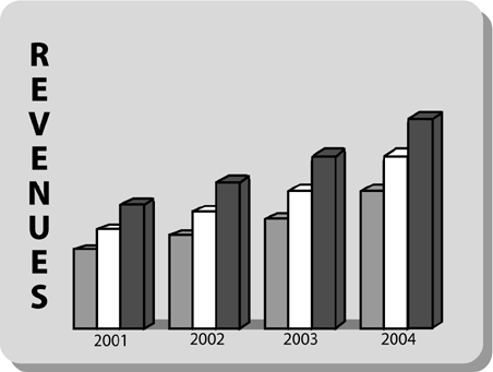
The label on the left side of Figure 8.5 is “stacked.” Type set this way is very hard to read. Think about it: The stacked label, containing eight letters, causes your eyes to make seven carriage returns. Ouch!
Figure 8.5. The label on the left is “stacked.”
This problem is easy to solve, as in Figure 8.6.
Figure 8.6. The more legible horizontal label.

Use a horizontal label like the one in Figure 8.6, which makes the chart much clearer and easier to read.
A close cousin of the stacked vertical label is the vertical ...
Get Presenting to Win: The Art of Telling Your Story now with the O’Reilly learning platform.
O’Reilly members experience books, live events, courses curated by job role, and more from O’Reilly and nearly 200 top publishers.

