Pie Charts
Figure 8.3 shows a typical pie chart (also called a circle chart). This kind of chart is useful for showing a total amount divided into subordinate parts; in this case, the chart shows how a company's sales are divided geographically. At a glance, it's easy to see the relative share of the whole that each part, or each wedge of pie, represents.
Figure 8.3. A typical pie chart.
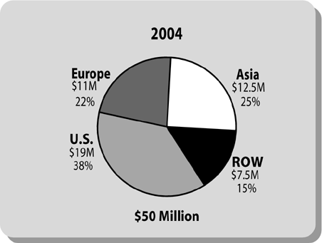
Unfortunately, the chart is needlessly cluttered and confusing to read. Stacking the name of the sales region, the sales figure, and the percentage (e.g., “Europe,” “$11 Million,” and “22%”) forces the viewer to pause and sort out what each element means.
Now look ...
Get Presenting to Win: The Art of Telling Your Story now with the O’Reilly learning platform.
O’Reilly members experience books, live events, courses curated by job role, and more from O’Reilly and nearly 200 top publishers.

