USING COMPARISONS
Most good diagrams I see either move somewhere or compare something to some other thing. This is the secret. Right now only one type of static visual explanations come to mind that really works—cross-section diagrams—and this is only because of the implicit opposition between the surface view and the internal structure. Difference. Change. If you want change, you must show it.
Figure 6-4 shows what is probably one of the most famous diagrams in the world: the Brookes print. It was designed in Plymouth, UK, in 1788 by the Plymouth Chapter of the Society for Effecting the Abolition of the Slave Trade. Its sole goal was to explain the horrific conditions on board a typical slave ship. Since 1788 it was reproduced many thousands of times in print, found its way into school textbooks and museums, and some might say even became the symbol for the abolitionist movement itself. What's the secret; why did this picture suddenly become so popular and powerful?
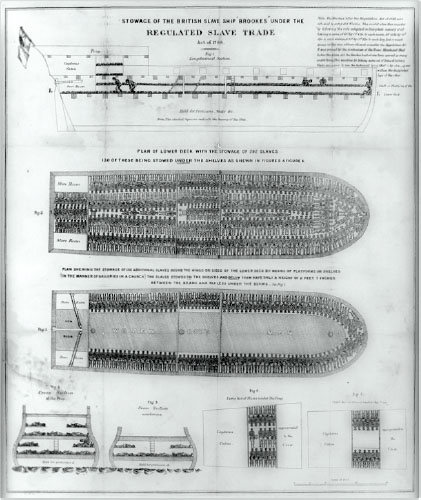
FIGURE 6-4: The Brookes print.
First of all, it lifts the veil. It showed what was happening inside a seemingly harmless ship. Why do we almost immediately realize that the things going on are torturous and inhumane? The diagram displays two aspects: free space and occupied space. The point is there's almost no free space. And that's very efficient, but that's also very inhumane. Live people were reduced to the status ...
Get Presentation Secrets: Do What you Never Thought Possible With Your Presentations now with the O’Reilly learning platform.
O’Reilly members experience books, live events, courses curated by job role, and more from O’Reilly and nearly 200 top publishers.

