Creating charts
Before starting to create chart diagrams, delete the filters we've created in the previous section or create a new sheet.
To create a Qlik Sense visualization, you need to know three important things:
- The type of chart you are going to use
- The dimension objects you are going to use in your analysis
- The metric or metrics
We're going to start with a very basic chart. Our objective is to create a pie chart like the chart in the following screenshot. This chart explains the distribution of our customers between two channels – Horeca and Retail:
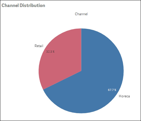
In this pie chart, the dimension is Channel and the measure is the number of customers. On the left-hand ...
Get Predictive Analytics Using Rattle and Qlik Sense now with the O’Reilly learning platform.
O’Reilly members experience books, live events, courses curated by job role, and more from O’Reilly and nearly 200 top publishers.

