Chapter 90. Tip #5: Use the Golden Ratio
Without mathematics there is no art.
Luca Pacioli
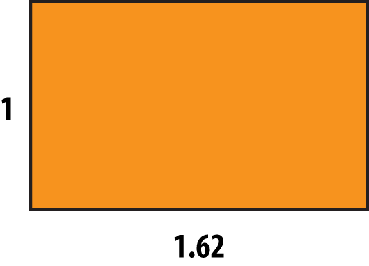
The Golden Ratio, or 1:1.618, is a number found in patterns that we see all around us every single day. In fact, the shape of this book and likely the screen you’re reading this on (if you’re an ebook reader) are probably pretty close to a Golden Rectangle, which is a rectangle where the long sides are 1.618 times longer than the short sides. The Golden Ratio is used in the design of the televisions we watch, architecture, paintings from the likes of Salvador Dali, and even occurs naturally in plants and our own DNA.
Shapes and patterns created with the Golden Ratio have been found aesthetically pleasing for centuries, and when it comes to data visualization, these patterns offer the added benefit of helping us prioritize the content we share in our dashboards. I’ve mentioned that I try to stick to twelve dashboard components or fewer, including titles, charts, and filters. The Golden Ratio is one of the tools I use to help guide how to select and lay out those twelve widgets.
The gist of the layout is that the most important data you are communicating should be toward the top and to the left, with lower-priority information appearing further toward the bottom and right of your view. Just as you start reading a page in a book, you can expect your audience to approach your data visualization ...
Get Practical Tableau now with the O’Reilly learning platform.
O’Reilly members experience books, live events, courses curated by job role, and more from O’Reilly and nearly 200 top publishers.

