Chapter 74. Three Ways to Make Lovely Line Graphs in Tableau
Line graphs are a close second to bar charts as my favorite fundamental visualization type and are the obvious choice for evaluating trends over time.. Like bar charts, the invention of line graphs is generally credited to William Playfair at the end of the 18th century Also like bar charts, I blame their age and people’s familiarity with line graphs as the reason some data visualization enthusiasts look for “more engaging” choices. Line graphs have stood the test of time and their effectiveness cannot be denied. I’m hoping that these three approaches help cement line graphs as a top choice for your Tableau data visualizations.
Approach #1: Use Formatting Available in Tableau
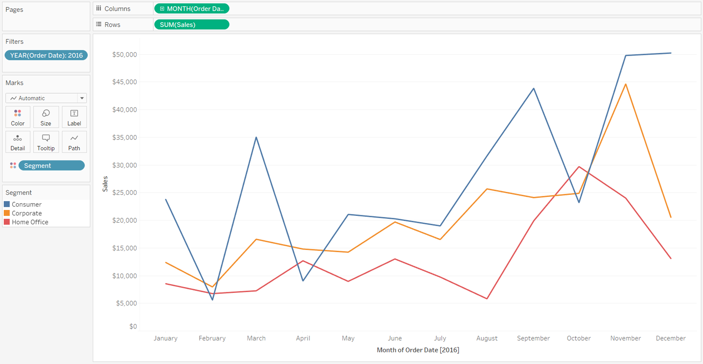
My first tip for making line graphs more engaging is to use the formatting options available to you in Tableau. Consider the following sales by segment line graph with all of the default Tableau format settings. Note that I’ve used the Month([Order Date]) field as continuous and filtered the data to the year 2016:
A great deal of thought went into Tableau’s default formatting including the fonts, colors, and mark sizing. So as can be expected from my data visualization tool of choice, this graph is already getting the job done and providing good insights. That being said, if one of your objectives is to make the graph as engaging as possible, ...
Get Practical Tableau now with the O’Reilly learning platform.
O’Reilly members experience books, live events, courses curated by job role, and more from O’Reilly and nearly 200 top publishers.

