Chapter 50. How to Add Instructions or Methodology Using Custom Shape Palettes
Instructions on a Tableau dashboard are vital to ensuring your end users can get the most out of your work whether or not you are there to explain it to them. As with most things in Tableau, there are several different approaches to adding instructions to a dashboard, and there is not necessarily one best method. Just to name a few off the top of my head, you could:
-
Add a text box to your dashboard and type out the full instructions.
-
Include instructions on a second tab in your workbook.
-
Not include written instructions, but display color, size, and mark legends for every dashboard object.
My go-to approach for adding instructions to the corporate dashboards I create in Tableau is to leverage a custom shapes palette to display a familiar icon to my end users. When they see the icon, they know they can hover over it for more information, which is displayed to them as a tooltip.
Here is an example where I used this approach to share the methodology for one of my Tableau Public visualizations:
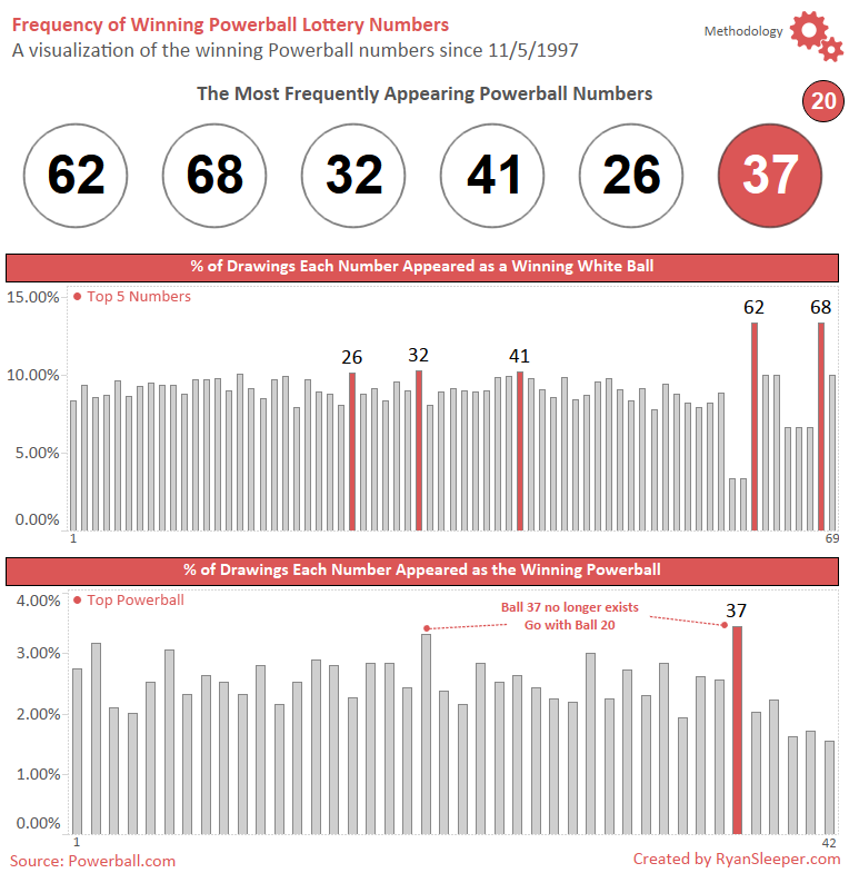
This is my favorite approach to including instructions because it ensures the end user has access to the instructions without requiring much real estate on my dashboards (I have cooler things to show, after all). My end users have learned that the gear icon is their go-to place for instructions, but they ...
Get Practical Tableau now with the O’Reilly learning platform.
O’Reilly members experience books, live events, courses curated by job role, and more from O’Reilly and nearly 200 top publishers.

