Chapter 46. How and Why to Make Customizable Jitter Plots
“Jittering” is a technique for separating overlapping marks on a view. By giving marks some extra room by separating them into different columns, hidden data is often revealed and it is easier to visualize how the data points are distributed. The bad news is that Tableau does not provide an out-of-the-box option to jitter data points. The good news is that Tableau has an amazing community of very smart people who are willing to share their ideas. At least three Tableau Zen Masters that I know of—Steve Wexler, Mark Jackson, and Jeffrey Shaffer—have written about jitter plots.
If it’s good enough for them, it’s good enough for me. This chapter shares my favorite technique for creating jitter plots in Tableau, and also shows you how to put the intensity of the jitter into the hands of your end users.
Consider the following box and whiskers plot, which shows the sales distribution of all of the customers in the Sample – Superstore data source:
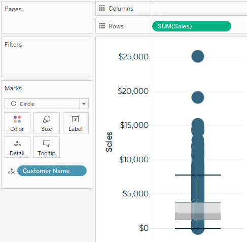
While the box and whiskers themselves are providing some valuable information about the distribution of the customers, it is impossible to get a good sense of how many customers are at each sales value on the y-axis. We are able to see a couple of outliers at the very top, but the view summary in the bottom-left corner of the authoring interface is telling me that there are 793 marks ...
Get Practical Tableau now with the O’Reilly learning platform.
O’Reilly members experience books, live events, courses curated by job role, and more from O’Reilly and nearly 200 top publishers.

