Chapter 42. How to Make a Pareto Chart
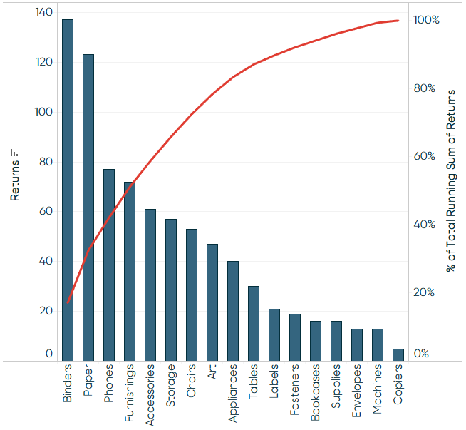
A Pareto chart, named for Vilfredo Pareto (the 80-20 guy!), is a dual-axis combination chart used to highlight dimension members that are having the biggest impact to the measure in question. On the primary axis, bars are used to show the raw quantities for each dimension member, sorted in descending order. On the secondary axis, a line graph is used to show the cumulative total in percent format. While this chart type can serve a variety of purposes, it is part of the seven basic tools of quality control, and is traditionally used to identify the biggest contributors to a cumulative total and opportunities for improvement.
How to Make a Pareto Chart in Tableau
In sticking with a quality control scenario, this tutorial will use the Sample – Superstore dataset to look at which product sub-categories contribute the most returned items. The final chart will look like this:
As with the rest of Practical Tableau, you can follow along using the Sample – Superstore data that comes with every download of Tableau. However, this tutorial required me to take two additional steps to prepare the data:
-
Left join the Returns table to the Orders table.
To do this, right-click the Sample Superstore data connection and choose “Edit data source”. A new interface will appear where you can drag the Returns table next to the Orders table and set up a left ...
Get Practical Tableau now with the O’Reilly learning platform.
O’Reilly members experience books, live events, courses curated by job role, and more from O’Reilly and nearly 200 top publishers.

