Chapter 38. How to Make Dual-Axis Slope Graphs
Slope graphs, or essentially line graphs between two points, are one of my favorite Tableau charts when my analysis requires a comparison between two data points. They work so well, in fact, that they are the one chart I will use to connect lines between discrete categorical variables. In almost every scenario, lines should only be used to connect points in time, but with slope graphs, I am OK drawing a line between “Thing 1” and “Thing 2,” as well as “Time 1” and “Time 2.” I like the following approach so much because you can easily view changes of individual dimension members (i.e., sub-categories) in context of each other, and the dual-axis mark provides extra real estate to share additional context in your analysis.
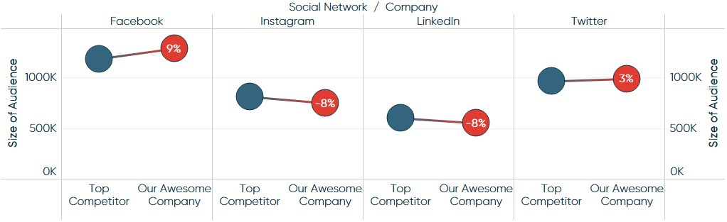
This chapter shares not only how to make slope graphs in Tableau, but how to enhance them by leveraging a second axis to provide additional context. By the end of the chapter, we will have re-created this dual-axis slope graph:
How to Make Slope Graphs in Tableau
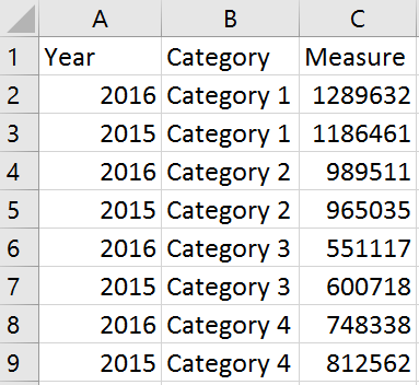
First, let’s knock out the traditional slope graphs using this data:
-
Create a bar chart.
Create a bar chart with your two-point time comparison on the Columns Shelf as a discrete dimension and your measure on the Rows Shelf:
-
Add dimension to level ...
Get Practical Tableau now with the O’Reilly learning platform.
O’Reilly members experience books, live events, courses curated by job role, and more from O’Reilly and nearly 200 top publishers.

