Chapter 36. How to Make a Gantt Chart
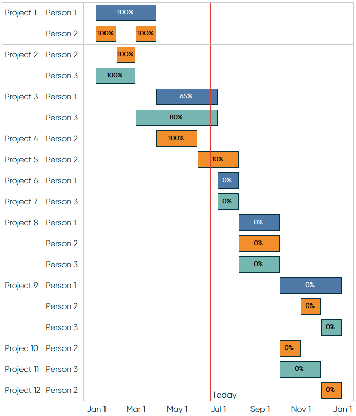
Gantt charts are traditionally used for visualizing project schedules. They are effective for illustrating task durations and dependencies in context of the larger business operation. As with several visualizations that can be built with Tableau, the fact that “Gantt Bar” is a mark type option unlocks some flexibility that allows you to use this chart type in many other ways. To start demonstrating the usefulness of the Gantt Bar mark type, we will build a Gantt chart with a traditional application of illustrating project schedules. The final product will look like this:
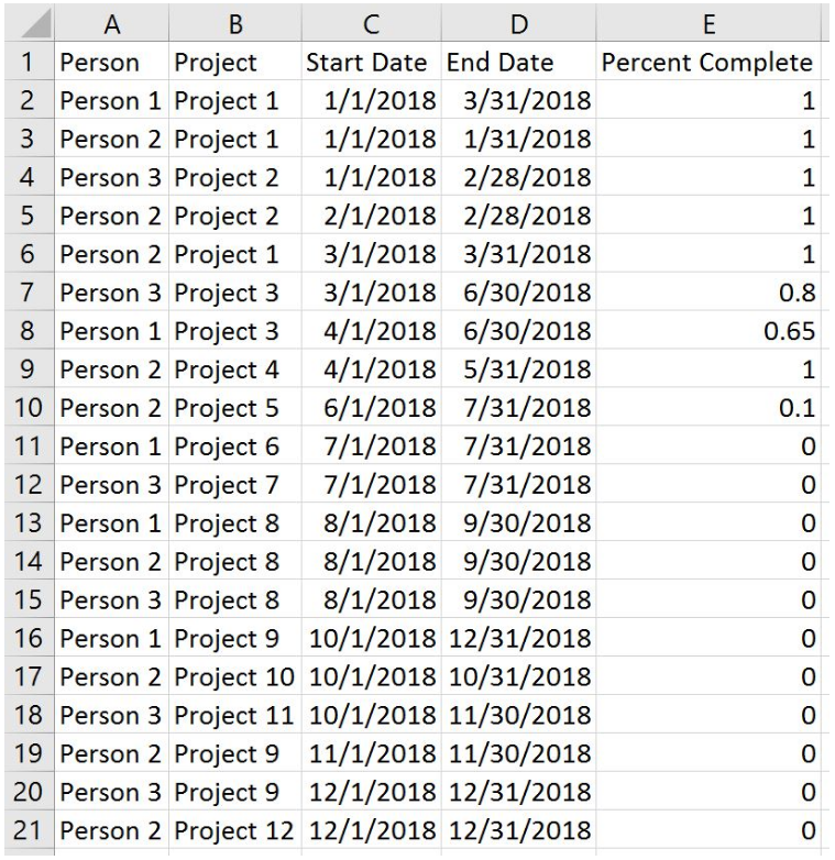
This is one of the few examples that cannot be illustrated using the Sample – Superstore data source, so I will be using the following dataset:
For the purposes of this illustration, let’s pretend that we are a manager with three employees and we are plotting out their schedules across twelve projects for the year. We have created the schedules in Excel, but want to leverage data visualization to (a) get a better sense of how our projects and employees line up, (b) track progress to completion for each project, and (c) provide a visual schedule for our employees to use. All three of these features can be provided through a Gantt chart.
Gantt charts are created with one ...
Get Practical Tableau now with the O’Reilly learning platform.
O’Reilly members experience books, live events, courses curated by job role, and more from O’Reilly and nearly 200 top publishers.

