Chapter 31. How to Make a Filled Map
In the previous chapter, I shared how to create symbol maps in Tableau with custom Mapbox maps, and how mapping in Tableau leverages schemas that you are familiar with to help you rapidly decode latitude and longitude pairs. Maps in Tableau can be thought of as scatter plots, with a background image of a map to help you orient yourself almost instantly to the geographic territories being displayed.
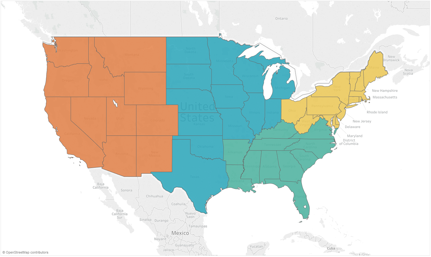
Filled maps in Tableau are similar to symbol maps, but they include many more data points. While a symbol map draws a symbol at the intersection of each latitude and longitude pair, filled maps draw a polygon around the entire border. Here’s one example of a filled map colored by region in Tableau:
How to Make Filled Maps in Tableau
Filled maps are one of the easier chart types to create in Tableau using Show Me. Just click a geographic dimension (identified by a globe icon) from the Dimensions area of the Data pane and choose “maps” under Show Me. That being said, in the spirit of learning, we will build a filled map from scratch. To create a filled map manually, I will first double-click the geographic dimension for State in the Sample – Superstore dataset:
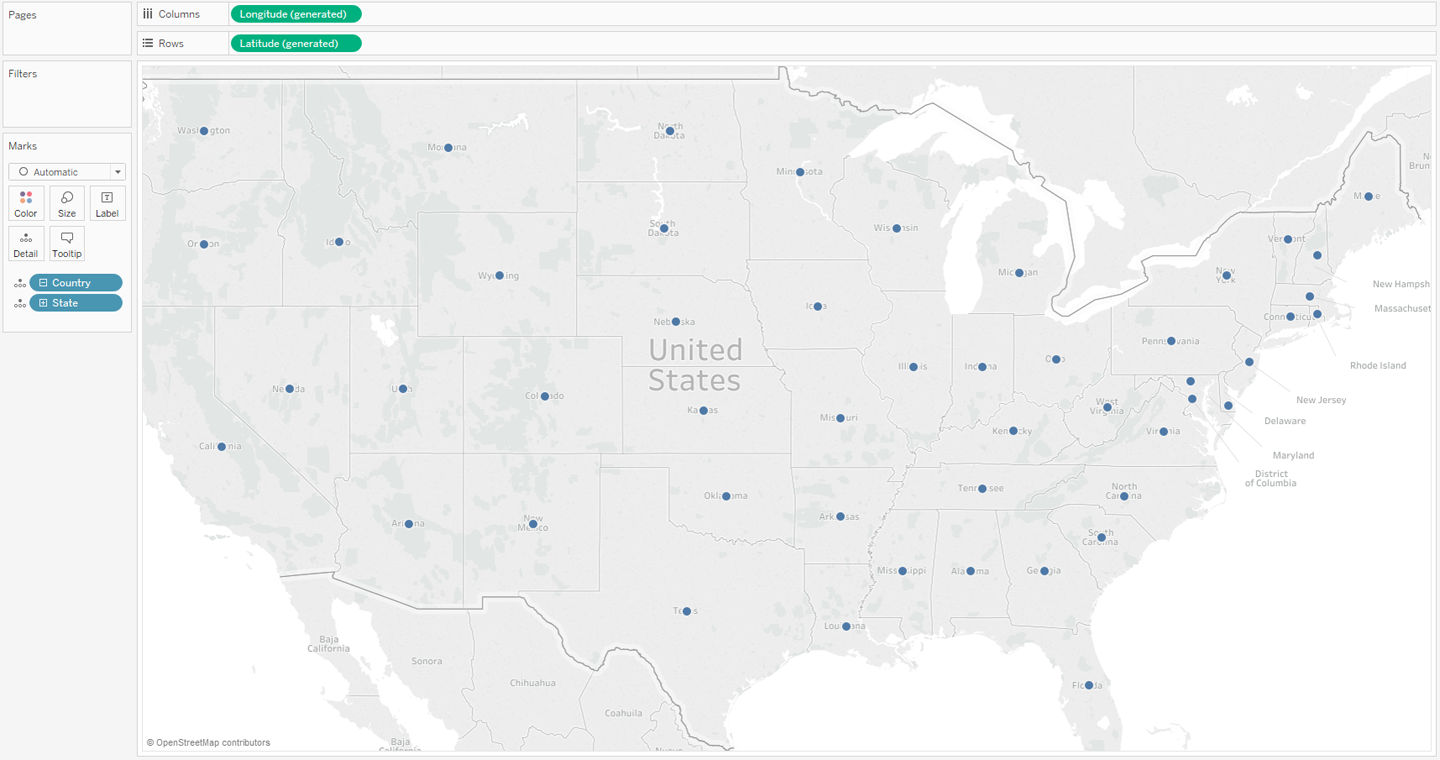
By default, Tableau generates a symbol map, placing a circle at the intersection of ...
Get Practical Tableau now with the O’Reilly learning platform.
O’Reilly members experience books, live events, courses curated by job role, and more from O’Reilly and nearly 200 top publishers.

