Chapter 28. How to Make a Histogram
Histograms are one of the most effective chart types for showing a distribution of quantitative data at one point in time. Similar to a bar chart, the important distinction is that histograms are used to plot continuous, numerical data while the bar chart is used to plot discrete, categorical data. When you create a histogram, bins are created to group equally sized numerical ranges. Despite being continuous and quantitative, these bins can be thought of as the dimension that you slice and dice the count of records by to create the histogram.
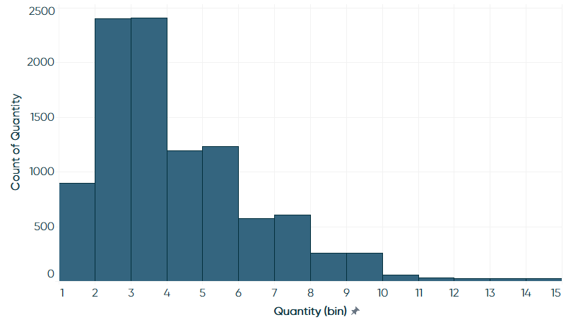
In this chapter, we will re-create the following visualization:
How to Make a Histogram in Tableau
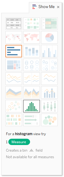
Histograms are one of the 24 chart types in Tableau that can be created using the Show Me tool in the upper-right corner of the Tableau Desktop interface. I’ve mentioned I usually like to explain how a visualization is created manually in Tableau instead of relying on Show Me, but histograms are one of my few exceptions. Histograms are created in Tableau using just one measure. To create a histogram, pre-select the measure that you want to visualize the distribution for by clicking it in the Measures Shelf. Then navigate to the Show Me options and choose “histogram”:
Here’s how a histogram looks if you ...
Get Practical Tableau now with the O’Reilly learning platform.
O’Reilly members experience books, live events, courses curated by job role, and more from O’Reilly and nearly 200 top publishers.

