Chapter 23. How to Make a Tree Map
A tree map is a visualization that nests rectangles in hierarchies so you can compare different dimension combinations across one or two measures (one for size; one for color) and quickly interpret their respective contributions to the whole. When used poorly, tree maps are not much more than an alternative pie chart. When used well, they provide at least two big benefits:
-
Depending on the analysis, some portions of the tree map will be composed of large rectangles where additional context can be added as labels. This is beneficial when the visualization will not be interactive and you still want the written information represented.
-
In addition to the scatter plot, tree maps are one of the only visualization types that allow you to reasonably communicate and consume hundreds of marks on a single view. This makes it easier to spot patterns and relationships that you would not otherwise be able to see.
For this tutorial, we will be making the following set of tree maps:
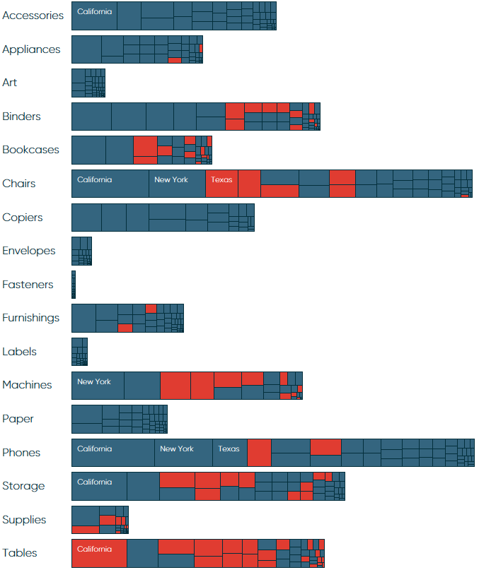
This analysis shows not only the sales amount by sub-category, but the sales contribution of each US state per sub-category and whether or not those states were profitable within each sub-category.
By changing the level of detail to make our analysis more granular and encoding the marks by a second measure of Profit Ratio provides more context to the view and helps us avoid ...
Get Practical Tableau now with the O’Reilly learning platform.
O’Reilly members experience books, live events, courses curated by job role, and more from O’Reilly and nearly 200 top publishers.

