Chapter 21. How to Make a Dual-Axis Combination Chart
Dual-axis combination charts, or Combo Charts, are an effective chart type for showing related information while saving real estate by combining views. This chart type is created with one shared axis, such as an x-axis for date, and two separate axes, such as y-axes for two different measures. This chapter will show you how to make a dual-axis combo chart in Tableau that looks at Sales and Discount by Year and Product Category.
How to Make a Dual-Axis Combo Chart in Tableau
Before we begin, let’s take a look at how our final product will look:
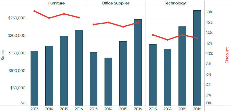
-
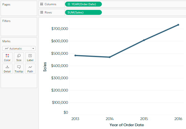
Make a graph of one of the measures.
The first step is to make a graph for one of your measures. It doesn’t matter too much which of your two measures you begin with, but the first measure you select will always form the lefthand y-axis or bottom x-axis (depending on the chart’s orientation). Let’s start by making a line graph for sales by year. To create the first graph, drag the Order Date field to Columns Shelf with an aggregation of Year Continuous. Then drag the Sales field to the Rows Shelf. At this point, the view looks like this:
-
Drag the second measure onto the opposite axis.
In order to create a dual-axis chart, you will drag the second measure onto the opposite axis ...
Get Practical Tableau now with the O’Reilly learning platform.
O’Reilly members experience books, live events, courses curated by job role, and more from O’Reilly and nearly 200 top publishers.

