Chapter 19. How to Make a Highlight Table
In Chapter 87, I demonstrate an exercise for “Smoothing the Excel Transition” by introducing the value of data visualization. In the example, we simply encode the values in a large text table of data by color—the higher the sales values, the darker the green. The result is called a highlight table.
Highlight tables are one of the simplest chart types to create, but are also among the most powerful. When compared to a crosstab (a.k.a. text table) view, this basic data visualization helps reduce the time to insight and improve the accuracy of insights. Highlight tables are definitely worth making a part of your chart type toolbelt, right alongside bar charts and line graphs. They are best used for:
-
Quickly identifying highs and lows or other points of interest in your data
-
As a means of enhancing a crosstab
-
As a tactic for helping smooth the Excel transition
Highlight tables consist of one or more dimensions and exactly one measure (the color). Let’s take a look at how they’re made.
How to Make a Highlight Table in Tableau
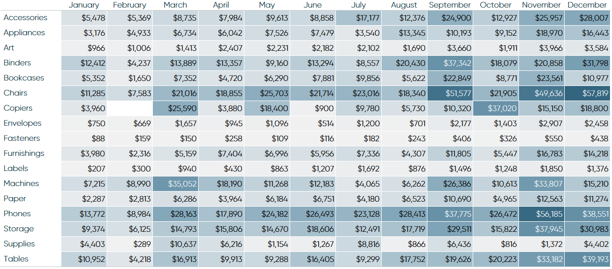
Before we begin, let’s see how the final product will look:
You can create a highlight table with any combination of one or more dimensions and one measure. You can also create a highlight table using Show Me, but I prefer to learn by creating chart types manually so I understand how Tableau is generating the ...
Get Practical Tableau now with the O’Reilly learning platform.
O’Reilly members experience books, live events, courses curated by job role, and more from O’Reilly and nearly 200 top publishers.

