Creating graphs in R
Once a dataframe has been set up with the necessary column, we can begin to graph the data and explore visualization options.
Creating simple charts with plot() in R
The most basic graph can be generated with the plot() function using the following script:
plot(SQL_Query_1, main = 'Discount Code by Week')
The output of the script can be seen here:
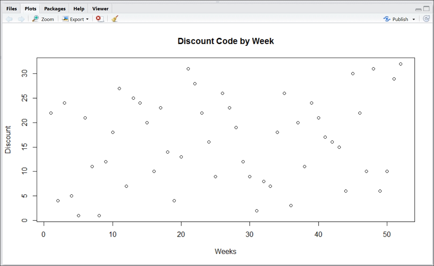
While the plot displays the discount by week, it is difficult to identify the relationship week-to-week without being able to connect the dots.
The following script will connect the dots between each sequential point:
plot(SQL_Query_1, main = 'Discount Code by Week', type="o")
The output ...
Get Practical Business Intelligence now with the O’Reilly learning platform.
O’Reilly members experience books, live events, courses curated by job role, and more from O’Reilly and nearly 200 top publishers.

