Palm webOS is designed for mobile, battery-operated devices with limited but variable screen sizes, and a touch-driven UI. User interaction is centered on one application at a time, though applications, once launched, continue to run until closed even when moved out of the foreground view. There is a rich notification system enabling applications to subtly inform or directly engage the user at the applicationâs discretion.
Navigation is based on a few simple gestures with optional extensions that create a rich vocabulary of commands to drive powerful navigation and editing features. To start with, though, all you need to know is:
- tap (act on the indicated object)
Commonly in a view that contains clusters or lists of items, tapping reveals information contained in an item. This can be thought of as an open function, which changes the nature or context of the view to be about the selected item exclusively. Alternately, a tap will change an objectâs state such as setting a check box or selecting an object.
- back (the inverse of open)
This feature looks like the opposite of a tap: the item compresses down to its summary in the containing context where it belongs. Typically, it reverses a view transition, as going from a child view to a parent view.
- scroll (flick and quick drags)
Beyond this, you can learn to pan, zoom, drag and drop, switch applications, switch views, search, filter lists, and launch applications. But to begin with, only these three gestures are needed to use a webOS device.
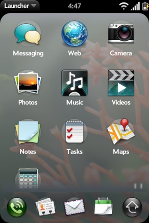
When a user turns on a webOS device, the screen displays the selected wallpaper image with the status bar across the top of the screen and, hovering near the bottom, the Quick Launch bar. The Quick Launch bar is used to start up favorite applications or to bring up the Launcher for access to all applications on the device. From this view, users can initiate a search simply by typing the search string; searches can be performed on contacts, installed applications, or to start a web search. Figure 1-2 shows both the Quick Launch bar and the Launcher.
The launched application takes over the available screen becoming the foreground application; the applicationâs view replaces the wallpaper image and the Quick Launch bar is dismissed. The status bar remains and is always visible except in full screen mode, which is available to applications such as the video player or others that request it. The application launch sequence is fluid and smooth, as you will see with all webOS transitions.
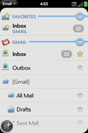
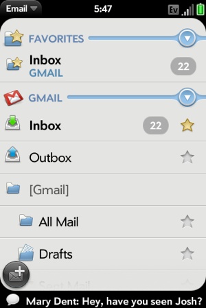
Figure 1-3 shows an applicationâs main view, in this case the Email applicationâs folder view. The main view includes UI elements that make up the basic email application. The inbox view displays specific folders, which users can select to open a new card with a detail view of the messages contained within the selected folder. At the bottom, floating icons represent menu items. A tap to a menu icon will typically reveal another view associated with that menu action, a submenu, or a dialog box.
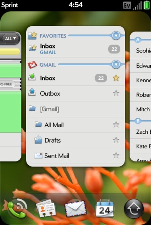
Running one application at a time, or performing one activity at a time, can be terribly restrictive and inefficient. Palm webOS makes it easy to work on more than one thing at a time. Swiping up, from the bottom of the display, brings up a new view, the Card view, an example of which is shown in Figure 1-4. From the Card view, users can switch to another activity simply by scrolling to and tapping the card representing that activity. Users can also launch another application from the Quick Launch bar.
The Card view was inspired by the way people handle a deck of cards. You can fan the cards out to see which card is where, and within the deck of cards, you can select or remove any single card with a simple gesture, or move it to a new location by slipping it between adjacent cards. Users can manipulate the webOS Card view in similar ways by scrolling through the cards, selecting and flicking cards off the top to remove them, or selecting and dragging a card to a new location.
The term activity needs further explanation. In most applications, users will, by design, work on one activity at a time. However, with some applications, it is more natural to work on several activities in parallel. A common email activity is writing a new email message, but in the middle of writing that message, the user may want to return to the inbox to look up some information in another message or perhaps read an urgent message that has just arrived.
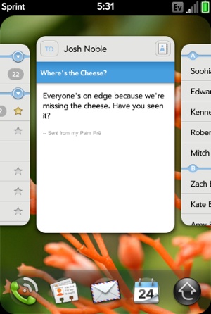
With a webOS device, the draft email message has its own card, separate from the email inbox card. In fact, users can have as many draft email messages as they need, each in their own cards; each is considered a separate activity and is independently accessible. Switching between email messages is as simple as switching between applications, and the data is safe, as it is saved automatically by the Email application. Figure 1-5 shows the Card view with the email applicationâs inbox card and a draft email compose card.
What happens to the foreground application when the user switches to a new application? The previous application is not closed, but continues to run as a background application. Background applications can get events, read and write data, access services, repaint themselves, and are generally not restricted other than to run at a lower priority than the foreground application.
To allow background applications to communicate with the user, Palm provides a notification system with two types of notifications:
- Pop-up
Nonmodal dialog boxes that have a fixed height and include at least one button to dismiss the dialog box. Pop-up notifications interrupt the user and are appropriate for incoming phone calls, calendar alarms, navigation notifications, and other time-sensitive or urgent messages. Users are forced to take action with pop-ups or explicitly clear them, but since they are not modal, users are not required to respond immediately.
- Banner
A nonmodal icon and single unstyled string of text. Banner notifications are displayed along the bottom of the screen within the Notification bar, which sits just below the application window in what is called negative space since it is outside of the cardâs window. After being displayed, banner notifications can leave a summary icon in the Notification bar as a reminder to the user. Figure 1-6 shows an example of a banner notification and the summary icons are shown in Figure 1-7, indicating that the music player is active and that there is an upcoming calendar event and new messages.
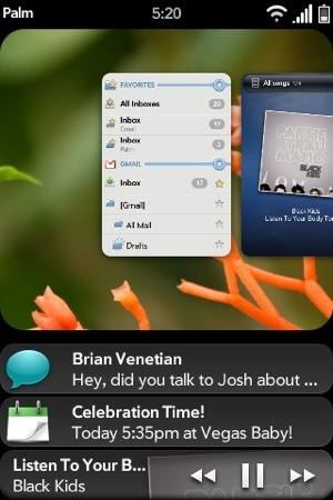
At any time, the user can tap the Notification bar, which brings up the Dashboard view, shown in Figure 1-8. Notifications that are not cleared should display their current statuses within a dashboard summary.
A dashboard summary is more than just a history of a notificationâit is a dynamic view that allows any background application to display ambient information or status. For example, the Calendar application always displays the next event on the calendar even before the event notification has been issued. In Figure 1-8, the Music application shows the current song along with playback controls that you can manipulate to pause the music or change the selection.
Dashboard applications are those that can be completely served through the dashboard, as their entire purpose is to monitor and present information. For example, a weather application could display the current weather for a targeted location in a dashboard without having a Card view at all.
The Notification bar and Dashboard view manage messages and events, keeping users abreast of changes in information without interrupting their current activities. It may help to think of the Dashboard view as an event-driven model, while the Card view provides the user with task-oriented navigation tools. The combination enables the user to quickly track and access the information he needs when he needs it.
There are some foundational principles or values that support the overall webOS user experience. You can exploit these principles to more deeply integrate your application into the overall user experience. You can rely on the framework to provide most of what is required at an implementation level, but you should keep in mind these key principles when designing your application:
Physical metaphors are reinforced through direct interaction with application objects and features, instant response to actions, and smooth display and object transitions with physics-based scrolling and other movement. For example, users delete objects by flicking them off the screen and they can edit in place without auxiliary dialog boxes or scenes.
Maintain a sense of place with repeatable actions, reversible actions, stable object placement, and visual transitions that take the user from one place to the next.
Always display up-to-date data, which requires both pushing and pulling the latest data to and from the device so that the user is never looking at stale data when more recent data is available. This also means managing on-device caches so that when the device is out of coverage or otherwise offline, the user has access to the last data received.
Palm webOS is fast and simple to use. All features should be designed for instant response, easy for novices to learn and efficient for experienced users.
Minimize the steps for all common functions. Put frequently executed commands on the screen and less frequently executed commands in the menus. Avoid preferences and settings where possible. If you must use them, keep them minimal.
Donât block the user. Donât use a modal control when the same function can be carried out nonmodally.
Be consistent. Help users learn new tasks and features by leveraging what they have already learned.
Palm applications have always been built around a direct interaction model, where the user touches the screen to select, navigate, and edit. Palm webOS applications have a significantly expanded vocabulary for interaction, but they start at the same place. Your application design should be centered on direct interaction, with clear and distinguishable targets. The platform will provide physical metaphors through display and navigation, but applications need to extend the metaphor with instantaneous response to user actions, as well as smoothly transitioning display changes and object transitions.
You can find a lot more on the UI guidelines and design information in the Palm Mojo SDK. Weâll touch on the principles and reference standard style guidelines in the next few chapters, but will not be covering this topic in depth.
Get Palm webOS now with the O’Reilly learning platform.
O’Reilly members experience books, live events, courses curated by job role, and more from O’Reilly and nearly 200 top publishers.

