Once your picture is just right, it's time to put it into a page and let it shine. Editing a photo is only half the fun when it comes to publishing photos on the Web. The other part is the presentation, and just as with the tools and technologies associated with photo editing, you have a lot of options for how you can display your photos.
If a photo is meant for story illustration, you can embed it directly into the text, and we'll look at clean approaches to do this. However, you can also add a photo "filmstrip" at the bottom of the story, or to the side—even a link to a slideshow.
Speaking of slideshows, some of the same tools you use to edit the photo can also be used to generate either HTML or Flash slideshows; or you can use any number of freely available slideshow packages that are, more or less, drop and play. The functionality can also be implemented using JavaScript for a more modern "Ajaxy" feel.
Rather than a slideshow, you can also publish your photos in a more formal gallery. Again, some photo editors and workflow tools can generate galleries, or you can use server-side software that manages the gallery functionality for you. You can even embed a small piece of code into your web page and have it alter the photo that's displayed as part of a header, background, or sidebar item each time a person accesses a page.
Regardless of how you publish your photos online, one issue related to all the techniques is how large your published photo should be, which is indirectly related to the topic of thumbnails. Thumbnails are more than just miniaturizations of the larger photo—they can invite exploration or even provide their own unique presentation and statement.
I would estimate that more than 90% of the thumbnails for photos online are generated automatically from whatever software is used to publish the photo online. The software does a good job, and the thumbnail looks OK, but we're not giving thumbnails the respect they deserve when we let the applications handle their creation.
A thumbnail is usually just a smaller, perhaps more optimized, version of a larger, better quality picture that is linked to the thumbnail. It's a way to provide a sample of the larger picture without burdening the person with big photos that may take longer to download, or that may take up too much page real estate.
Thumbnails, though, can provide a whole new way of looking at the photo, and even a way to create something new, interesting, and completely different from just the photo itself.
Consider another area of life where size matters: food and the presentation of such. Nothing better than sitting down to a turkey the size of a small bus or a big plate of lasagna (or a pot roast with golden roasted potatoes!), but I don't think there are any of us who don't appreciate the samplings of food we get at parties: pretty crackers with slivers of salmon or bite-sized hot mushroom tarts passed as hors d'oeuvres. There are restaurants that serve meals that are nothing more than a series of courses with smaller servings, one right after another, that mix taste and presentation. Between courses, wait persons pass out whatever the chef has created for amuse-bouche that day: tiny creations that explode the myth that food tastes the same no matter the dimensions. As Melissa Clark wrote in "Tiny Come-Ons, Plain and Fancy" for the New York Times in 2006, "The fact is that as long as it's small, tasty, and pleasing to the eye, almost anything can make an amuse-bouche."
The same concepts can be applied to photography, with thumbnails as the tasty tidbit, the hors d'oeuvre, the amuse-bouche that enlivens the page.
Tip
The examples in this chapter use Photoshop CS3 or GIMP, but all the effects can be re-created using the desktop photo editors reviewed in Chapter 3. Whenever necessary, instructions are provided that show you how to manually create an effect.
There is no area where the differences between a photo for the Web and one for printing are more apparent than that of photo resizing.
Photos published to the Web have one constraint on their size: the pixel dimensions. Printing, on the other hand, is heavily dependent on the resolution of the photo, because unlike monitors, TVs, and the like, printers can resize the pixels, and the higher the resolution, the better the print.
If you look at something like Photoshop's Image Size dialog, the top part has the pixel size, which is what we're interested in for web publication. The middle part, labeled as "Document," only matters to printing. The last part of the dialog, which has to do with constraining dimensions and resampling, affects both.
The Scale Styles setting is of interest if you've added layer styling, such as a drop shadow. Constrain Proportions, which is most likely replicated with other tools, allows you to set a new width or height and have the other dimension resize accordingly. Or not, if you want to adjust the image only on one dimension.
The last option, again supported in most photo and graphics applications, is resampling. Resampling uses an algorithm to interpolate between the image's current size and the size you want it to be. Some applications support one algorithm; others, including Photoshop, support several and allow you to pick the one you prefer. Most photo editors support the Bicubic algorithm because it provides the smoothest gradients. Other algorithms work better for hard-edged graphics, such as illustrations. You might want to spend some time exploring the resampling algorithms supported by your photo editor, to understand what works the best for you.
Applications that work in batch to create thumbnails should use resampling. Some may even allow you to specify the algorithm. ImageMagick, which I cover later in this book, uses different methods based on the format of the file and whether the image is being increased or decreased.
Regardless of resampling algorithm, you don't want to "resize" your image by specifying smaller dimensions in the img tag in the web page, or use CSS to constrain image sizes. One reason is that you're not saving bandwidth, because the file sizes are the same. The other reason is that browsers do a lousy job of resizing photos. Plus, it takes longer for the image to display. Which leads us to the next issue: what size image?
There is no right size for a published photo. The size of your pictures is determined by the tools you use, your web page layout, what you know of the people who visit your site and their connection type (and patience level), and the average monitor resolutions.
Years ago, we designed for pages 640 pixels or less. Nowadays that wouldn't hold the average photo. Today's conservative standard is to assume people are viewing your pages with 800x600 resolution. However, according to statistics at the W3 Schools (http://www.w3schools.com), 54% view pages with monitors set at 1,024 x 768, 26% at higher resolutions, 14% at 800x600, and 6% unknown. Of course, these statistics are based on the W3 School's visitor statistics—other sites may vary.
Regardless of what size layout you use for you web pages, you can use smaller images, or thumbnails, in your web pages, and then provide larger images for people capable of (and interested in) viewing them.
The thumbnail size can vary based of whether it's "standalone" or embedded into text. For my own sites, I use thumbnails ranging in size from 400 pixels to 600 pixels when the image doesn't have text wrapped around it. For photos embedded into text, I use thumbnails as small as 50 pixels. The size is dependent on how the thumbnail is being used and its subject.
These sizes I mentioned in the last section should work with most computer monitors, but what about people accessing the pages, and images, with cell phones or other small handheld devices? In the section "Adobe Photoshop CS3," in Chapter 3, I demonstrated what a photo can look like on a cell phone, and the result wasn't very pretty. The average viewscreen for a mobile device is about 120 pixels wide. That's not a lot of space.
I've always admired people who can surf the Web on a device not much bigger than a dieter's chocolate bar, so much so that I create mobile stylesheets for all my sites. A mobile stylesheet is CSS that's linked in such a way that it's loaded only if the site is accessed by a mobile device. The link looks similar to the following:
<link rel="stylesheet" href="http://burningbird.net/wp/mobile.css" type="text/css"
media="handheld" />
In the stylesheet, I eliminate the problem of image sizes on mobile devices with the following CSS:
img { display: none }For most of my sites, I just turn off image display for mobile devices, and then provide clean and simple access to my writing. This approach also helps conserve the device user's bandwidth, which can be quite limited.
In the last section, I mentioned not using CSS to size a photo. However, when dealing with mobiles, especially when embedding thumbnails into a page, resizing the image within a mobile stylesheet is an option. To manage varying sizes of thumbnails, the following just ensures the image is never wider than 50 pixels:
img { max-width: 50px }The max-width attribute sets the maximum width of the image, and doesn't affect the size if the width is smaller than the amount specified. Most browsers, other than Internet Explorer 6.x, support max-width, and that includes many mobile devices. Or, you could just specify a fixed width, like the following:
img { width: 50px }This doesn't eliminate the bandwidth issues, and using CSS to resize an image is not the best way to display your photos, but it will do for most handhelds. To test what the page looks like, I use the mobile device emulation built into the Opera browser to view the page in my laptop, as shown in Figure 4-1.
The Opera emulator provides an option to turn images on or off, but this option doesn't impact the page in the figure, as my own CSS controls the image display.
Another approach is to use JavaScript to resize the images, but this is problematic on handheld devices. An advantage to using a script is that you can test the window dimensions and determine whether the page is accessed by a mobile or other small device. Again, though, this puts a scripting dependency on your site just for displaying images that may or may not display all that well on the device in the first place. In addition, many mobile devices don't support scripting when accessing web pages.
Instead of modifying the page or images using client-side script, you can also query for the user agent in your server-side application and use code to redirect image requests to mobile-sized images. However, not all mobile phones provide the correct user agent.
To make graphics on mobile devices even more challenging, Apple's new iPhone and Touch iPods with Internet access don't follow the same conventions as mobile devices and won't use a mobile stylesheet. The only setting that Apple supports in its devices is the size of the content area viewpoint, discarding spacing within the page:
<meta name="viewport" content="width=800" />
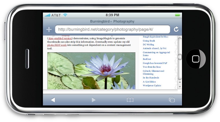
What the iPhone and Touch iPod do is shrink the page down, so it fits the display. To expand the material, the person uses a "pinching" motion or a built-in touch keyboard. To see what a page would look like in iPhone, a company called Marketcircle created an emulator called iPhoney that can display a page vertically or horizontally, just like in the device, as shown in Figure 4-2. The only difference is the emulator doesn't have touch control.
Tip
iPhoney is available at http://www.marketcircle.com/iphoney/.
Which leads us to our last "sizing" issue, one based on very new technology that will potentially have an impact on images served through the browser in the future.
At the same time I was writing this book, the world of photography was all agog about a new algorithm for resizing photos that was making the rounds of the web sites. Called "seam carving" and invented by Dr. Ariel Shamir and Shai Avidan at the Efi Arazi School of Computer Science in Israel, this algorithm would examine a photo for vertical and horizontal paths through the photo that have the least "energy," and could then target these areas for either removal (for shrinkage) or expansion (for enlarging) without an overall negative effect on the photo.
Tip
A video demonstration can be found at http://www.faculty.idc.ac.il/arik/IMRet-All.mov, and the paper on the process can be downloaded at http://www.faculty.idc.ac.il/arik/imret.pdf.
It's a fascinating algorithm with interesting results, but most photographers had kittens when viewing it, especially when people began to shout out requests for this technology as browser extensions.
When we create a photograph, there is a reason for all that seemingly nonenergetic space within the photo. A field of white may seem to be extraneous material to the algorithm, but is an integral expanse of crystal white snow to the photographer. The algorithm creators used the text in a web page as an analogy of re-targeting, as they called their concept. In web pages, unless a column is a fixed size, as the page changes to a smaller size, the words wrap and are pushed down the page. Why not have the photos resize like the text?
The thing is, resizing a web page and causing the words to wrap doesn't impact the message of the text or result in dropped conjunctives—in other words, it doesn't say, hey, let's drop every other "and."
Get Painting the Web now with the O’Reilly learning platform.
O’Reilly members experience books, live events, courses curated by job role, and more from O’Reilly and nearly 200 top publishers.

