668 office x for macintosh: the missing manual
Microsoft Graph
Microsoft Graph is a stripped-down version of Excel’s charting functions. You’re
likely to use it most often in Word or PowerPoint; after all, there’s little point to
using it in Excel, whose charting functions are much more highly evolved.
From within a Word or PowerPoint document, choose Insert→Object. The Microsoft
Graph window appears, carrying unmistakable echoes of Excel. It consists of four
main elements:
• Cells. Just as in an Excel spreadsheet, Graph draws the information for its charts
from its own set of cells. However, you can’t type formulas into them, this time;
you must type the numbers themselves into each cell.
• Graph preview. This window shows you what your graph in progress looks like
as you work.
• Standard toolbar. Its commands let you manipulate items in your chart and in
Graph’s spreadsheet.
• Formatting toolbar. The Formatting toolbar contains formatting commands simi-
lar to those in Excel’s Formatting Palette, such as text alignment, style commands,
and cell formatting commands.
Entering Data
To get started in Microsoft Graph, plug numbers into the cells. Navigating through
Graph’s cells is similar to moving through an Excel sheet (press Tab to move right
one cell, Shift-Tab to move left; Return to move down one cell, Shift-Return to go
up). You can also click the cell you want to edit.
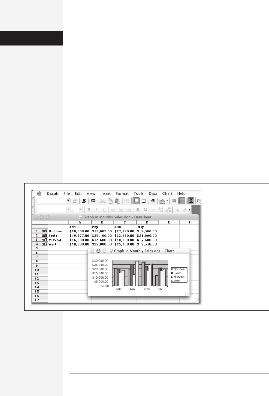
Figure 18-15:
The best time to use
Microsoft Graph rather
than Excel is when you
want to whip up a quick
graph without bothering
with Excel. If, on the other
hand, the data you want to
graph is already in an Excel
worksheet, go ahead and
create the chart in Excel.
Microsoft Graph

chapter 18: the graphics programs of office x 669
As in Excel, cells are labeled with letters and numbers; unlike Excel, Graph’s spread-
sheet has an extra row at the far left and an extra column at the top. You’re supposed
to type row and column headers into these special dedicated areas. Graph will then
use these cells in the chart for its axes and for the legend.
As you work, you can make these kinds of changes to your chart:
• Change the chart type. Microsoft Graph can produce every chart type that Excel
can, but it starts out with a vertical bar graph. To change this chart type, choose
one of the eighteen options found in the Chart Type pop-up button in the Stan-
dard toolbar. (If you can’t figure out which icon it is, point to the toolbar icons
without clicking and read the resulting tooltips). (See Chapter 13 for a discus-
sion of which chart type to use with which kinds of data.)
To use a chart type that isn’t present in the Chart Type palette, choose
Chart→Chart Type to open the Chart Type window. This window is nearly iden-
tical to the Chart Type window in Excel and features the same range of chart
types.
• Swap axes. If Graph is showing the data on the wrong axes, click the By Row or
By Column button in the Standard toolbar—either will swap the chart’s hori-
zontal and vertical dimensions.
• Change element colors. To change colors in a chart, simply click the element that
you want to change (such as a bar or its background) and then select a new color
from the Fill Color pop-up button (the “pouring paint can” icon) in the Stan-
dard toolbar.
• Move or resize something. You can move the chart’s legend by dragging it. Most
other graph elements are fixed in place, but you can resize something (such as the
legend or the chart’s plot area) by clicking it and then dragging one of the resize
handles that appear at its corners. If you have a 3-D item in a chart, you can also
drag its corners to rotate it, just as you can in an Excel chart containing a 3-D
element.
Tip: If you really want to fine-tune control over a 3-D object, choose Chart→3-D View, which produces a
control window in which you can control the exact rotation of a 3-D object.
• Change the fonts. You’re not stuck using Geneva in your tables. To change the
font, select the item in question (label, axis, whatever) and then choose
Format→Font to bring up the Format window, where you can tweak the font
size, style, color, underline, and so on. Click OK to save the changes.
• Add a data table. If you want to include a data table (which displays the cells used
to make the chart), click the Data Table button in the Standard toolbar. It plops
the data table below the chart.
Microsoft Graph
Get Office X for Macintosh: The Missing Manual now with the O’Reilly learning platform.
O’Reilly members experience books, live events, courses curated by job role, and more from O’Reilly and nearly 200 top publishers.

