Excel Lesson 5: Working with Charts
In this lesson, you will learn how to create charts from your worksheet data. You will learn how to use recommended chart types, customize chart elements, and change formatting options. You will also learn how to spot trends in your data with Sparkline charts. Finally, you’ll learn how to print your worksheet charts.
What you’ll learn in this lesson:
- • Creating a chart
- • Using chart recommendations
- • Updating data in a chart
- • Enhancing chart options
- • Printing a chart
Starting up
You will work with files from the Excel05lessons folder. Make sure you have loaded the OfficeLessons folder onto your hard drive from www.digitalclassroombooks.com/Office2013. If you need further instructions, see “Loading lesson files” in the Starting up section of this book.
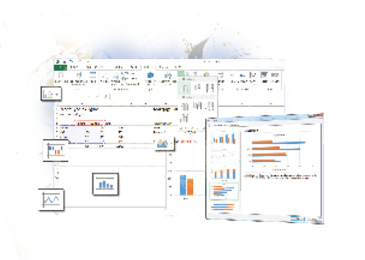
Understanding chart types
Excel offers a number of different chart types. From bar graphs and pie charts to scatter plots and area charts, Excel provides a chart type for the data you want to present. The new Recommended Charts feature helps to remove some of the guesswork by offering a number of chart types based on your selected data. You can also change the chart from one type to another once it is complete. The following table lists the 12 chart types that Excel offers.
|
Chart types |
||
|
Type |
Icon |
Description |
|
Area |
Shows the relative importance of values over time. An ... | |
Get Office 2013 Digital Classroom now with the O’Reilly learning platform.
O’Reilly members experience books, live events, courses curated by job role, and more from O’Reilly and nearly 200 top publishers.

