Charts
To paraphrase the old saying, “a graph is worth a thousand numbers.” Fortunately, Excel can easily turn a spreadsheet full of data into a beautiful, colorful graphic, revealing patterns and trends in the data that otherwise might be difficult or impossible to see.
In place of the aged Chart Wizard of Excels past, Excel 2008 presents the new Chart Gallery. When you click its button beneath the toolbar, you can quickly scan through and choose a chart type from Excel’s abundance of styles—and then make it your own by modifying it.
The keys to making an effective chart are to design your spreadsheet from the beginning of charthood, and then to choose the right chart type for the data (see Figure 13-12).
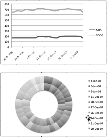
Figure 13-12. Here’s an example of the importance of choosing the right chart type to match your data. Both charts use the same set of data, but the line chart on the top is appropriate for the kind of data presented. Conversely, the doughnut chart below is the wrong way to present this information. All you get is a rainbow of colors that fails to communicate any useful information.
Chart Parts
Most charts share the same set of features to display your spreadsheet information as shown in Figure 13-13.
Axes. An X axis (or category axis) and a Y axis(or value access) are the horizontal and vertical rulers that provide a scale against which to plot or measure your data. One axis corresponds ...
Get Office 2008 for Macintosh: The Missing Manual now with the O’Reilly learning platform.
O’Reilly members experience books, live events, courses curated by job role, and more from O’Reilly and nearly 200 top publishers.

