Working with Chart Data
After you create a chart, you might want to change the data range on which it is based, or how this data is plotted. The following sections explain how you can do this.
Plotting by rows versus by columns
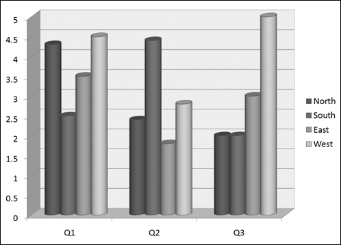
By default, the columns of the datasheet form the data series. However, if you want, you can switch the data around so that the rows form the series. Figures 23-31 and 23-32 show the same chart plotted both ways so that you can see the difference.
Figure 23-31. A chart with the columns representing the series.
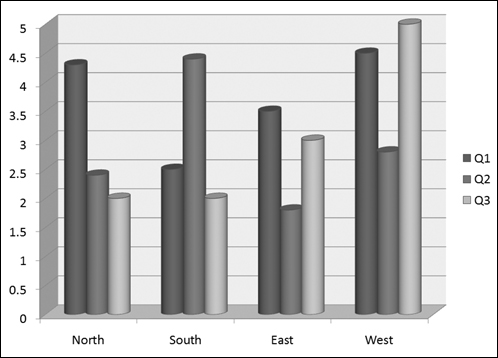
Figure 23-32. A chart with the rows representing the series.
Note
What does the term data series mean? Take a look at Figures 23-31 and 23-32. Notice that there is a legend next to each chart that shows what each color (or shade of gray) represents. Each of these colors, and the label associated with it, is a series. The other variable (the one that is not the series) is plotted on the chart’s horizontal axis.
To switch back and forth between plotting by rows and by columns, click the Switch Row/Column button on the Chart Tools Design tab.
Tip
A chart can carry a very different message when you arrange it by rows versus by columns. For example, in Figure 23-31, the chart compares the quarters. The message here is about improvement—or lack thereof—over ...
Get Office 2007 Bible now with the O’Reilly learning platform.
O’Reilly members experience books, live events, courses curated by job role, and more from O’Reilly and nearly 200 top publishers.

