Hands On: Creating and Customizing a Chart
This section contains a step-by-step example of creating a chart and applying some customizations. If you’ve never created a chart, this is a good opportunity to get a feel for how it works.
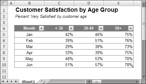
Figure 18-3 shows a worksheet with a range of data. This data is customer survey results by month, broken down by customers in three age groups. In this case, the data resides in a table (created by choosing Insert ![]() Tables
Tables ![]() Table), but that’s not a requirement to create a chart.
Table), but that’s not a requirement to create a chart.
Figure 18-3. The source data for the hands-on chart example.
Selecting the data
The first step is to select the data for the chart. Your selection should include such items as labels and series identifiers (row and column headings).
For this example, select the range B4:E10. This range includes the category labels but not the title (which is in B1).
Note
The data that you use in a chart need not be in contiguous cells. You can press Ctrl and make a multiple selection. The initial data, however, must be on a single worksheet. If you need to plot data that exists on more than one worksheet, you can add more series after the chart is created. In all cases, however, data for a single ...
Get Office 2007 Bible now with the O’Reilly learning platform.
O’Reilly members experience books, live events, courses curated by job role, and more from O’Reilly and nearly 200 top publishers.

