The Details are Delightful
The subtle distinctions that OpenType and expert sets offer would have passed fairly unnoticed in the general public years ago. But the level of type sophistication has increased so dramatically across an incredible variety of professions, so the subtle distinctions in type are now being noticed and appreciated. Even though the changes are what some may call minor, the overall professional effect comes through clearly.
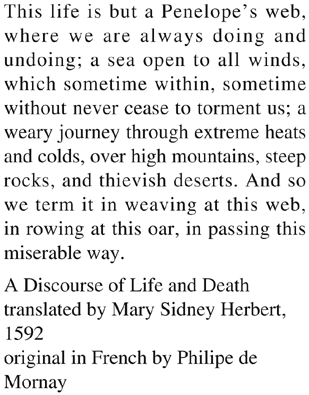
This is a simple example of the difference the specialty fonts in an expert set can make in a piece of type. To the left is plain ol’ Times Roman, 12/14.5, justified.

This is Brioso Pro Regular, 10.5/15, ...
Get Non-Designer’s Type Book, The, Second Edition now with the O’Reilly learning platform.
O’Reilly members experience books, live events, courses curated by job role, and more from O’Reilly and nearly 200 top publishers.

