Reverse Type and Light or Heavy Weights
White type on a dark background (reverse) appears to be smaller than black type on a white background. Compensate for this by using a slightly heavier typeface and slightly larger point size. If you have a Pro version of an OpenType font (see Chapter 30), use the caption weight, which is a little heavier.
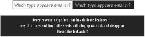
The same guideline applies for text that is dropped out of a graphic image. I know it looks great on the screen, but when ink hits absorbent paper, all kinds of havoc is wreaked upon unsuspecting delicate type. Don’t let your work look foolish by ignoring the realities of the reproduction process.
Extra ...
Get Non-Designer’s Type Book, The, Second Edition now with the O’Reilly learning platform.
O’Reilly members experience books, live events, courses curated by job role, and more from O’Reilly and nearly 200 top publishers.

