Chapter 12
Statistical Regression
Statistical regression is the relation between selected values of x and observed values of y. I am not going to explain or define “regression” as that is beyond the scope of this book. My purpose is to explain how to use Excel to calculate the parameters of a regression line. In the Excel file Chapter 12 under the sheet named Regression, you will find a set of data that will be used to demonstrate this feature in Excel. The data (sales over time) is going to create an almost perfectly straight line when you draw it on XY coordinates.

USING THE SCATTER CHART IN EXCEL
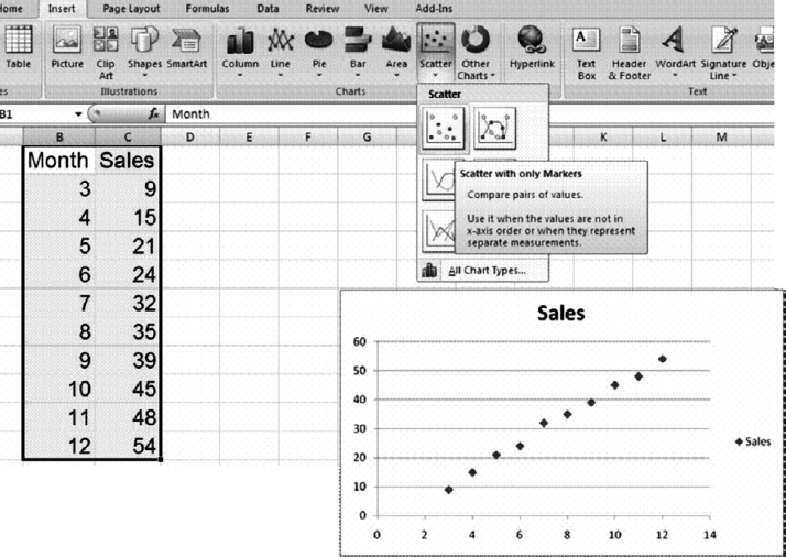
You can use the chart option of Excel to reveal or demonstrate the relationship between the two data sets. We assume, in this example, that the Sales is our Y variable and that the Month is our X variable. To create a chart, select the Month and Sales data B1:C11 (including the header) and activate the Chart Wizard. When you select, under the Insert ribbon, the very first scatter chart as shown in Figure 12.1, it will result in the XY scatter chart.
FIGURE 12.1 Creating the XY Scatter Chart
To better visualize, you can add a regression line to the chart. Right-click on any of the points in the chart and select Add Trend line in the small drop-down menu. Check the last two boxes on ...
Get Next Generation Excel: Modeling In Excel For Analysts And MBAs (For MS Windows And Mac OS), 2nd Edition now with the O’Reilly learning platform.
O’Reilly members experience books, live events, courses curated by job role, and more from O’Reilly and nearly 200 top publishers.

