9. Visualizing Excel Data with Charts
In this chapter, you’ll learn about creating, customizing, and formatting charts to help visualize your Excel data.
→ Converting Excel data into a chart
→ Working with Excel’s different chart types
→ Moving, resizing, and changing the layout of a chart
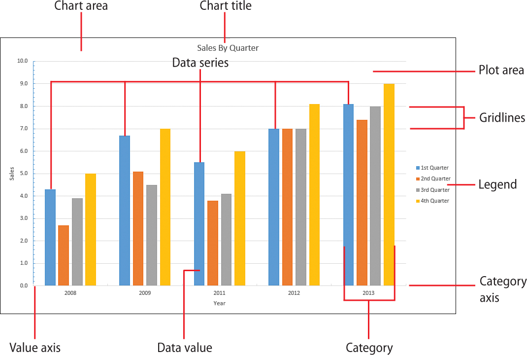
→ Selecting and formatting chart elements
→ Adding chart titles, a legend, and data labels
One of the best ways to analyze your worksheet data—or get your point across to other people—is to display your data visually in a chart. Excel gives you tremendous flexibility when creating charts: It enables you to place charts in separate documents or directly on the ...
Get My Office 2013 RT now with the O’Reilly learning platform.
O’Reilly members experience books, live events, courses curated by job role, and more from O’Reilly and nearly 200 top publishers.

