In this slice we will learn how to create a visualization that will show the percentage of salary breakdown per department:
| UI Location | Graphic | Description |
| Sidebar | 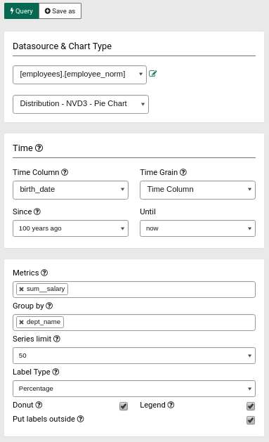 |
Datasource & Chart Type: select [employees].[employee_norm] as the datasource and Distribution - NVD3 - Pie Chart as chart type In the Time section, select birth_date as Time Column and 100 years ago as Since column. In the Metrics section, select sum_salary as the value from dropdown and dept_name as Group By.
|
| Graphic Output | 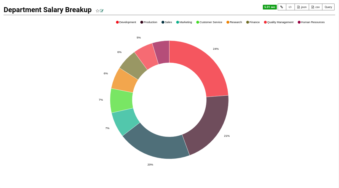 |
Clicking on Query ... |

