This is also a 2D graphic where the data axes are the edges of equidistant sectors (like a pie chart's edges). This graph is useful when there are multiple dimensions in which we want to understand the relative significance of each data point.
To understand this graph better, let's take a look at this sample data and the graphic:
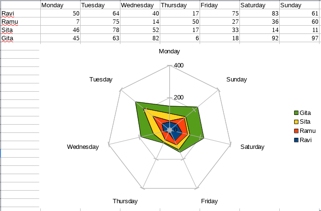
The data consists of eight columns:
- First column: List of all users
- Second to Eighth column: Days in a week and the dollars owned by each person on that day
We want to draw a graph that shows us the following things:
- Total dollars per day
- Dollars owned by every person every day
We have drawn all this ...

