This is a 2D graphical representation of data where the data points are shown as vertical/horizontal bars. Each bar represents one data point. When there is no time dimension involved with reference to the data points, the order in which these points are shown might not make any difference. When we deal with time series data for representing bar charts, we generally follow the chronological order of display along the X (horizontal) axis.
Let's take a look at a sample chart that is generated with four data points. The data represents the amount each user has:
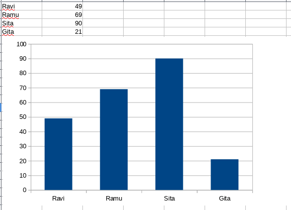
Interpretation: The graph has both text data in rows and columns, ...

