A scatter chart can be a multi-dimensional graphic. This is one of the simpler graphics to understand as we render each data point on the canvas corresponding to the numeric value along the axis. This graph is useful to understand the relative importance of each point along the axes.
A bubble chart is a variant of a scatter chart, where the points on the canvas show the values as big bubbles (to signify their importance).
Let's take a look at both these graphics with this example:
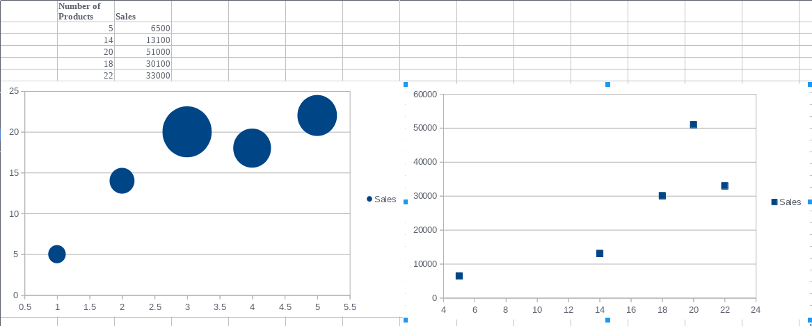
The graphic on the left-hand side is a bubble chart and the right one is a scatter plot.
Let's take a look at the data and the charts that are ...

