Chapter 9. Feedback and Affordance
- Feedback Patterns
Error Messages, Confirmation, System Status
- Affordance Patterns
Tap, Swipe/Flick, Drag
Feedback Patterns
In its âPrinciples for Usable Designâ (http://www.usabilitybok.org/principles-for-usable-design), the User Experience Professionals Association says that well-designed user interfaces should âprovide appropriate, clear, and timely feedback to the user so that he sees the results of his actions and knows what is going on with the system.â Paraphrasing an old movie tagline, Iâd shorten this to: âFeedback means users never have to say, âWhatâs happening?!ââ
Feedback can vary from simple progress indicators and confirmation messages to more sophisticated animations and effects. Mobile feedback patterns include Error Messages, Confirmation, and System Status.
Error Messages
Error Messages should be expressed in plain language (no codes), precisely indicate the problem, and suggest a constructive solution. Best practice is to make Error Messages highly visible onscreen, like in Soundwave and Pandora. These approaches are preferable to modal dialogs, since they may literally cover up the issue, as in Square Register and Pinterest.
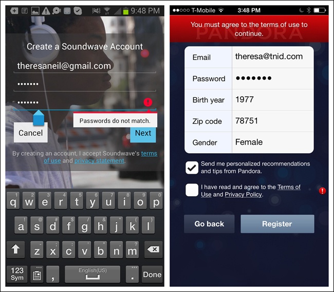
Figure 9-1. Soundwave for Android and Pandora for iOS: highly visible Error Messages
Figure 9-2. Square ...
Get Mobile Design Pattern Gallery, 2nd Edition now with the O’Reilly learning platform.
O’Reilly members experience books, live events, courses curated by job role, and more from O’Reilly and nearly 200 top publishers.

