Have you looked at AutoDirect, Greensheet, or a similar freebie print ad circular lately? Youâll see page after page of classified ads organized in very broad categories, like Trucks, Cars, and Appliances. You practically have to read the whole rag from beginning to end to see if there are any ads that interest you. This should give you a new appreciation for three basic online tools: search, sort, and filter.
We take them for granted in our digital world. But there are some nuances to getting search, sort, and filter right in a mobile application. This chapter explores more than a dozen different approaches.
Josh Clark, author of Tapworthy: Designing Great iPhone Apps (OâReilly, 2010), says that in touch interface design, âbuttons are a hack.â Thatâs because touch gives us more direct ways of interacting with content, like pull to refresh and pinch to zoom. Why use an abstract button when a physical gesture would be more intuitive?
We should think of mobile search the same way. As our apps become more âawareâ of our individual needs, they can reduce instances where we have to explicitly search for whatâs relevant to us.
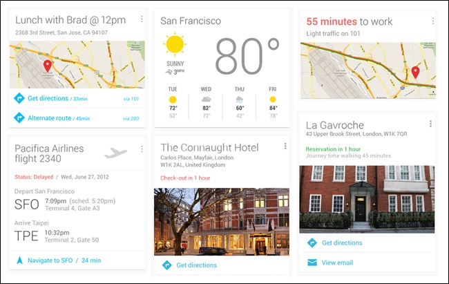
For instance, Google âknowsâ that I have a meeting downtown and tells me when to leave and how to get there. It also knows that I often take the kids to the movies on Saturday, so it âsuggestsâ some shows at our favorite theater. And when I am near a mall that has some of my favorite stores, RetailMeNot shows me all the deals they are running.
This emerging pattern is called Implicit Search. Weâll explore it further, and take a fresh look at the classic search, sort, and filter techniques covered in the earlier edition.
In this section weâll look at search patterns specific to mobile applications, including patterns for Implicit Search; Explicit Search; Auto-Complete; Scoped Search; Dynamic Search; Saved, Recent, and Popular; Search Forms; and Search Results.
One night before I had a meeting with a new client, I Googled the clientâs address on my PC. As I prepared to leave the next morning, I opened the new version of Google Maps and typed in the first number of the address, and Maps immediately knew where I wanted to go.
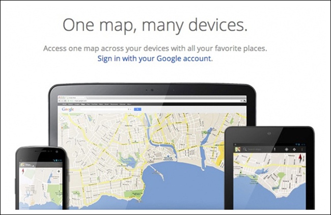
With the new app, Google synchronized my information across channels and performed an Implicit Search for me. Wow, I thought, that was helpful. But then Google Now really took Implicit Search to a new level, showing me where my following meeting was located, when I should leave, and how to get there. I rarely ever need to explicitly search in Google Maps now.
I had a similar delightful experience with the RetailMeNot application: as I was driving around running errands, I heard a âcha-chingâ from my purse. Wondering why my phone sounded like a cash register, I saw a RetailMeNot notification telling me that my favorite stores at the mall nearby were running some great deals. Once I was in a store, the app surfaced in-store coupons I could use to save on my purchase. This relevant information found me, without my having to look for it.
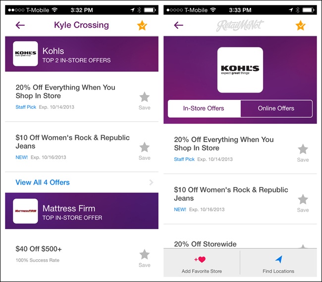
For me, this is a much more efficient way to find deals than explicitly searching for a store and then searching to see if it is running any special offers. And it is definitely working for RetailMeNot, who saw a fourfold increase in engagement with the introduction of this âgeofencingâ feature.
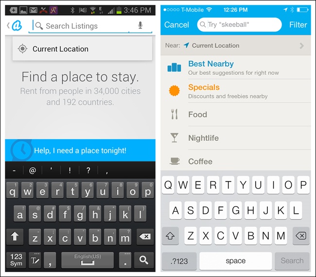
There are many other examples of Implicit Search. If location-based services are enabled in Zillow and similar real estate apps, the apps immediately reveal all the properties for sale or rent in the area. Badoo, a social meetup tool, uses the same technique to show nearby people looking to connect.
Foodspotting and Hungry Now highlight nearby restaurants on their landing pages. The former uses a carousel to show pictures and details about each restaurant, encouraging the user to start rating her dining experiences, whereas the latter shows the restaurants on a map.
Note
Consider the possibilities of Implicit Search before choosing another search pattern. It could introduce an element of delight to the user experience.
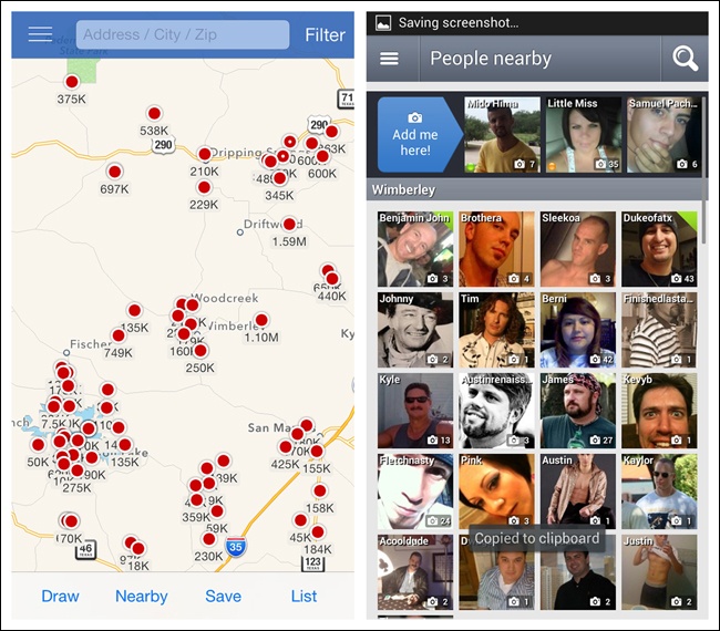
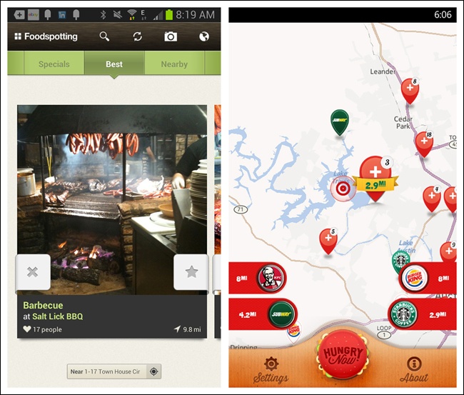
Figure 4-5. Foodspotting for Android and Hungry Now for Windows Phone: more location-based results
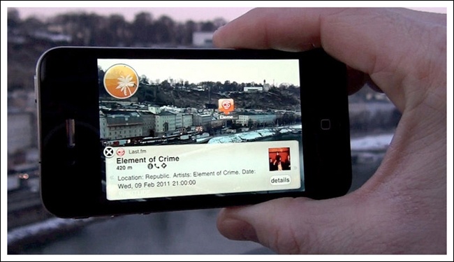
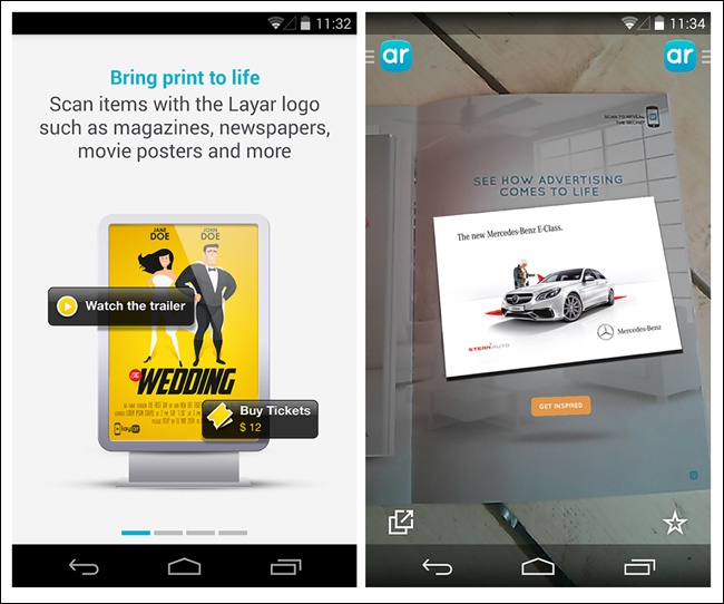
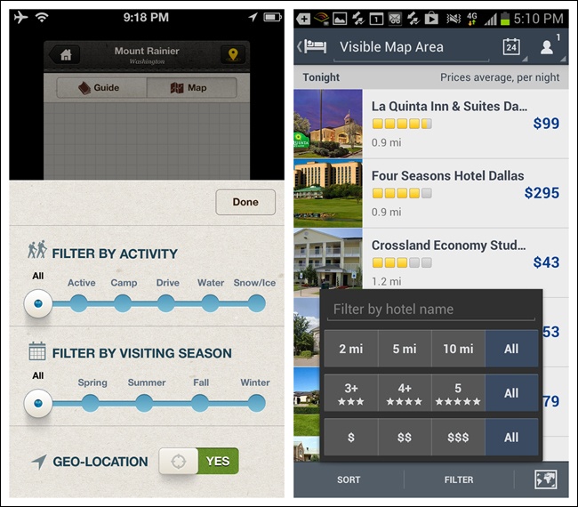
Apps like Wikitude and Layar use a combination of the deviceâs location and the accelerometer to create an âaugmented realityâ for the userâno search terms necessary.
While Implicit Search can create richer user experiences, there are still valid cases for the Explicit Search pattern. As you might guess, Explicit Search relies on explicit user action to perform the search and get results.
The eBay app on Windows Phone 8 is a simple example. Type the search term, then tap on the search icon or hit Return on the keyboard to see the results. But by being just a little smarter, eBay for Android manages to be a lot more helpful.
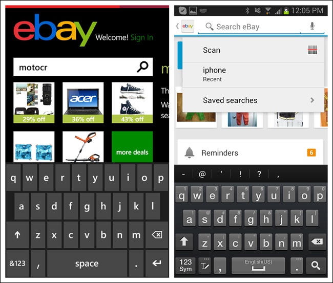
Tapping in the search field in the Android app provides a number of options: scan an item instead of typing it, reuse a recent search, or access saved searches. Once the user starts typing, the app surfaces suggestions that match the text entered. Minimizing the need to type in this way increases search efficiency and reduces the chance of error. Also see the next pattern, Search with Auto-Complete.
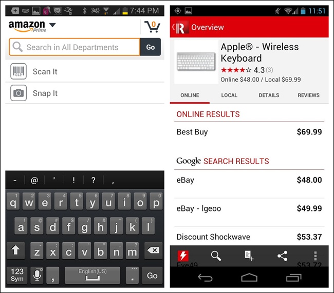
As eBay for Android suggests, Explicit Search neednât be confined to text entry. Amazon and RedLaser offer photo and barcode scanning options for quick in-store lookups. These mobile-friendly search features have helped drive the showrooming phenomenon (http://en.wikipedia.org/wiki/Showrooming) that has changed the retail shopping dynamic in recent years.
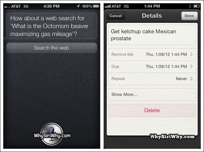
Voice-based search also can be useful, but it is dependent on the quality of the voice recognition program. Weâve all heard funny stories of Siri wildly misunderstanding user questions (see the screenshots from WhySiriWhy.com), but voice search has already come a long way, and I expect its refinement to continue.
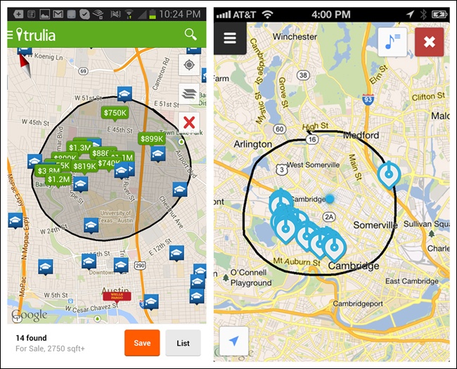
Another option for Explicit Search is via direct manipulation. Trulia and Soundwave both offer options to physically draw search boundaries on a map.
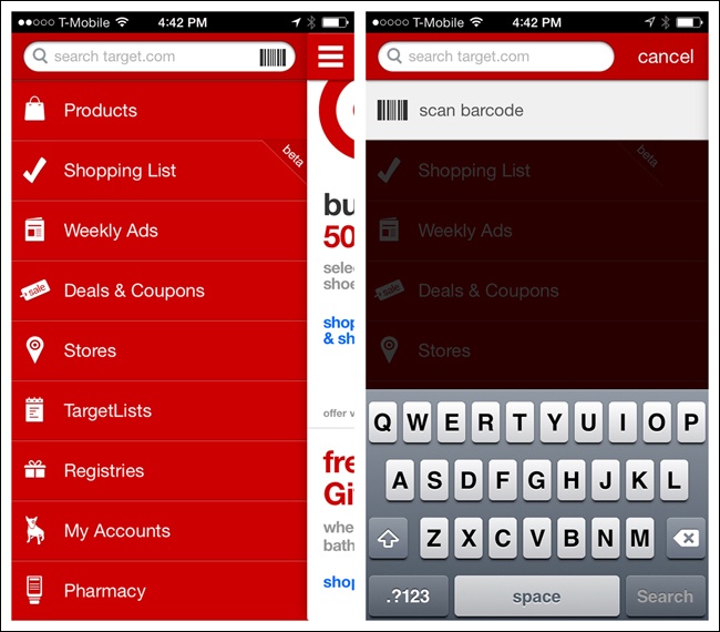
One more emerging pattern in Explicit Search is Modal Search. In this example from Target, the search field is shown in the navigation drawer, but as soon as it is tapped, âsearch modeâ displays a full search screen with keyboard.
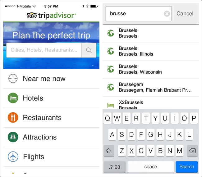
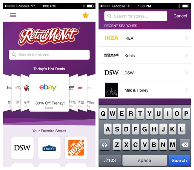
TripAdvisor and RetailMeNot use the same pattern, but in these examples, search lives on the home page instead of in a navigation drawer.
The main benefit of Modal Search is the additional real estate the full search screen offers. Just remember to offer a way back (e.g., Cancel) for users who decide not to search after all.
Note
Offer a Clear button and an option to cancel a Modal Search. Use feedback to show that the search is being performed (see Chapter 8).
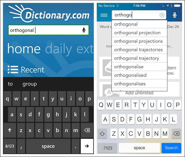
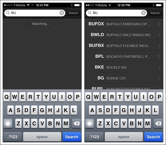
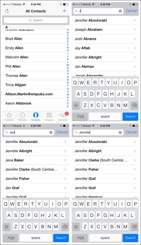
At this stage in mobile designâs maturity, Auto-Complete should be standard for Explicit Search. I was stunned that fewer than 10% of the Windows Phone 8 apps I researched had this functionality, even though these design patterns have been around since 2004 on the Web, and even longer on desktop. Shockingly, even Dictionary.com on Windows Phone doesnât offer Auto-Complete, and who needs it more than someone using a dictionary app?
Auto-Complete should be implemented so that as text is entered, a set of possible results surfaces. As the user continues to enter text, the search results narrow accordingly. A tap on any result initiates the search. Tapping a button (on the screen or keyboard) should also be an option to initiate search on the currently highlighted result.
Ideally, Auto-Complete results will display immediately, but a progress indicator (âSearching...â) should be used to give feedback. Fidelity displays feedback where the results will eventually be displayed.
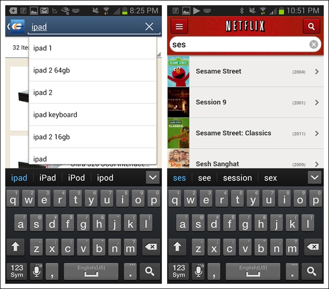
Figure 4-16. Newegg and Netflix for Android: Auto-Complete can offer multiple ways to initiate search
Targetâs Android app provides an enhanced Auto-Complete that shows the possible categories for each suggestion. This makes it easier for users to navigate directly to the most relevant search results. Songza also has an enhanced Auto-Complete that shows groupings.
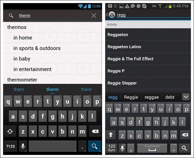
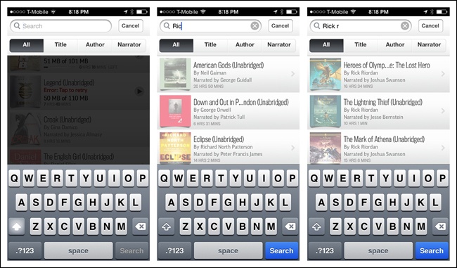
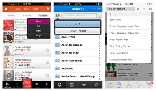
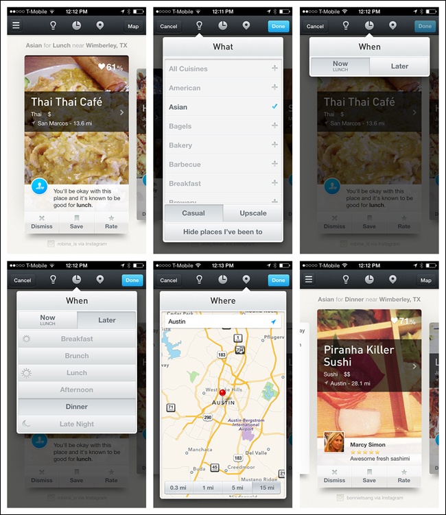
The Dynamic Search pattern may also be considered dynamic filtering. Here, a blank search field returns all possible category results, and entering a search string dynamically filters down the list. In the Audible example, you can see that my entire audiobook library is shown in the background. When I start to type, only the matching titles remain.
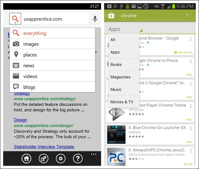
Sometimes users can get search results faster and easier if you let them narrow the scope of the search before they actually initiate it. Google on Windows Phone 8 offers a menu for specifying a category, while the Google Play Store for Android uses a Spinner control nestled under the search field.
It is common to see a segmented control in iOS for Scoped Search, as in iTunes, but there are other UI options, like Scrolling Tabs or a Pill Bar.
Well-designed mobile interfaces follow a basic usability maxim: respect the userâs effort. Saved, Recent, and Popular Searches do this by making it easy to select from previous searches instead of retyping the same keywords or search criteria.
Note
Saved Search typically requires an additional step to name the search for later use, whereas a Recent Search is automatically saved and surfaced. Consider which one will best serve the needs of your users.
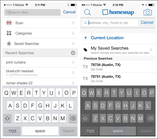
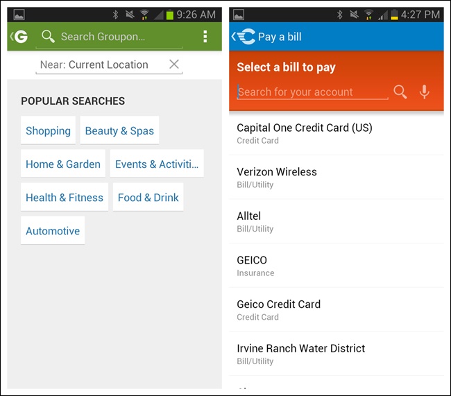
Groupon and CheckPay surface usersâ most popular searches and most popular search options, respectively.
Other techniques to respect the userâs effort include location-based searching, as in Airbnb and Foursquare.
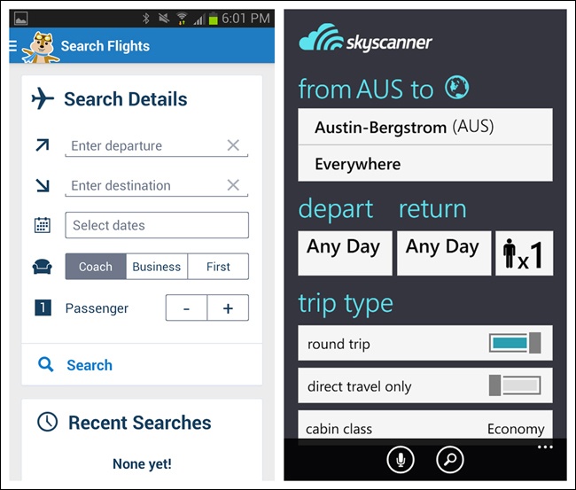
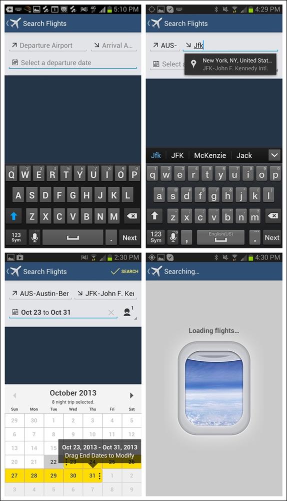
This pattern is characterized by a separate form for entering multiple criteria, along with an explicit search button. Hipmunk and Skyscanner use Search Forms to set the necessary criteria for searching flights and hotels. See more examples in Chapter 2.
Expedia for both iOS and Android uses an elegant design that animates the origin and destination fields. Both versions also include only the most essential search fields.
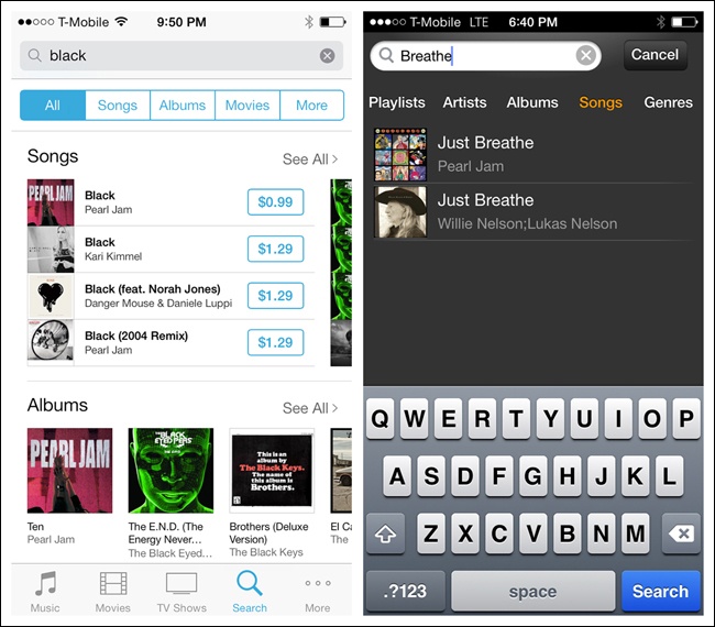
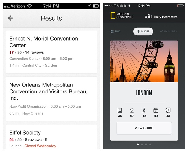
Once a search is performed, the results can be displayed on the same screen or on a dedicated results screen. Results may be displayed in a table or list, on a map or satellite image, or as thumbnails.
Multiple View Results options are available depending on the type of results and user preferences.
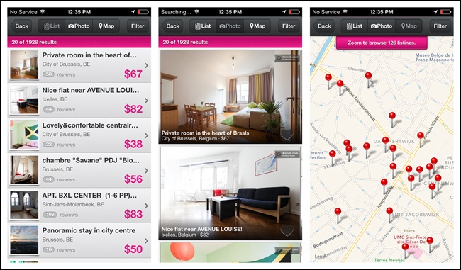
Another emerging trend for displaying Search Results is to show each result on a card, slide, or tile. Users can navigate these by swiping through them.
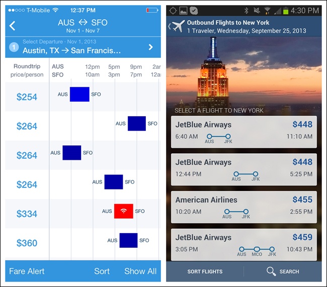
Hipmunk has pioneered visualizing flight results with a Gantt chartâstyle timeline. Expediaâs take on it helps visualize the flight duration in context with the ticket cost and departure time.
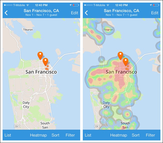
Hipmunk also offers an alternative way to view hotel search results. The results are shown on a mapâpretty standard, right? But thereâs a heat map overlay option for viewing the hotels with respect to area crime, shopping, and nightlife.
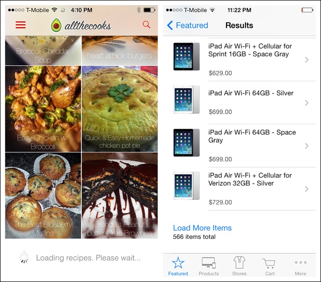
Lazy loading is a common technique for displaying partial results while the rest are being loaded. Many applications, like Allthecooks, automatically load more results when the screen is swiped. Alternatively, the Apple Store provides a link to load more items.
Avoid paged tablesâthey break the natural interaction model of viewing information on a mobile device.
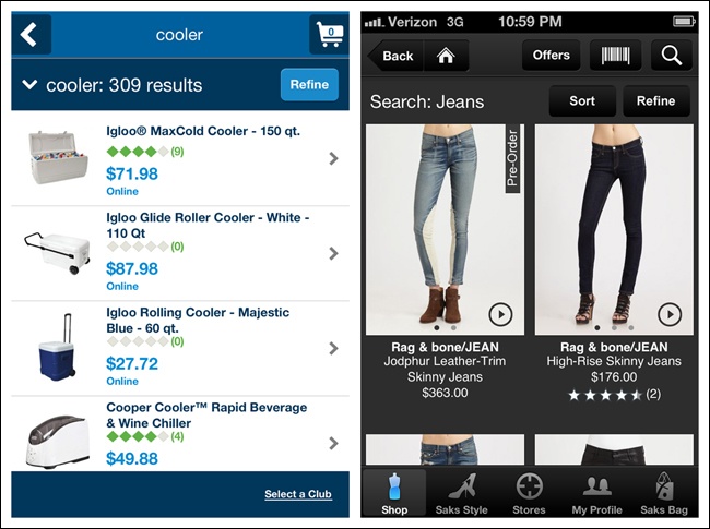
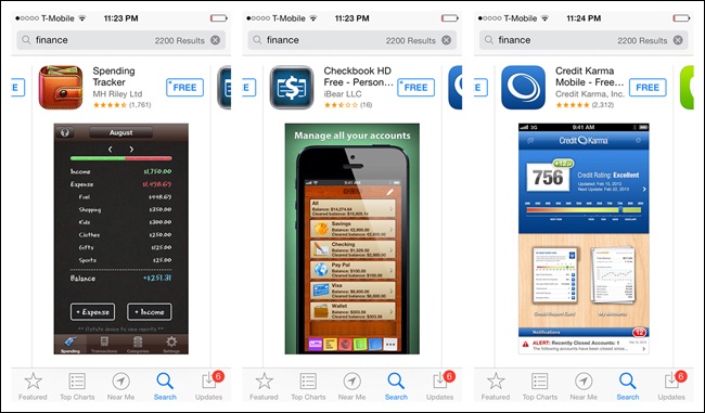
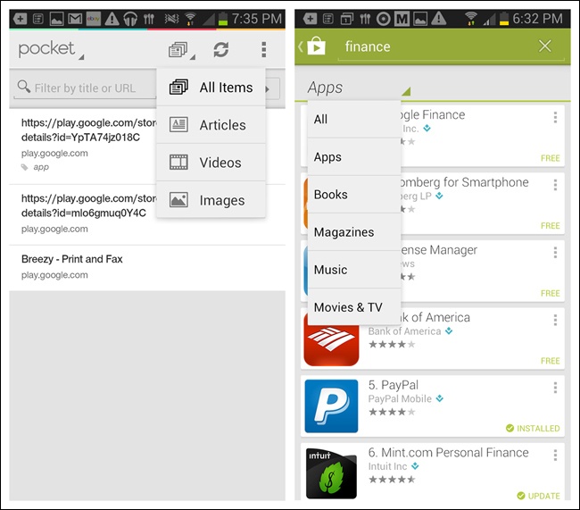
Apple earns praise for some of its user-centric designs, but Iâd argue the App Store search function shouldnât be one of them. Search âfinance,â for example, and youâll get 2,200+ results. As you start flicking through hundreds of apps, you might wonder, are these in any kind of order, like most popular, highest rated, or recently released? Thereâs no way to tell. Odds are good youâll need to go elsewhere to research which financial apps will work best for you, and then search for those specific app names.
Likewise, having the ability to manipulate search results in Google Maps would be a huge help. I assumed the default result for âgas,â say, would be the gas station closest to my current location, but I found that typically it isnât.
Instead, Iâm forced to open the results list to check the distances of each result. Of course, even this is less than perfect, because distance and drive time are not the same thing. Having the ability to arrange the list by highest rated, distance, or drive time would be super useful. Alas, no such luck.
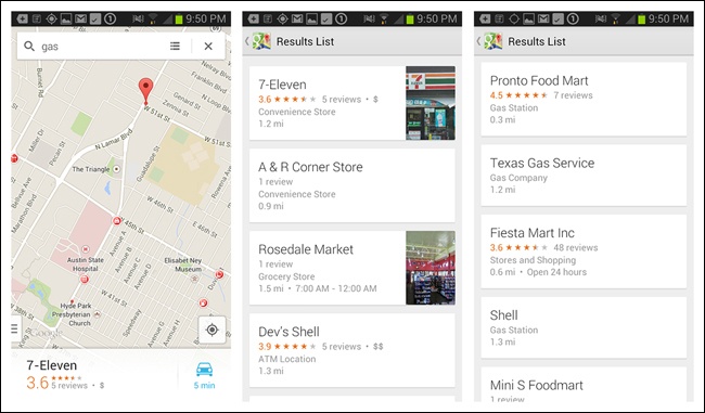
Figure 4-35. Google Maps for Android: the closest and highest-rated result is hidden on page 2 (Pronto Food Mart)
Although in these instances Apple and Google seem to have forgotten the value of it, the sort pattern can greatly enhance search usability. Consider integrating one of the following patterns with your search results:
Onscreen Sort
Sort Overlay
Sort Form
When you need only a few sort options, an Onscreen Sort can provide a simple one-tap solution. But as weâll see, many iOS apps have moved away from this pattern in favor of a more space-saving option, like the Sort Overlay.
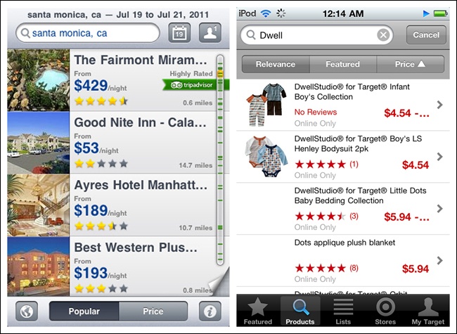
Figure 4-36. Onscreen Sort examples from the first edition of this book: Expedia and Target for iOS
The email app Boxer reveals Onscreen Sort options only after the sort icon has been tapped, and keeps them visible until the user closes them.
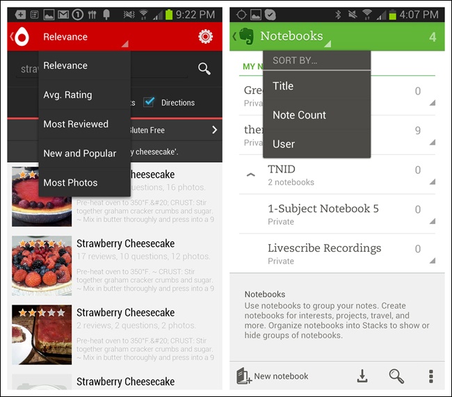
In Android apps, the Spinner control can work nicely for selecting the sort order. Though it doesnât show all sort options at a glance, it clearly shows which option is active.
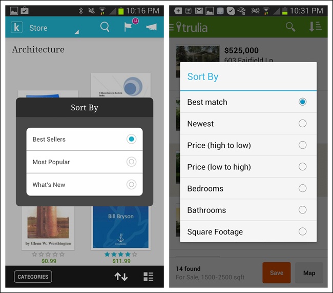
The Sort Overlay pattern is a good alternative to Onscreen Sort. It doesnât take up valuable screen real estate or force a truncated label when a longer, more explicit one would work better. The user can initiate the overlay by tapping a sort label or icon, and it can be placed at the top, middle, or bottom of the results screen. Audibleâs design is one of the most helpful since it shows which sort option is active, even when the overlay is closed.
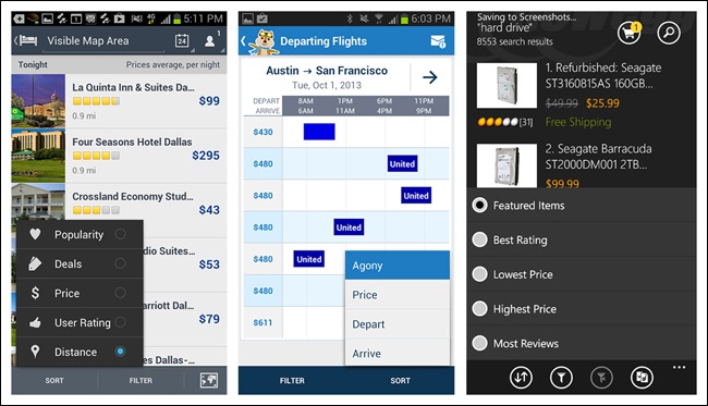
Wunderlist offers contextual tools, including a sort option, accessible from the bottom-right corner.
The Sort Form may require more effort from the user, who must open the form, select an option, and potentially tap âdone,â âapply,â or âback.â
Hipmunk uses the Sort Overlay pattern for Android, but chose a Sort Form for iOS. The sort selection is applied as soon as it is tappedâno âapplyâ or âdoneâ button required.
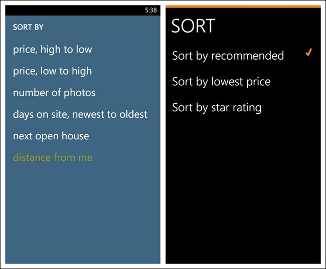
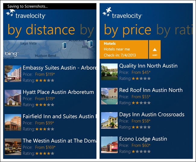
Unfortunately, in Windows Phone apps the Sort Form seems to be the predominate pattern, with Newegg, which uses a Sort Overlay, being a welcome exception. Another option to consider for Windows Phone apps is the Pivot control, as shown in the Travelocity example.
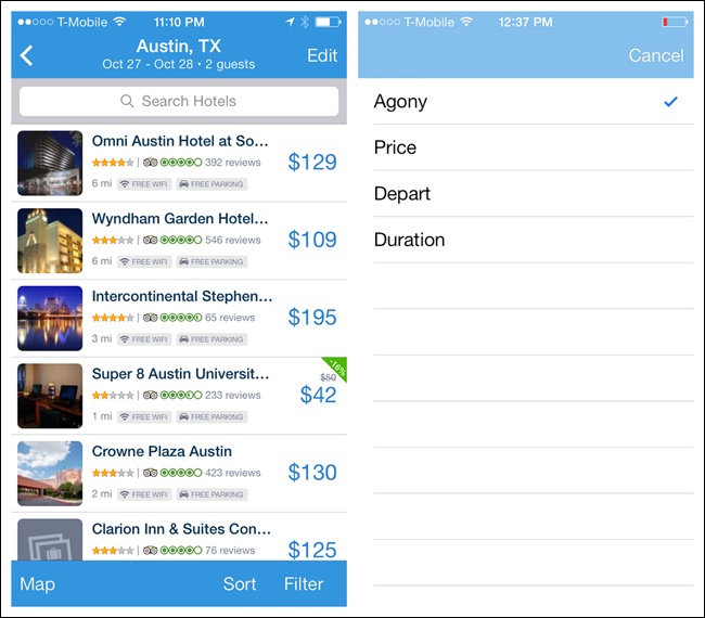
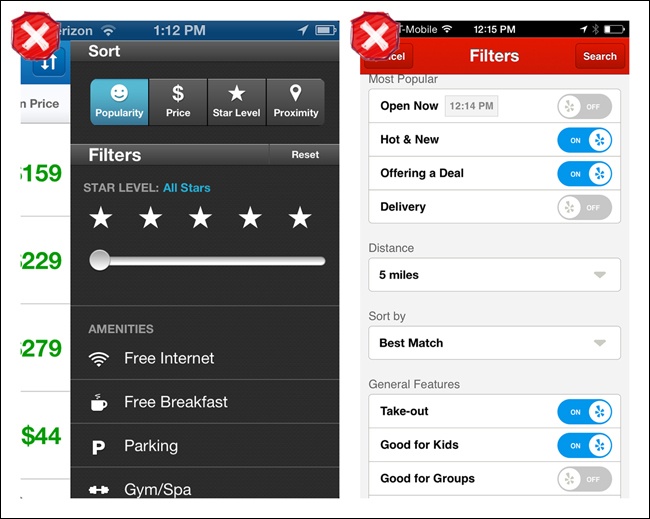
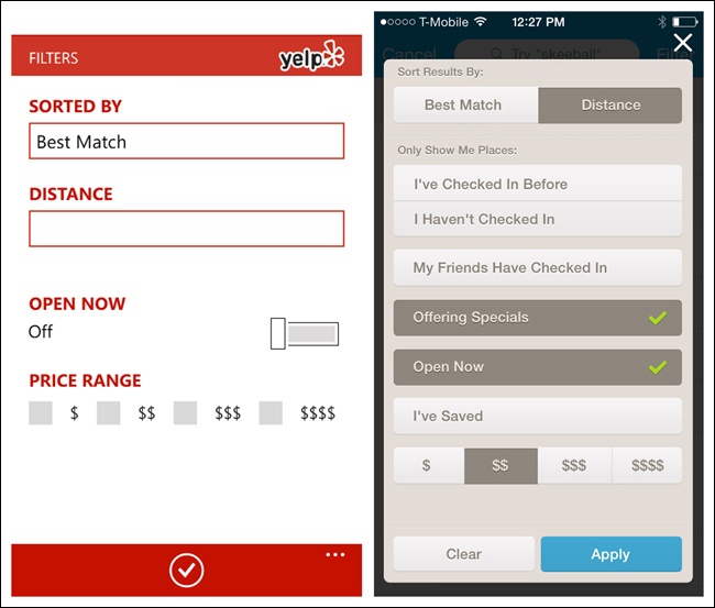
Some apps combine sort and filter patterns in a single form. This can seem to make sense, as both are search refinement options. But as with Priceline and Yelp for iOS, it can result in long and crowded screens that veer into anti-pattern territory (see Chapter 11). Yelp for Windows Phone and Foursquare for iOS offer cleaner, single-page designs.
Large sets of data can be so unwieldy as to be almost useless. To make sense of them, users often need to filter, or refine, the results. Filters let users select criteria to reduce data sets to their most manageable, relevant results. Common filtering patterns include:
Onscreen Filter
Filter Overlay
Filter Form
Filter Drawer
Gesture-Based Filtering
Also see the earlier search pattern, Scoped Search, for more filtering techniques.
Like the Onscreen Sort, the Onscreen Filter is displayed on the Search Results screen. With one tap, the filter is applied.
Google for Android shows its three most common Onscreen Filters across the bottom of the screen. Tapping More reveals other filter options. As a user scrolls the results, the filters hide, so more of the results are visible.
The Android versions of Groupon and the Play Store use a side-scrolling filter bar to let users quickly find certain types of coupons and apps, respectively. Android calls this control Scrolling Tabs, whereas Windows refers to it as a Pivot Header.
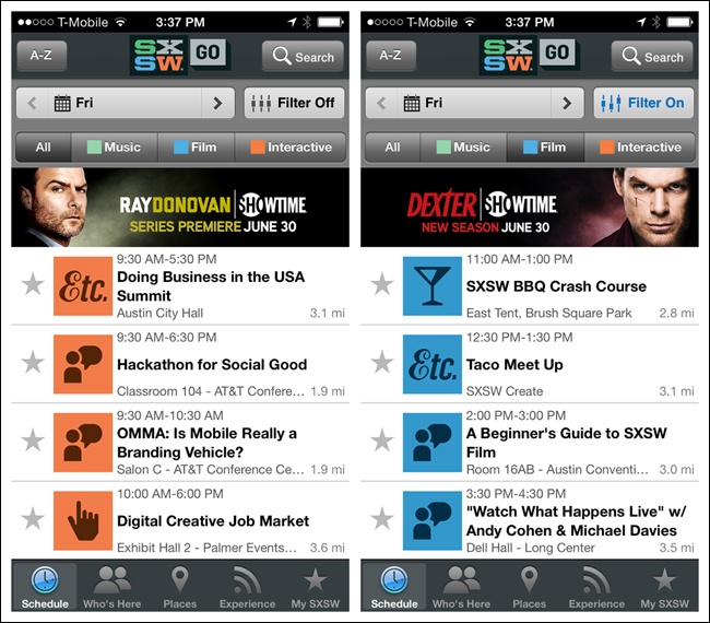
SXSW GO has a two-row filter for selecting the date, session type, and other advanced filter options. You can see when advanced filters are on because the color changes and the text is updated from Filter Off to Filter On.
In Android apps, the Spinner control can work nicely for filtering a list. Though it doesnât show all filter options at a glance, it can clearly show what is selected.
The Filter Overlay pattern is a viable alternative to the Onscreen Filter. It doesnât take up valuable screen real estate or force a short label where a longer, more explicit one would work better. The Overlay may be initiated from a Filter or Refine label, or icons that clearly depict the filtering criteria that can be applied.
Ness uses icons in the title bar to offer three filtering criteria, with each having its own distinct Overlay. The refined selections display beneath the segmented control.
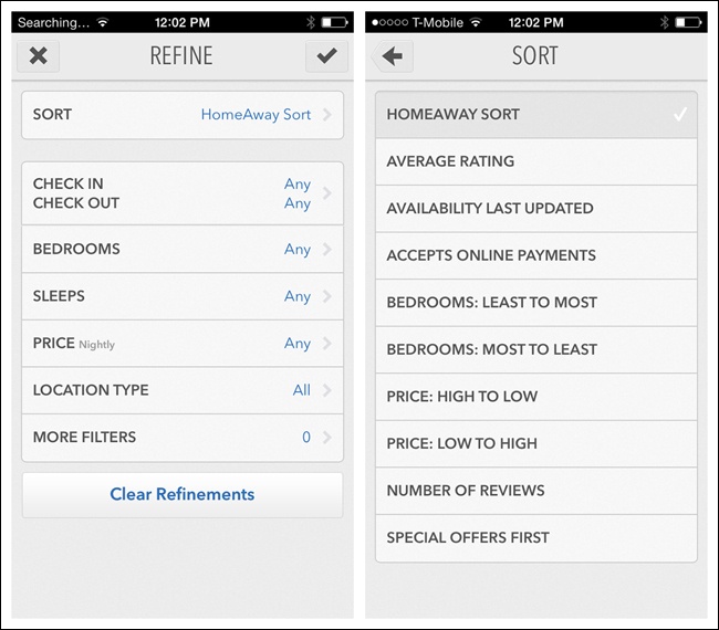
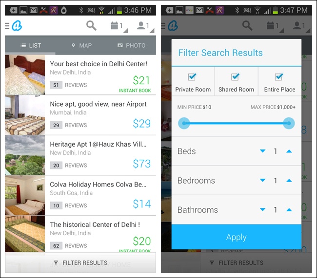
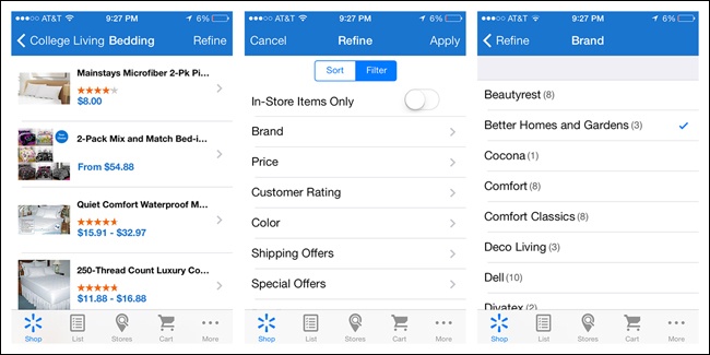
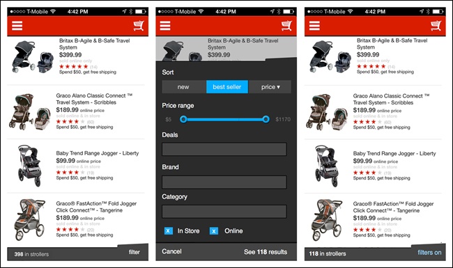
The Filter Form also requires more effort from the user, who must open the form, select one or more options, and explicitly âapplyâ them. Filter Forms might be the best fit where you have a large number of filter options that lend themselves to being grouped visually.
By necessity, Filter Forms momentarily hide the results being acted on. Note how Zillow for iOS dynamically updates the number of results as selections are madeâthis helps the user determine when the results list is manageable.
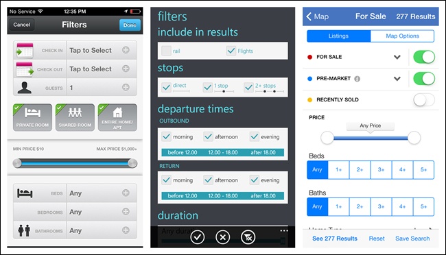
The Filter Form also works well for nested, or hierarchal, selections, as illustrated in the Walmart app for iOS 7.
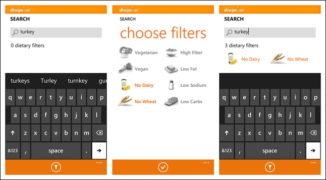
Allrecipes for Windows Phone offers a Filter Form in context with the search field, similar to the Scoped Search pattern illustrated earlier in this chapter.
Note
As with Search Forms, keep Filter Forms as spare as possible and follow OS guidelines for form design. Resist the urge to innovate new, âcleverâ types of filter controls to avoid creating an anti-pattern (see Chapter 11).
The Filter Drawer is very similar in some ways to both the Filter Overlay and the Filter Form. Like the Overlay and Form, it requires an extra tap of âapplyâ or âdoneâ to get the filtered results. Its main distinction is that it appears to slide out from the current screen, thus allowing the user to stay in context with the search results being refined. Ideally, the Filter Drawer will reveal a glimpse of the results behind it.
In the Target app for iOS, the Filter Drawer slides down, completely obscuring the search results. Once the drawer is closed, there is no indication which filters have been applied. The only feedback that filtering is active is that the label âfilterâ is now blue.
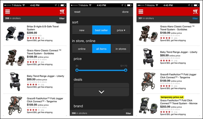
Hereâs an example of a redesign that follows best practices for a Filter Drawer:
Symmetrical actions to open and close the drawer
Dynamic update of the number of search results
Search results still visible in the background
Explicit feedback when filters are applied
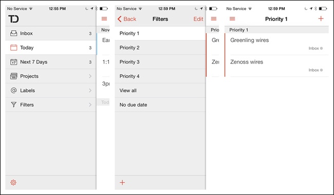
ToDo for iOS offers filtering in the Navigation Drawer. This will work only for simple filtering, and should be user tested. It could introduce inefficiencies if users would rather open a list and filter it directly.
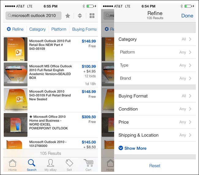
eBay for iOS has a robust, multilevel Filter Drawer. Tapping Refine on the Search Results screen slides in the Filter Drawer from the right, showing all the possible refinement options.
From the Search Results screen, you can also directly refine specific optionsâlike Category, Platform, and Buying Formatâby tapping on those labels, which will reveal the Filter Drawer open at the appropriate level.
The number of results is always displayed at the top of the drawer, and when it closes, the control bar indicates which filters are currently applied. Take a look at the video to see exactly how the interaction design works.
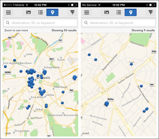
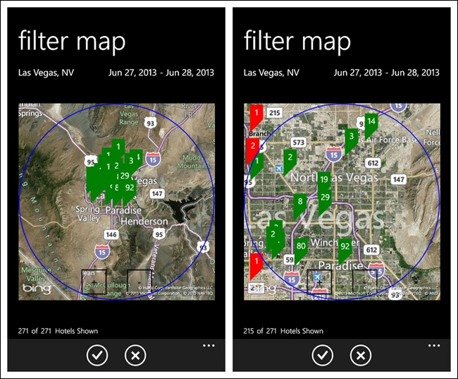
Pinch, zoom, and pan gestures can be used for filtering results whose relevance is dependent on location, as on a map, chart, or graph. HomeAway for iOS shows a default view of a certain radius. Pinchâzoom in to reduce the radius and thus the results shown; pinchâzoom out to widen the radius and show more results. Kayak for Windows offers the same functionality.
Get Mobile Design Pattern Gallery, 2nd Edition now with the O’Reilly learning platform.
O’Reilly members experience books, live events, courses curated by job role, and more from O’Reilly and nearly 200 top publishers.

