Patterns: Explicit Search, Auto-complete, Scoped Search, Saved & Recent, Search Criteria (form), Search Results, Onscreen Sort, Sort Order Selector, Sort Form, Onscreen filter, Filter Drawer, Filter Dialog, Filter Form
As I was waiting for a table at a local restaurant the other day, I flipped through a couple of the free classified papers. I was shocked to realize how dependent I’ve grown on three simple features that just aren’t available in a paper-based model: search, sort, and filter.
AutoDirect and some of the other freebies may be organized by category (like trucks, vans, SUVs) but others like Greensheet just list page after page of items for sale. I would actually have to read every single ad in the paper to see if anyone was selling what I wanted. No thank you. I’ll use Craig’s List on my phone instead.
But this got me thinking. While we take search, sort, and filter for granted in our digital world, there are some nuances to getting it right in a mobile application. This chapter explores a dozen plus different approaches to search, sort, and filter in mobile applications.
Peter Morville and Jeffery Callendar provide an excellent summary of design patterns for searching in Search Patterns: Design for Discovery(O’Reilly), January 2010 (http://shop.oreilly.com/product/9780596802288.do). I highly recommend reading this book before designing any search interface, whether for mobile or other platforms.
In this section, we’ll look at search patterns specific to mobile applications including patterns for:
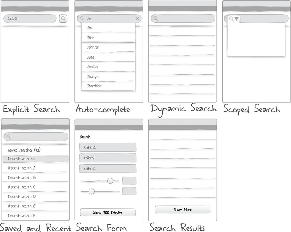
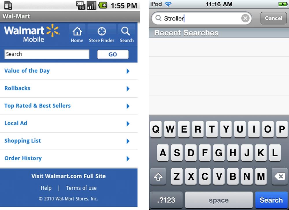
Explicit search relies on an explicit action to perform the search and view results. That action might be to tap a search button on the screen, like Walmart, or on the keyboard, like Target. The results are typically displayed in the area below the search bar. Consider pairing an explicit search pattern with the auto-complete pattern.
Note
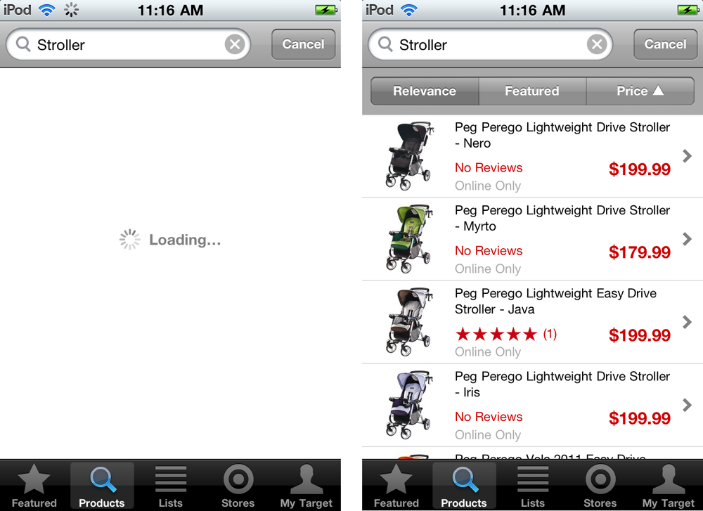
Offer a clear button in the field and an option to cancel the search. Use feedback to show the search is being performed (see Chapter 8).
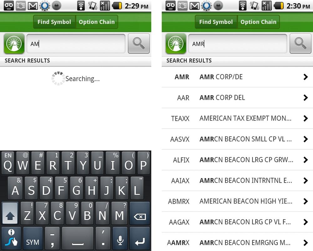
Probably the most widely adopted search pattern in web and mobile apps is auto-complete. Typing will immediately surface a set of possible results, just tap on one to selected it, and the search will be performed. Or continue typing and tap the explicit search button.
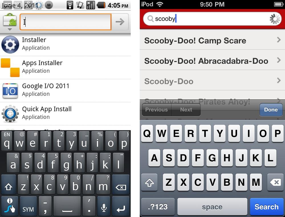
Ideally, the results will be displayed immediately, but a progress indicator (searching...) should be used for system feedback. Netflix (above) uses an indicator in the search field, whereas Fidelity (below) displays one where the results will eventually be displayed.
TripAdvisor provides an enhanced auto-complete, grouping the results by popular destinations, hotels, restaurants...

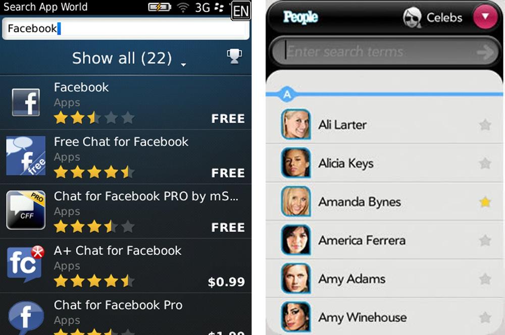
This pattern may also be considered dynamic filtering. Entering search text will dynamically filter the data on the screen. In these examples from BlackBerry App World and People on webOS, entering text filters the existing list of items.
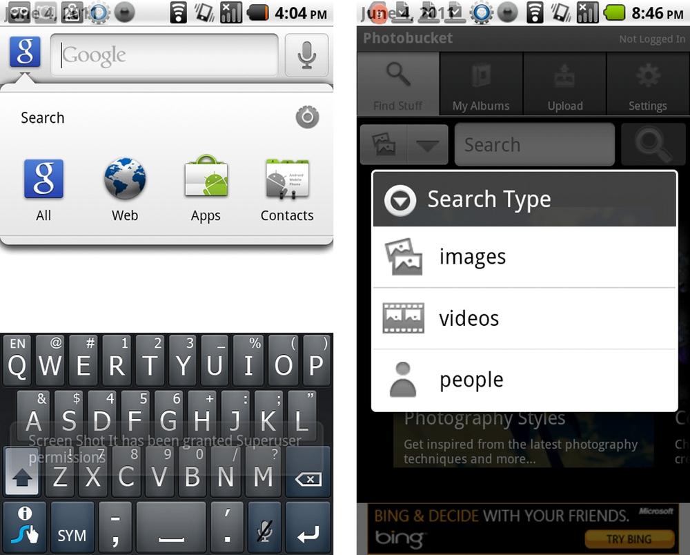
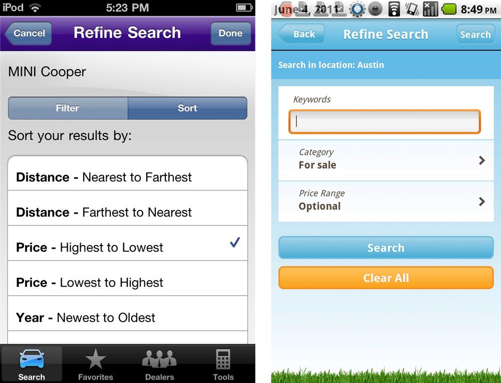
Sometimes it is easier (and faster) to get to the desired result by scoping the search criteria before performing the search. Google and Photobucket use different designs to the same end.
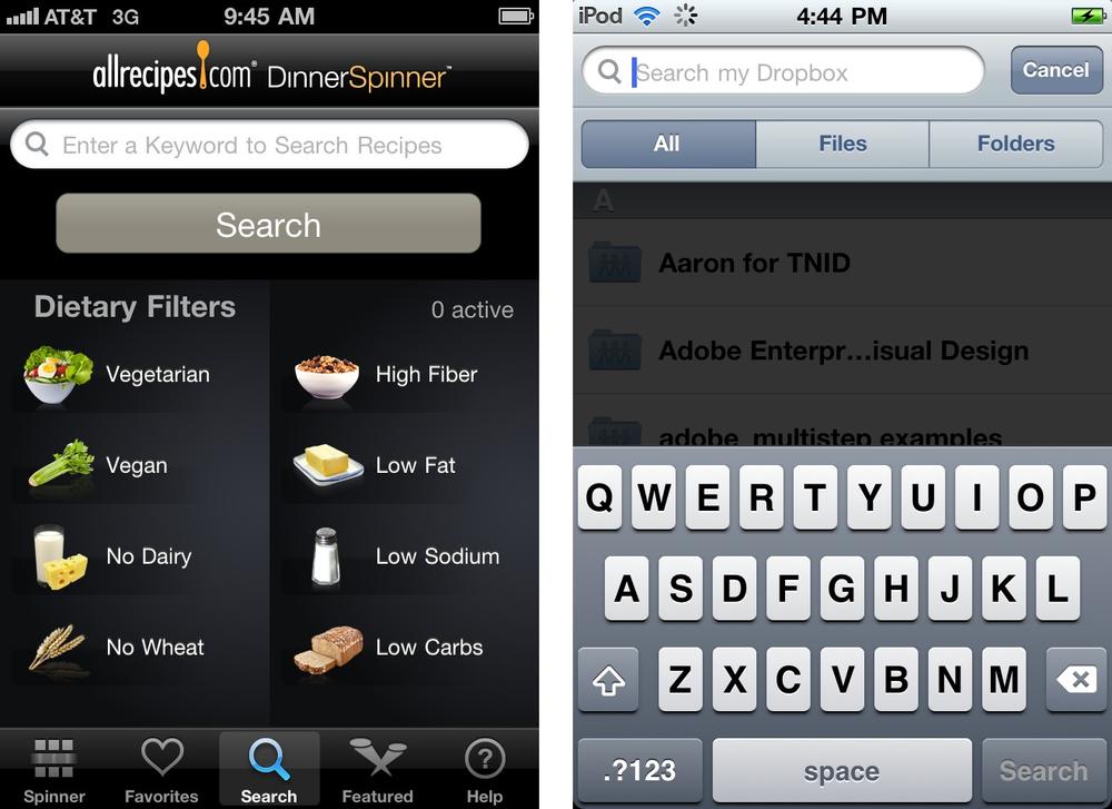
AllRecipes also lets you select criteria (or filters) before submitting the search. Dropbox defaults the initial scope to All, but you can switch it to Files or Folders before or after tapping the search button.
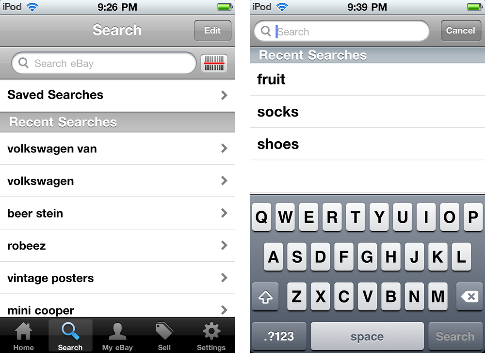
Successful mobile interfaces follow a basic usability maxim: respect the users’ effort. Saved and recent searches do this by making it easy to select from previous searches, instead of retyping the same keywords or search criteria. eBay and Walmart both use Saved and Recent Searches to increase users’ efficiency.
Other options to respect the users’ effort involve location-based searching options like Trulia, and bar code searching, like PriceCheck by Amazon.

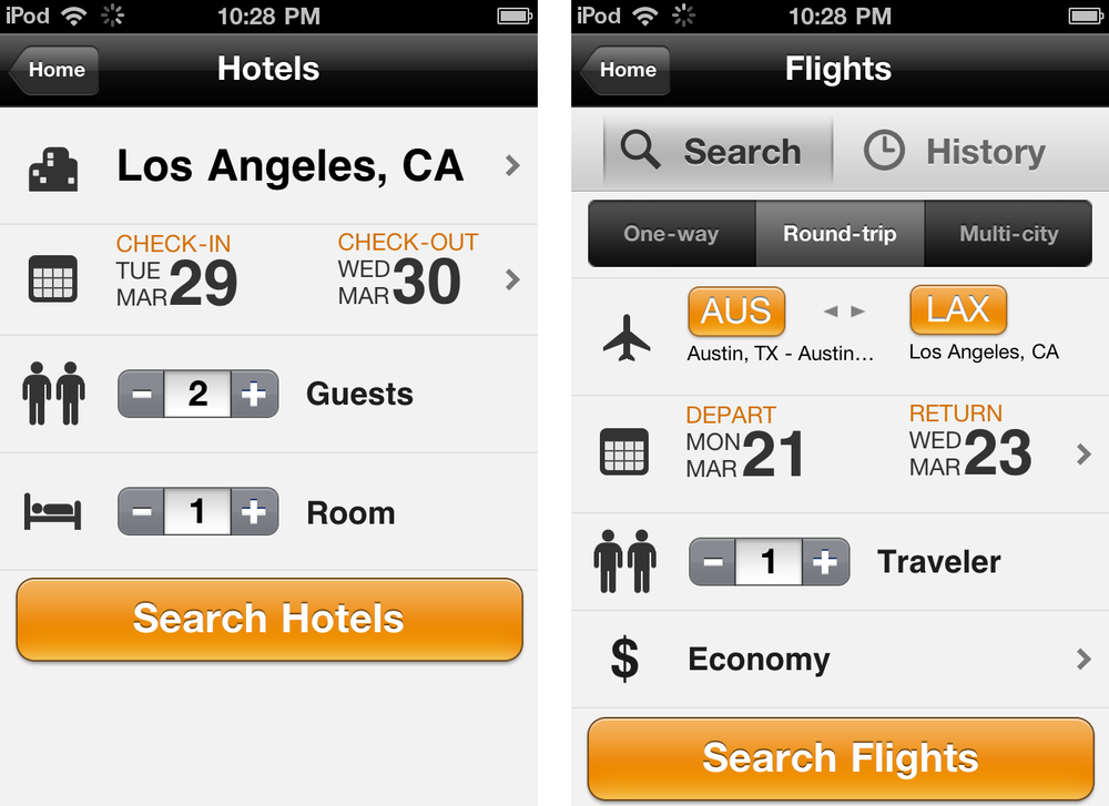
This pattern is characterized by a separate form for entering multiple criteria, and an explicit search button. Kayak and Whole Foods use search forms to collect the necessary criteria for searching for flights and hotels. See more examples in Chapter 2.

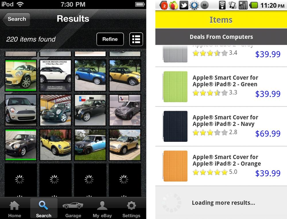
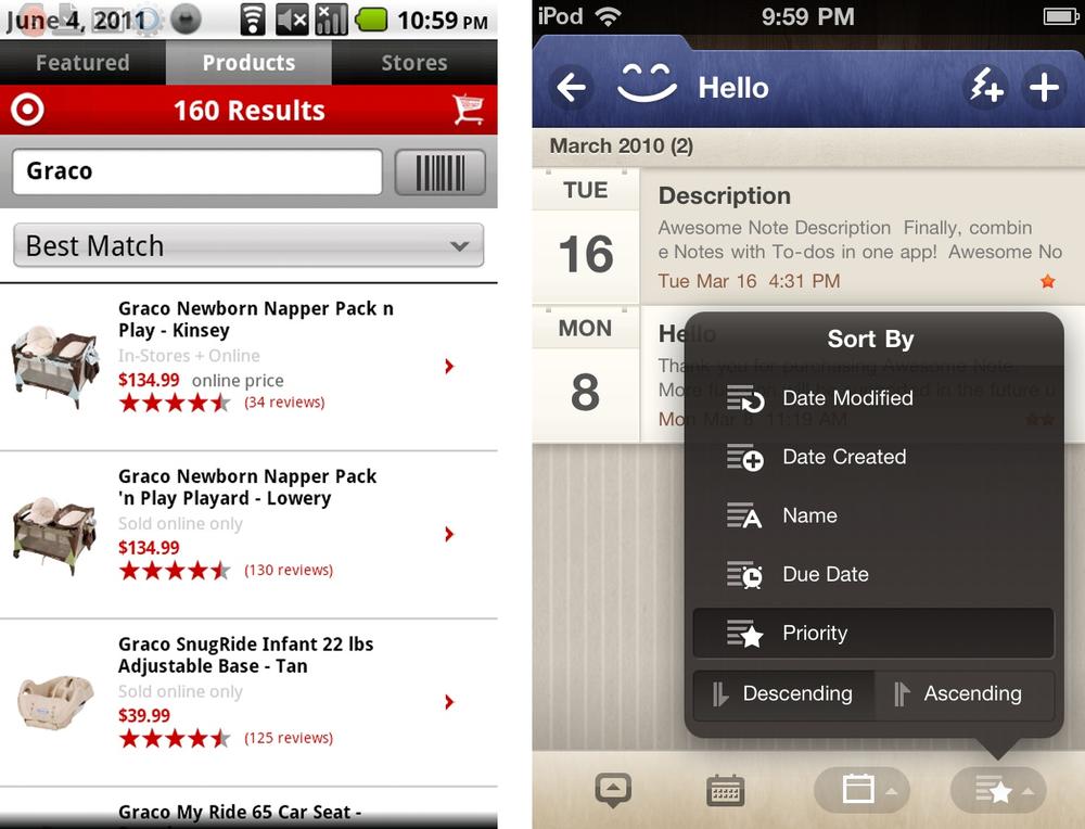
Once a search is performed, the results can be displayed in the same screen or on a dedicated results screen. Results may be displayed in a table or list, on a map or satellite, or as thumbnail images. Multiple view options can be used, depending on the type of results and user preferences.

Lazy loading is a common technique to use so that some results will be displayed while the rest are being loaded, see Ebay Motors and BestBuy. Many applications offer either a button to explicitly “view more results” or will automatically load more results when the screen is flicked.
Avoid paging tables, they break the natural interaction model of viewing information on a mobile device.
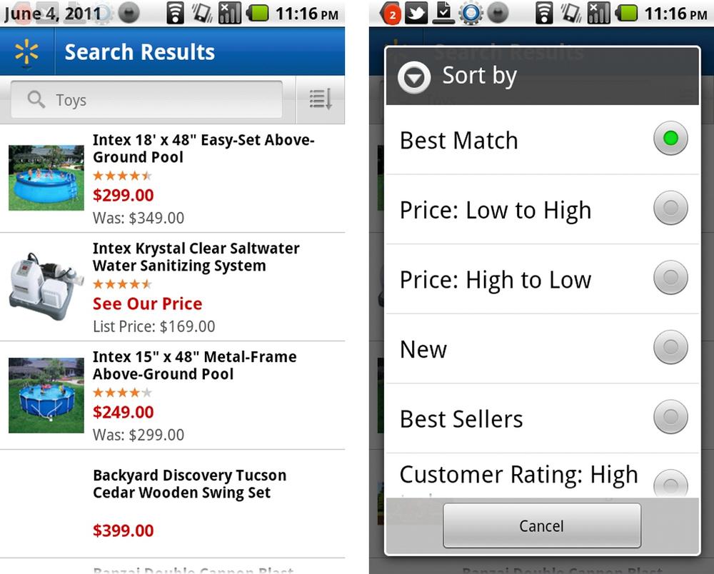
It is important to choose a reasonable default sort for displaying search results. A little common sense plus user validation is the best way to choose the default sort order. To offer additional sorting functionality, choose an existing interface design pattern:
onscreen sort
sort order selector
the sort form
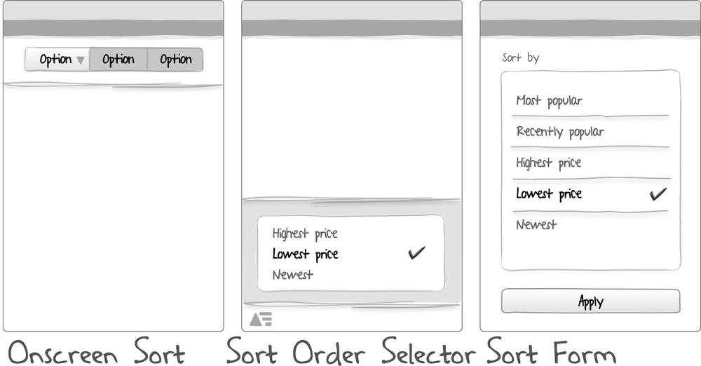
When there are only a few sort options, an onscreen sort can provide a simple one-tap solution. Placing the sort toggle at the top or bottom of the screen will depend on the other screen elements.
Target provides four sort options with a three-toggle button. For the price sort option, they offer two choices: sort by price ascending and sort by price descending.
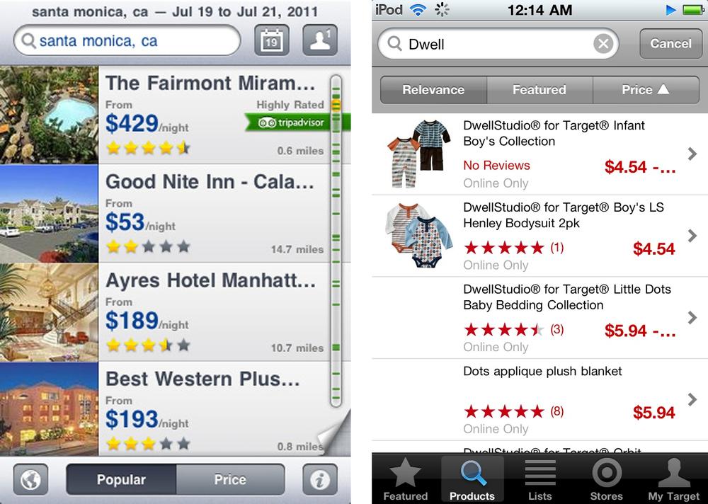
The selector pattern is a good alternative to the onscreen sort. There are a number of different UI controls that can be used for selection, but consider the design guidelines for the OS you are designing for (for example, the menu is common for Android app, and the picker and actionsheet are common in iOS apps).
The option titles can be longer (more explicit), and more options can be displayed. Walmart places the sort button in proximity with the search field, whereas Realtor.com puts it down with the other view options and actions
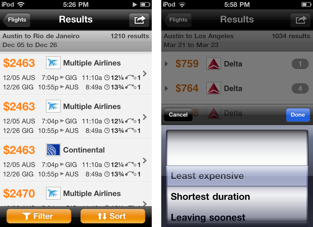
OS neutral solutions include a simple combobox, like Target, or an overlay menu, like Awesome Note.
Some applications have consolidated the sort and filter options into one screen, typically titled “Refine.” This is the most effort intensive sort pattern, requiring the user to open the form, select an option, and then apply the selection (by tapping “done” or “apply”).
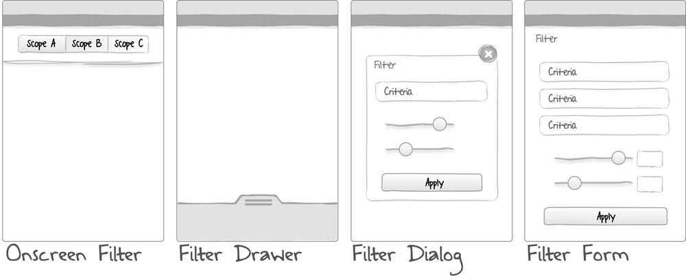
Large sets of data can require additional filtering, also called refining. Filtering relies on the user selecting criteria by which to refine the set of search results or a large set of objects. Common filtering patterns include:
Also see the earlier search pattern, Scoped Search, for an optional pre-filtering technique.
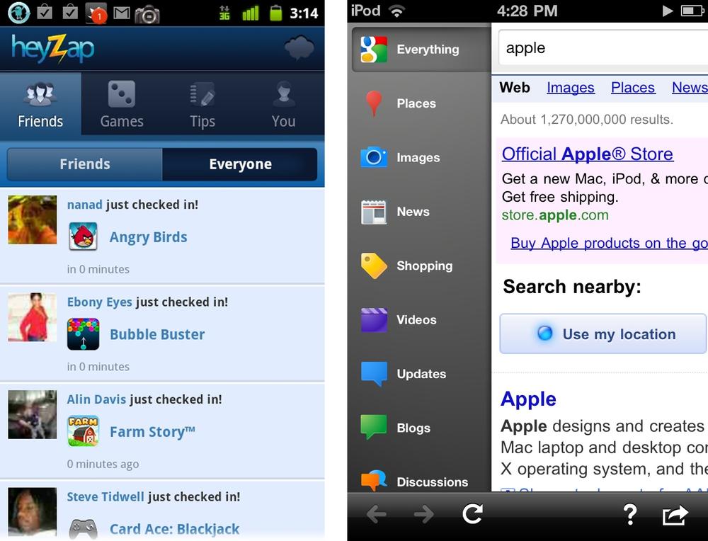
Similar to the onscreen sort, the onscreen filter is displayed with the results or list of objects. With one tap, the filter is applied. HeyZap uses the standard toggle button bar, whereas Google uses vertical tabs.
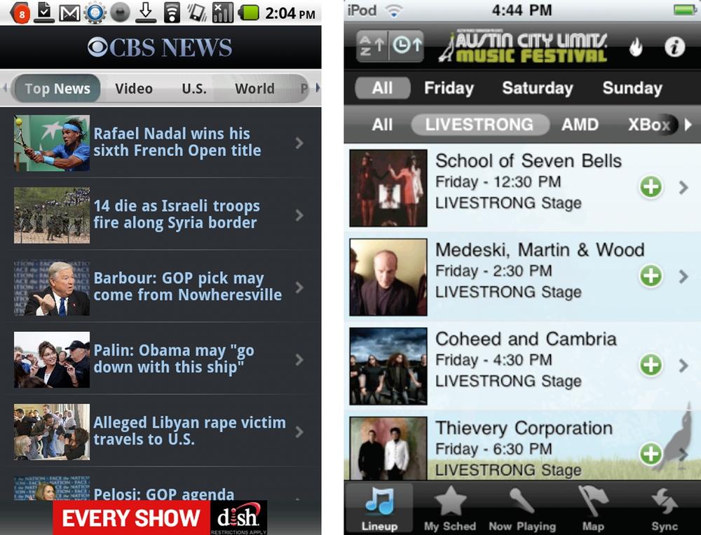
CBS News and the ACL Festival app use a scrolling filter bar as a way to let users quickly hone in on certain types of articles and bands, respectively.
Don’t use this filter pattern for primary navigation, but instead use it to group and filter content. See Chapter 10, Metaphor Mismatch.
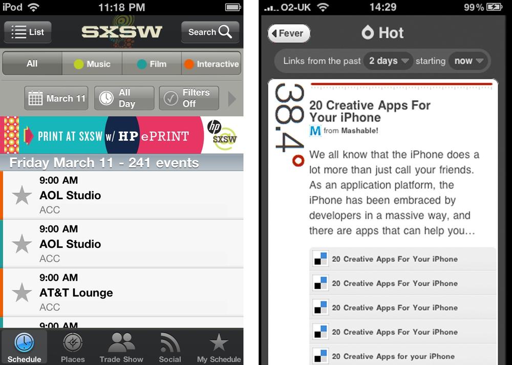
SXSW offers a filter button bar combined with a second row of filtering options. Feed a Fever news reader uses a super simple stylized set of comboboxes for filtering news feeds.
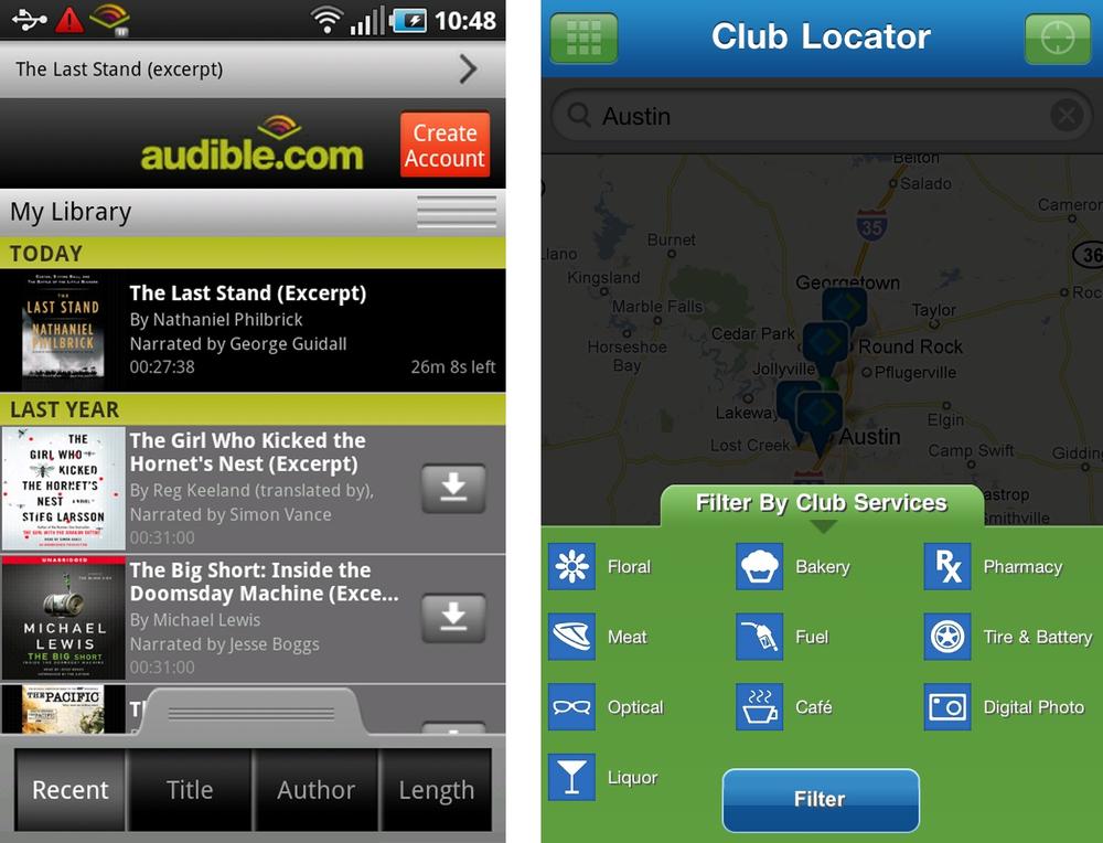
Almost as efficient as the onscreen filter, a drawer can be used to reveal filter options. Flicking or tapping a handle will open the drawer. Audible’s drawer reveals a simple filter toggle bar, whereas Sam’s offers a host of filter options that can be applied to the map of club locations. A better design for Sam’s would be to leave the map visible and allow for dynamic filtering instead of the explicit “filter” button.
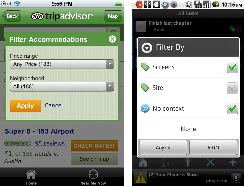
Like a pop-up on in a web app, the filter dialog is modal in nature. It requires the user to select a filter option, or cancel the action. TripAdvisor on iOS has a custom filter dialog, whereas USPS Mobile on Android relies on the default selector control.
While the Filter Dialog may get the job done, the first two patterns provide more freedom for users to experiment with and apply filters directly in context.
Note
Keep the options list short, avoid scrolling. Consider a Filter Form for lengthier or multi-select filter options. See Chapter 6, Charts with Filters, for examples on filtering chart data.
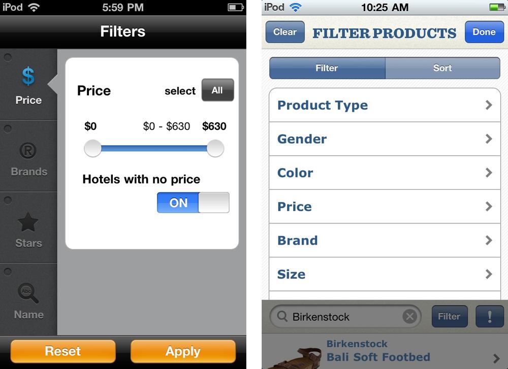
Large data sets can benefit from more advanced filter/refinement options. For example, Kayak uses a form to filter hotels based on price, brand, and stars. Zappos uses a similar approach, using the iOS standard clear/done buttons in the title bar.
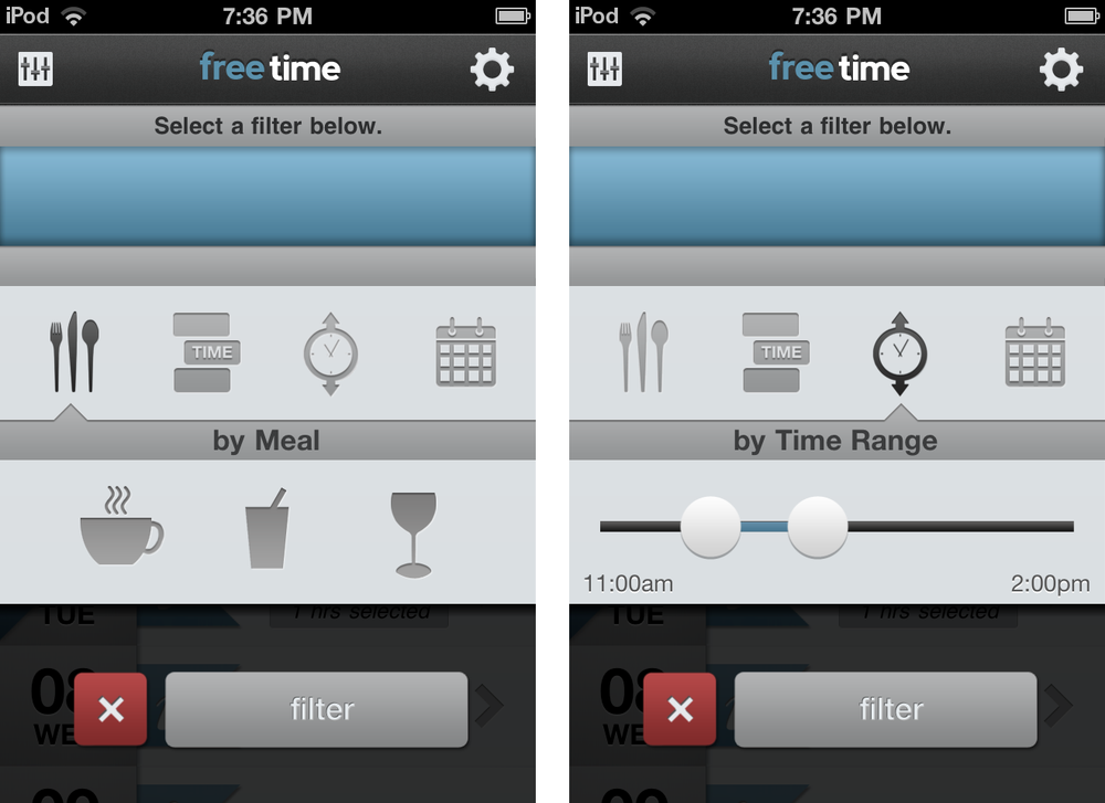
Freetime uses custom controls in their filter form. First you pick the filter category, then choose the filter criteria, then apply the filter to the calendar.
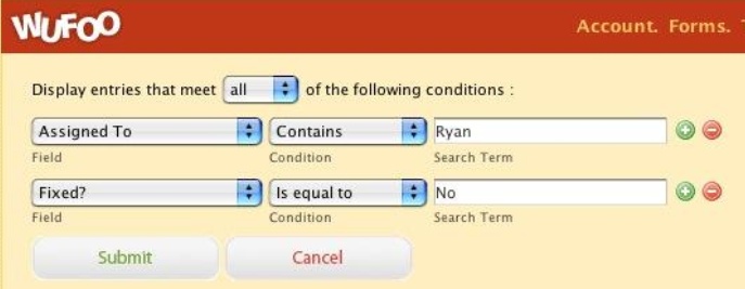
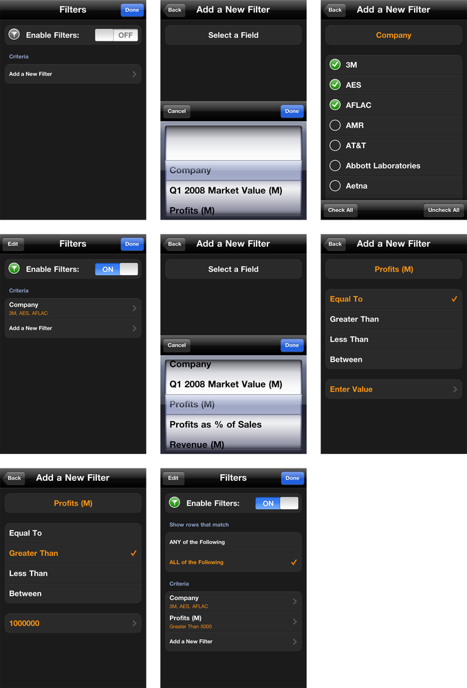
Conditional filters, also called predicate editors or expression builders, are an advanced filtering feature typically found in reporting tools. Here’s the standard layout used on the Web and desktop.
Creating a conditional filtering a mobile application can be challenging because of the form factor, but Roambi has successfully accomplished it.
Get Mobile Design Pattern Gallery, Color Edition now with the O’Reilly learning platform.
O’Reilly members experience books, live events, courses curated by job role, and more from O’Reilly and nearly 200 top publishers.

