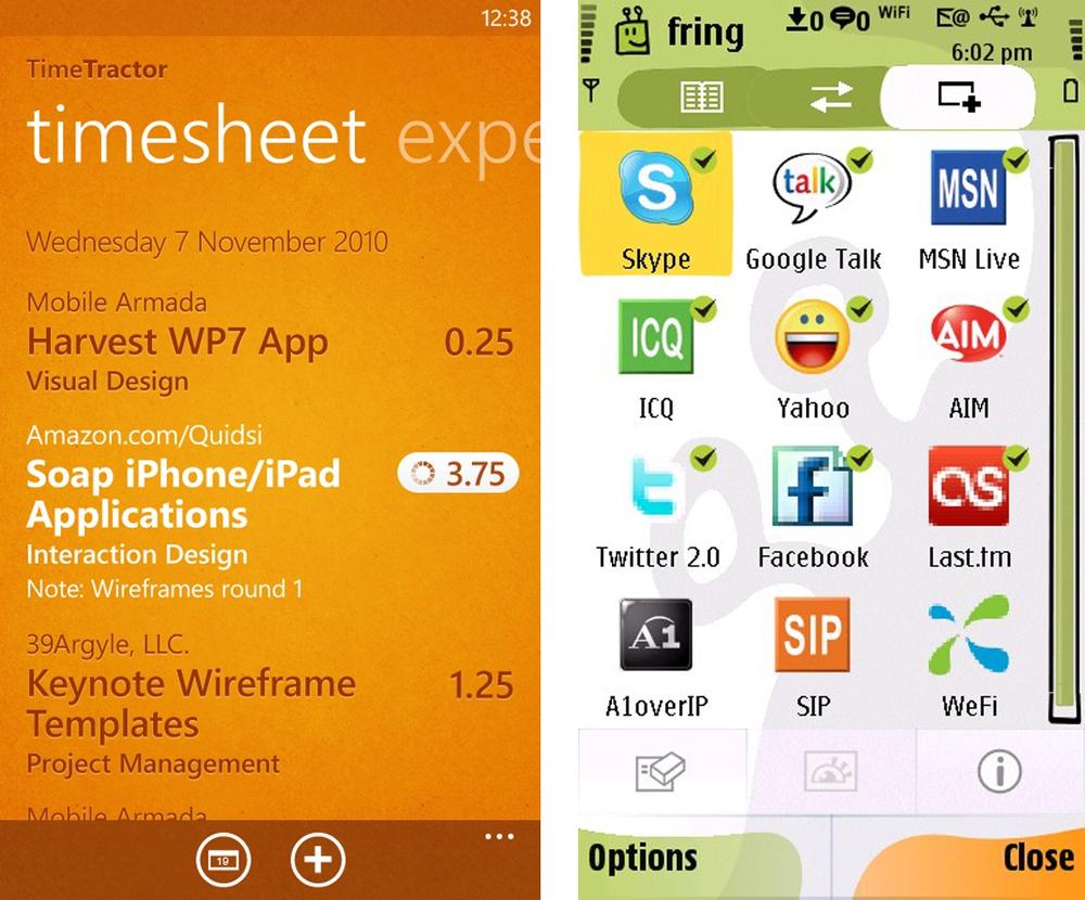
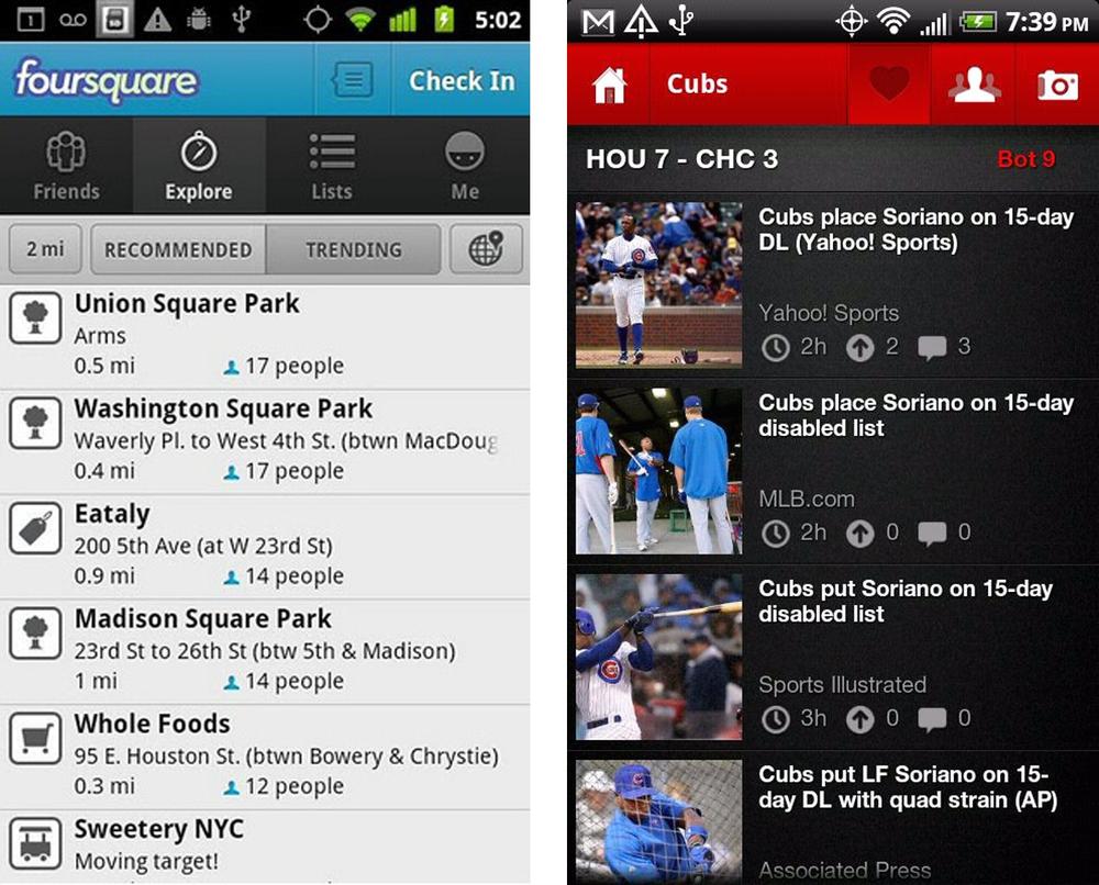
Primary Navigation Patterns: Springboard, List Menu, Tab Menu, Gallery, Dashboard, Metaphor, Mega Menu
Secondary Navigation Patterns: PageCarousel, Image Carousel, Expanding List
I like to read reviews in mobile marketplaces to better understand how people are using the apps. The marketplace rating system is an incredibly valuable feedback tool that doesn’t exist for web and desktop applications. It provides a rich source of information about customers’ preferences and expectations.
In general, most 4 and 5 star reviews aren’t very specific. They often sound a lot like this: “What a great app, it looks good and works well”. The 1 and 2 star reviews are much more telling; they extensively outline the problems with the application. The most common complaints seem to revolve around:
Crashing
Lack of key features (syncing, filtering, account linking...)
Poor navigation (can’t go back, can’t find things...)
Confusing interface design
The first two issues can’t be fixed with design patterns, but the third and fourth most common complaints can be. Following common design patterns for navigation will ensure that people can find and use the valuable features in your application.
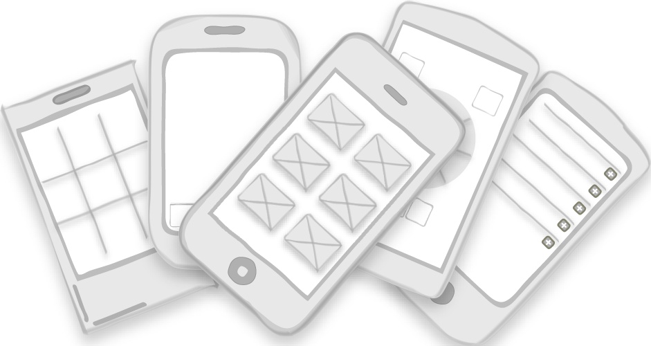
Good navigation, like good design, is invisible. Applications with good navigation just feel intuitive and make it easy to accomplish any task, from browsing friends to applying for a car loan. While there may be many options for navigating content within an app, I want to focus on seven patterns for primary navigation, i.e., patterns for the main menu:
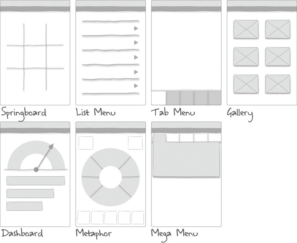
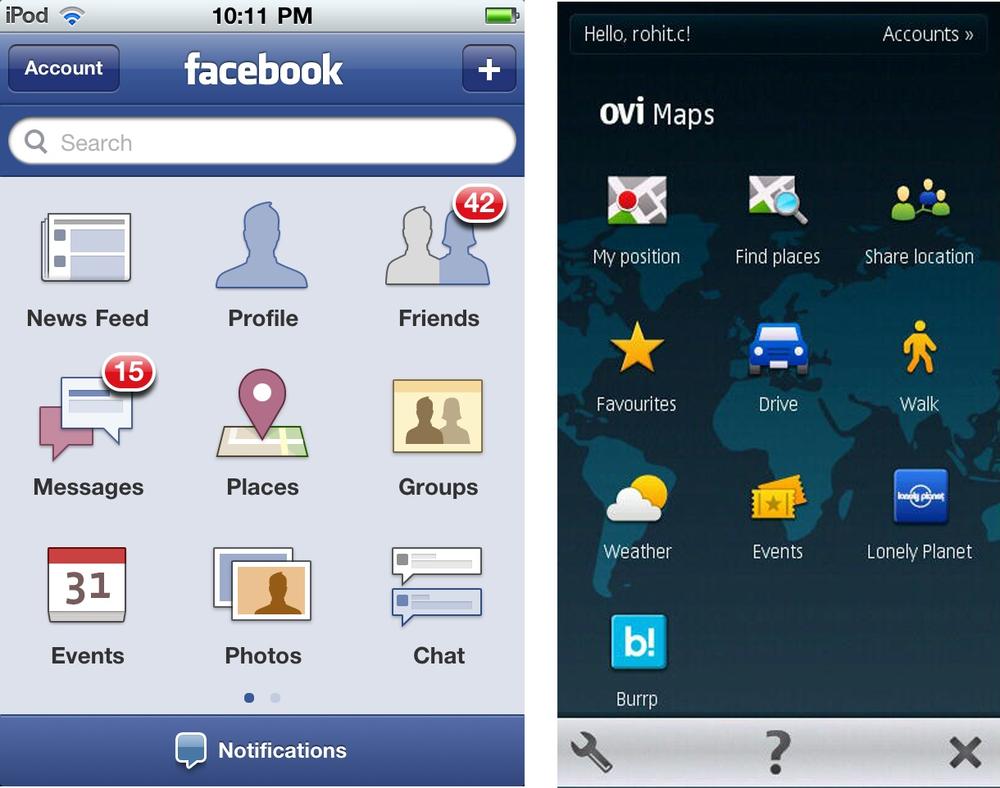
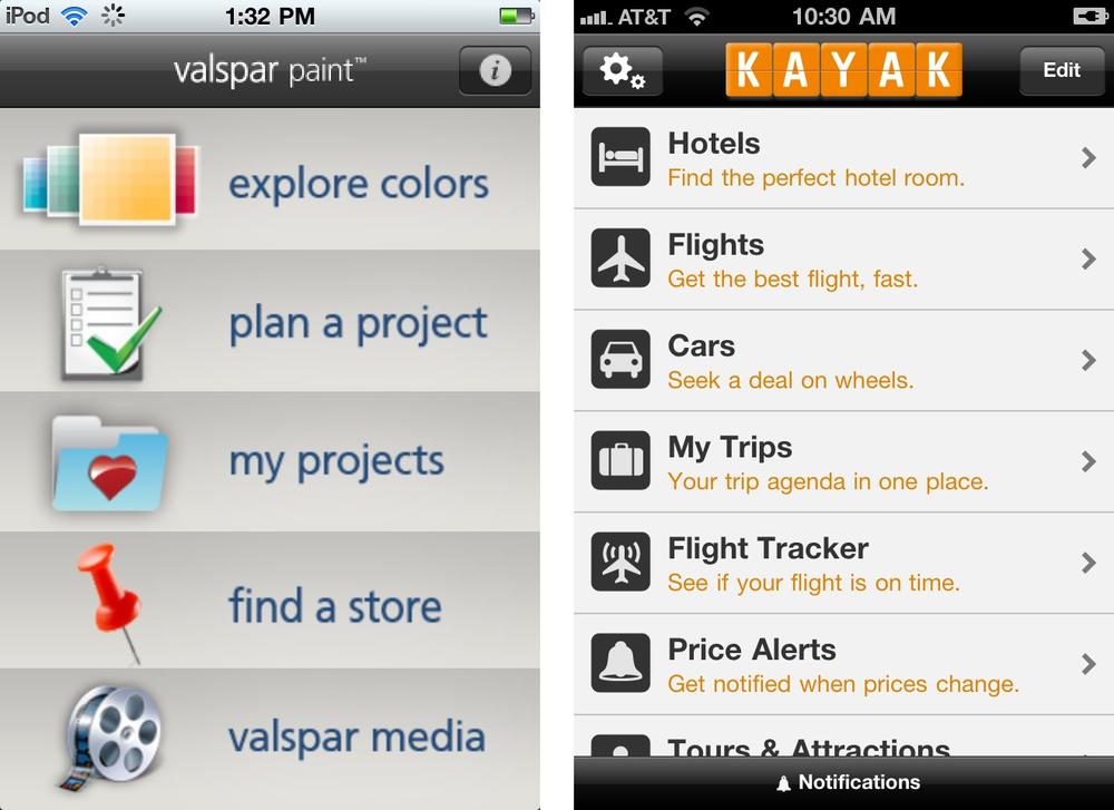
The Springboard pattern is OS neutral, working equally well across devices. It is also sometimes referred to as a Launchpad. The Springboard is characterized by a landing page of menu options that act as a jumping off point into the application. Facebook followed the Springboard design of the iOS home screen, and they were quickly emulated by other applications.
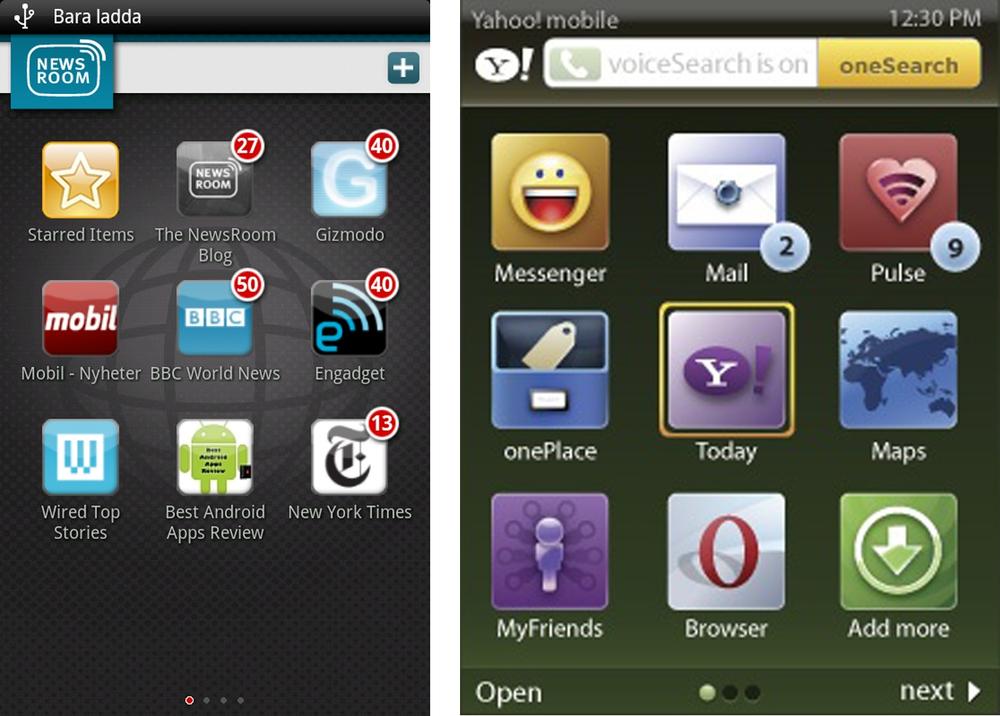
Personalized Springboards can be used to display personal profile information inline with the menu options. Typically a customization feature is available for changing the Springboard layout.
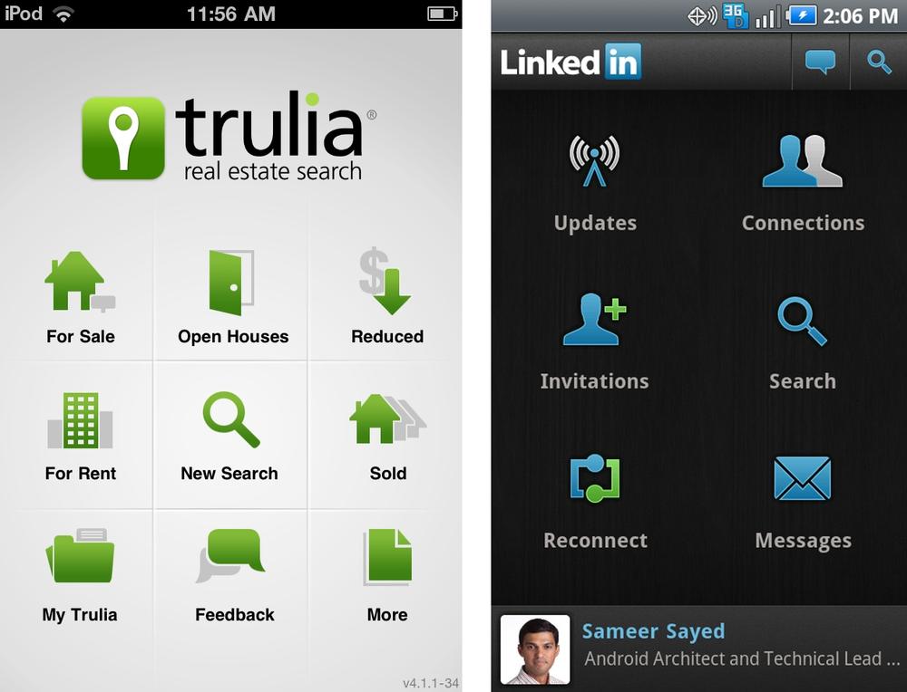
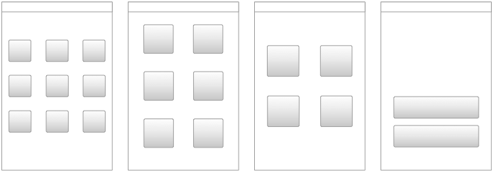
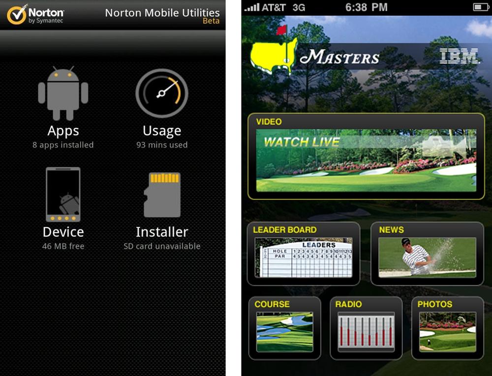
Grids for 3x3, 2x3, 2x2, and 1x2 are the most common layouts. But a Springboard doesn’t have to follow a grid layout. Some options can be proportionately larger to convey greater importance, like the video option in the Masters iPhone app is two to three times larger than the other menu items.
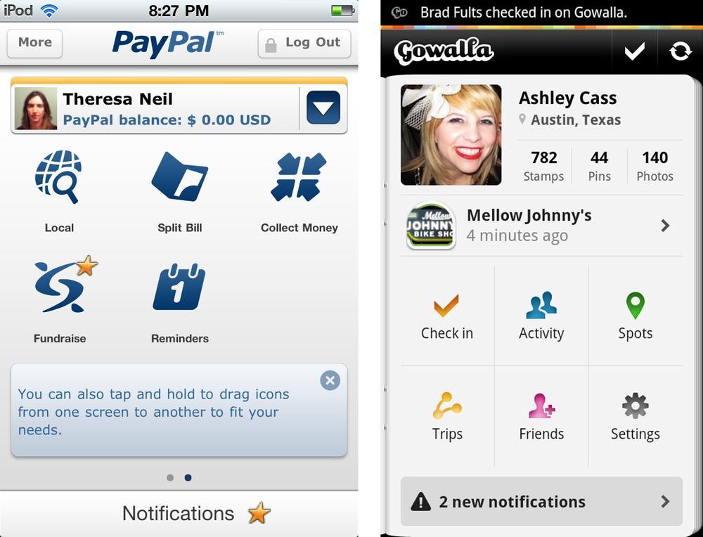
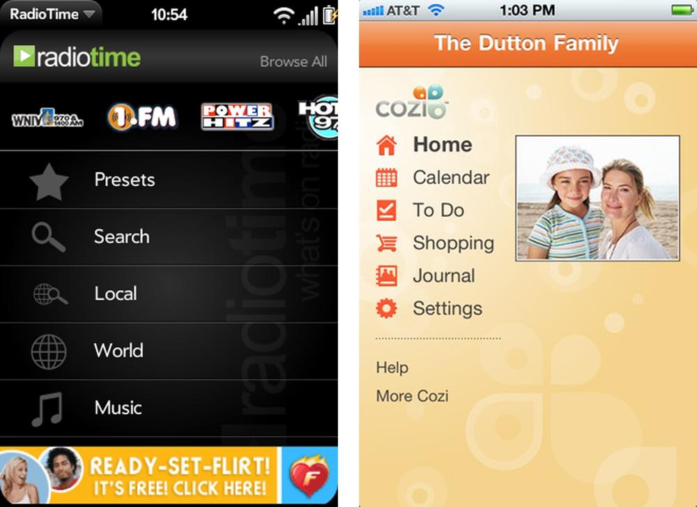
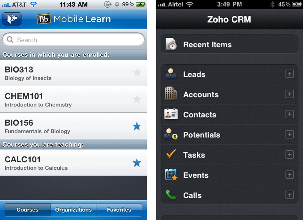
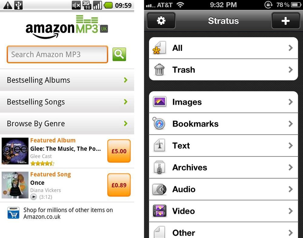
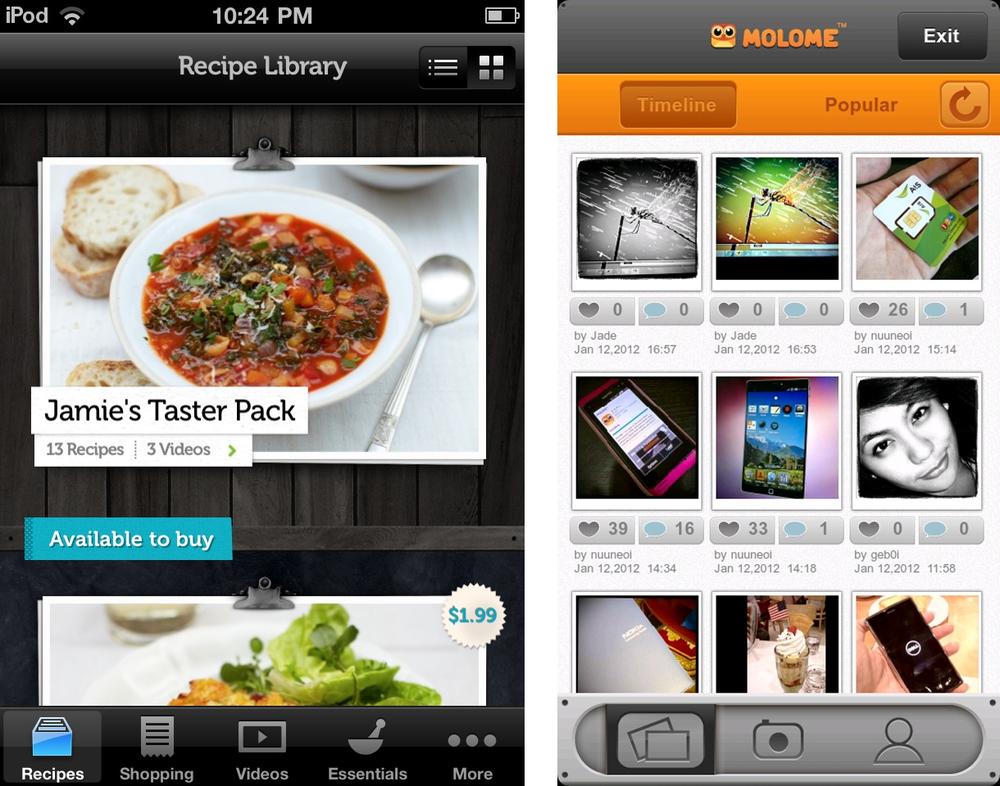
The List Menu is similar to that Springboard in that each is a jumping off point into the application. There are numerous variations of this pattern including personalized list menus, grouped lists, and enhanced lists. Enhanced lists are simple List Menus with additional features for searching, browsing or filtering.
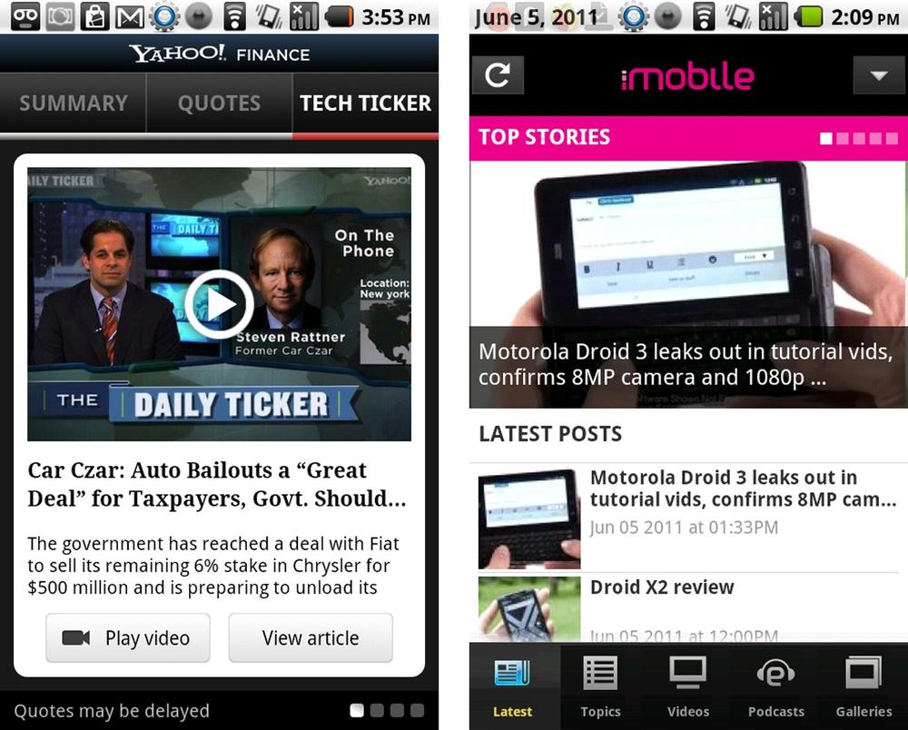
Tab navigation is not OS neutral since each OS has their own guidelines for tab location and design. When choosing this pattern for your application, be prepared to customize the tab location for the different OSs.
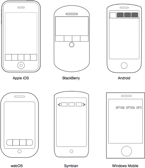
Bottom tabs, favored by iOS, WebOS, and BlackBerry, are the most thumb friendly option.
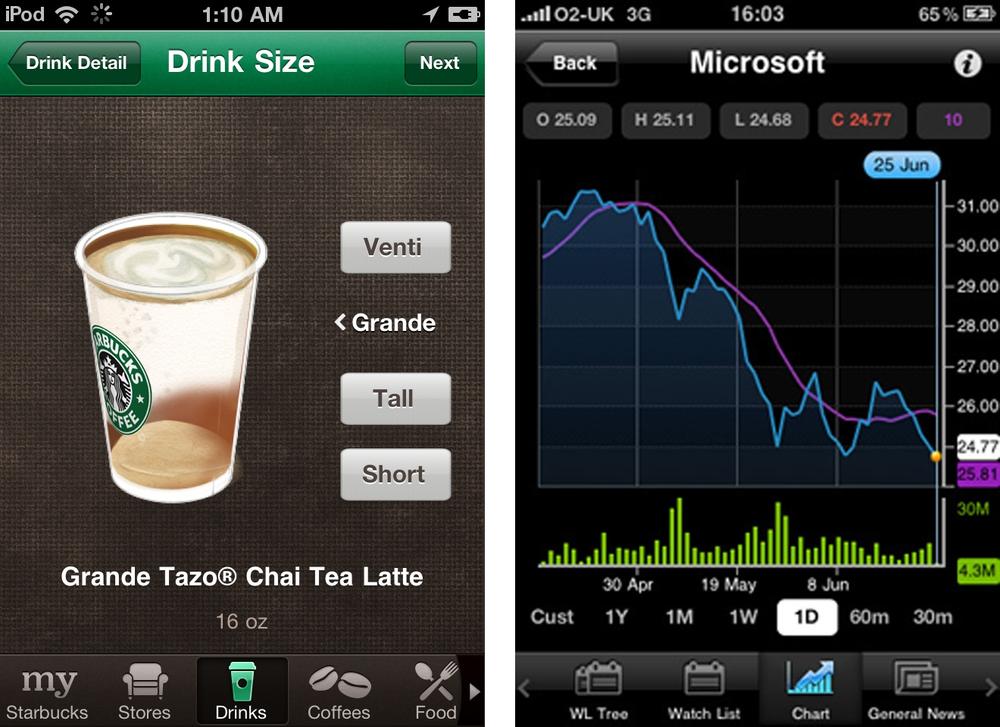
Horizontally scrolling bottom tabs, as shown in the Starbucks and Blue Mobile apps, provide a useful mechanism for offering more options without having to open up a More...screen.
Top tabs, favored by Android, Symbian, and Windows, look familiar since they are modeled after standard website navigation patterns. Nokia and Windows both use scrolling top tabs that you can flick to reveal more menu options.
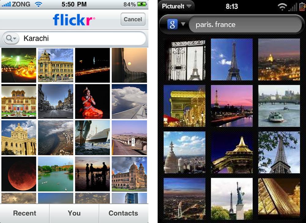
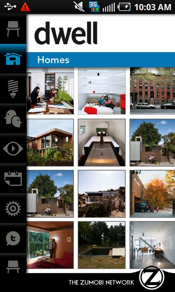
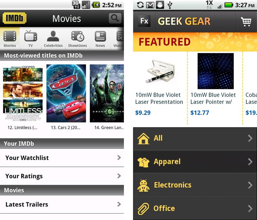
The Gallery pattern surfaces individual pieces of content for navigation. Content is usually individual articles, recipes, photos, or products and can be arranged in a carousel, grid, or slideshow.
Sometimes the content will be easier to browse if it is grouped. Dwell use side tabs to organize gallery content into manageable chunks.
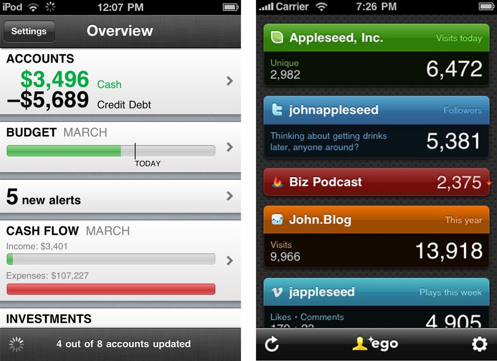
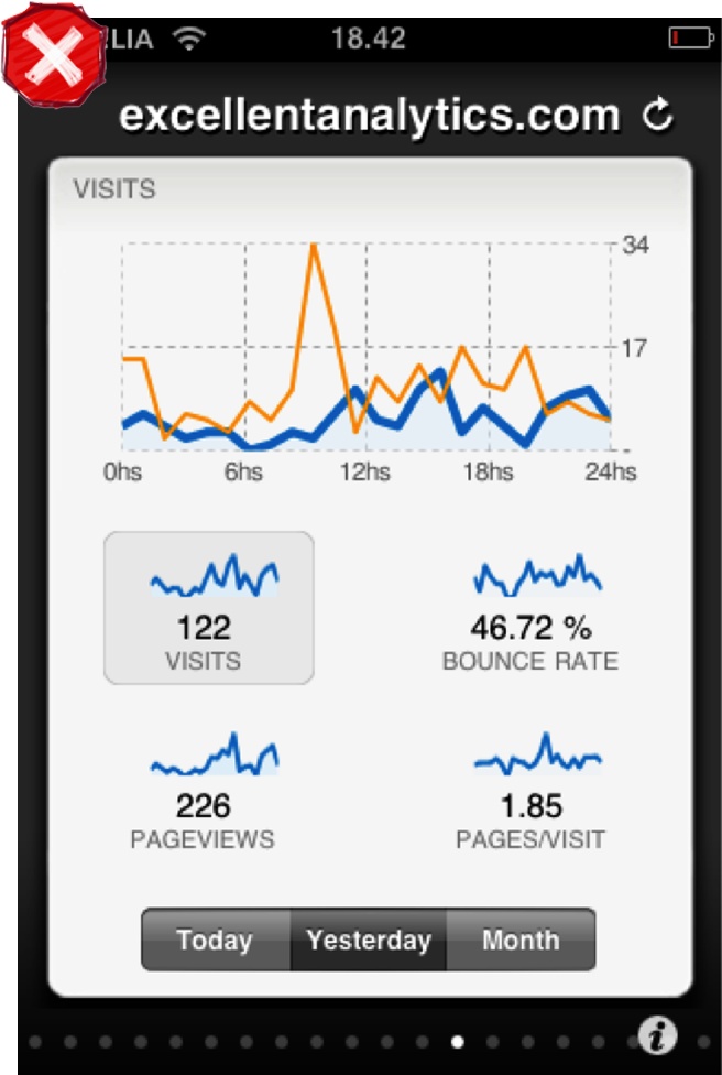
Dashboards provide a roll-up of key performance indicators, KPIs. Each metric can be drilled into for additional information. This primary navigation pattern is useful for financial applications, analytics tools and sales and marketing applications.
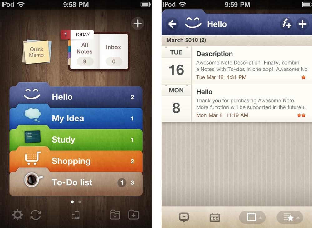
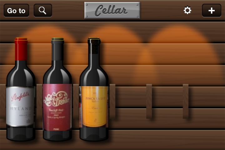
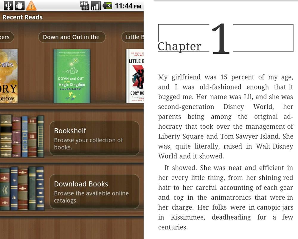
This pattern is characterized by a landing page modeled to reflect the application’s metaphor. This is used primarily in games, but can also be seen in applications that help people catalog and categorize items, like notes, books, wine, etc.
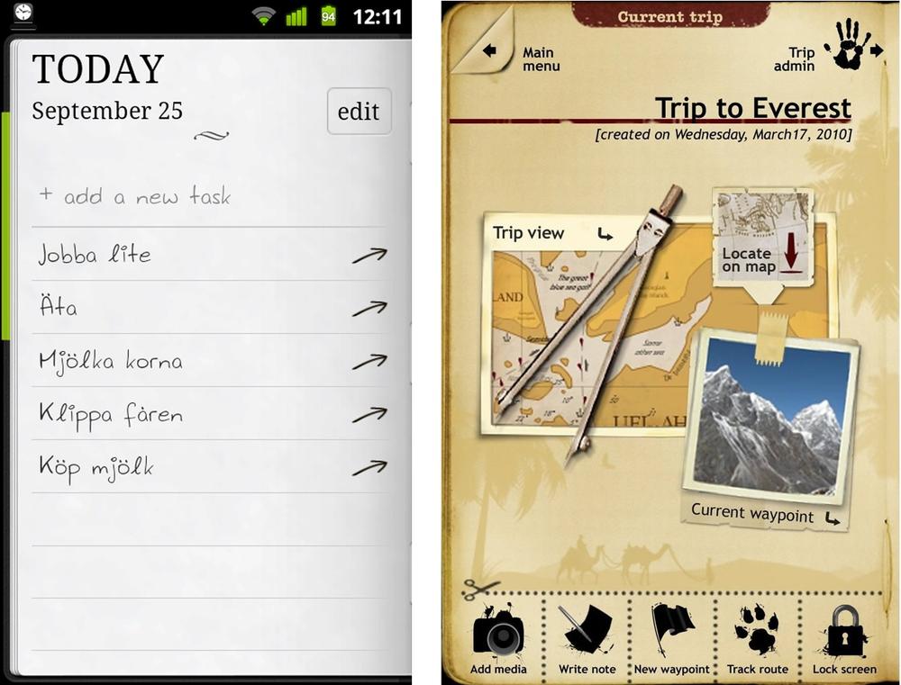
Note
Use the Metaphor pattern judiciously, as a poorly implemented metaphor can look a lot like the Novel Notion anti-pattern in Chapter 10.
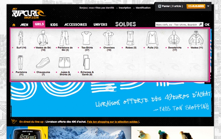
A mobile Mega Menu is like the web Mega Menu, a big overlay panel with custom formatting and grouping of the menu options. The RipCurl website uses a mega menu for navigating into sub categories of clothing.
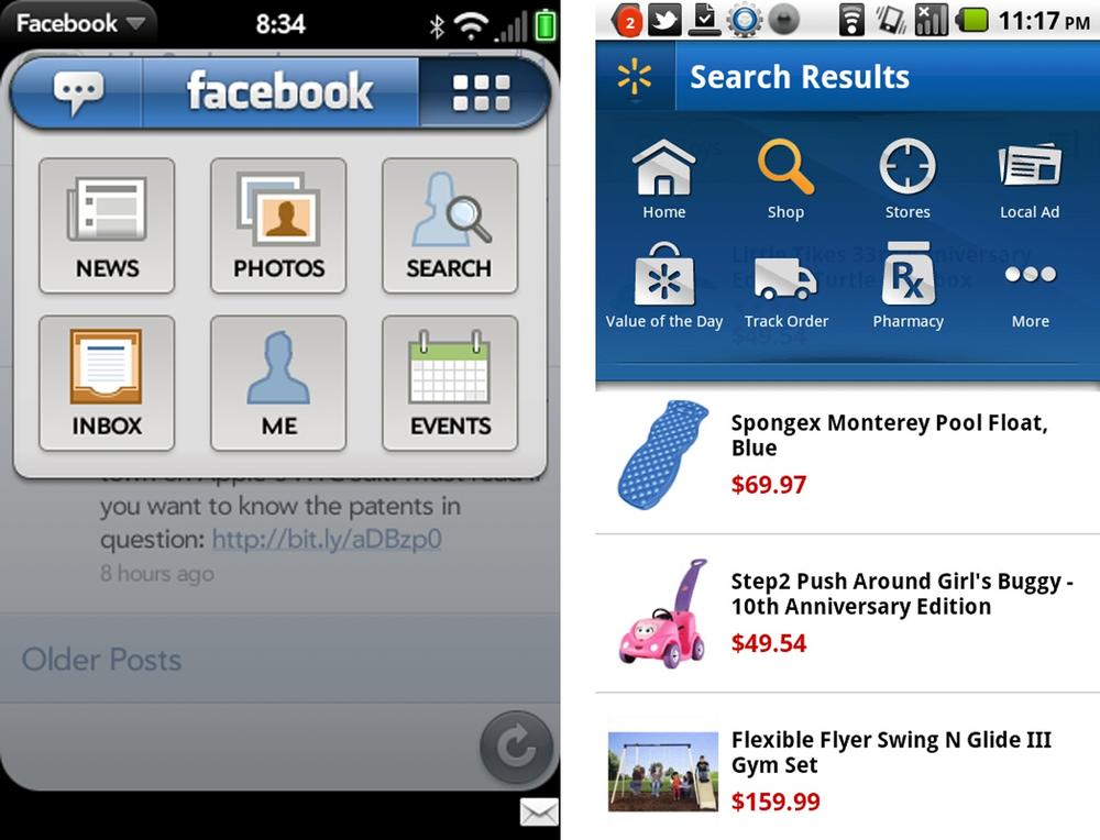
The webOS version of Facebook uses a megamenu for streamlined navigation, avoiding the extra navigation found in a Springboard pattern. Walmart uses this same pattern in their Android app.
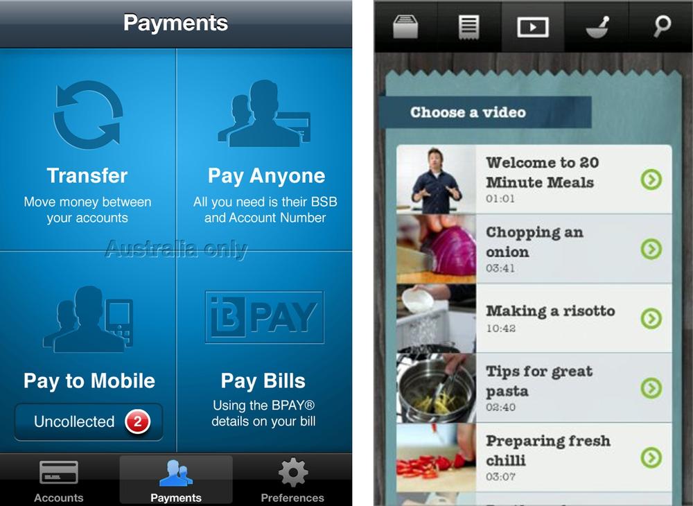
This chapter didn’t feel complete with only menu patterns, so I broadened it to include secondary navigation. By secondary navigation, I mean the navigation within a page or module. For example, the Springboard in the ANZ application is secondary to the primary Tab navigation. Similarly in Jamie Oliver’s Recipes, the List is secondary to the primary Tab navigation.
Any of the primary navigation patterns can be reused as secondary navigation patterns. It is common to see Tabs with Tabs, Tabs with Lists, Tabs and Dashboard, Springboard and Gallery, etc.
There are some additional patterns that work well for secondary navigation, but probably aren’t ideal for primary navigation:
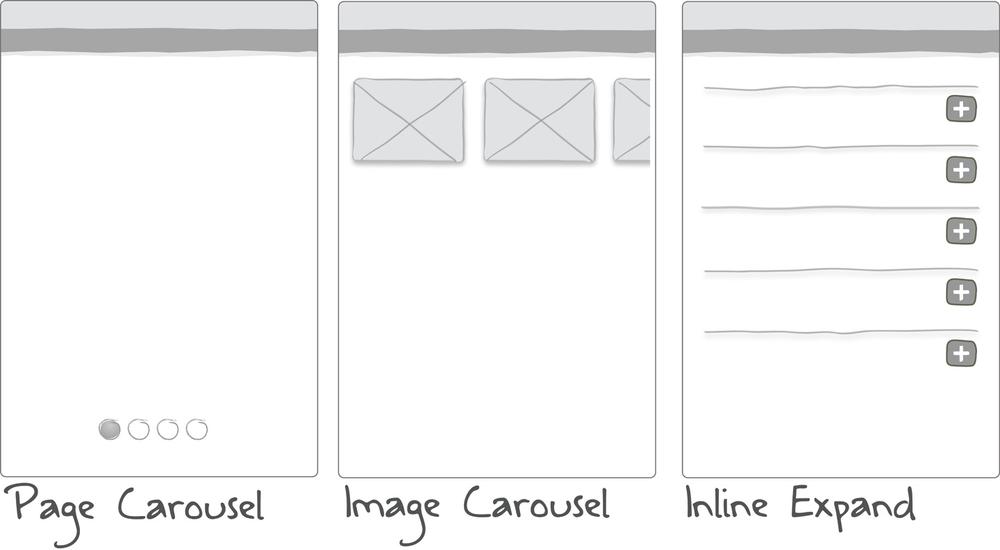
This pattern can be used to quickly navigate a discreet set of pages using the flick gesture. The page indicator (the iOS term for the little dots) displays how many pages are in the carousel; flicking displays the next page. All four examples below use the page carousel within a selected tab.
The page carousel pattern has its limits. Consider using a list for navigating more than eight pages.
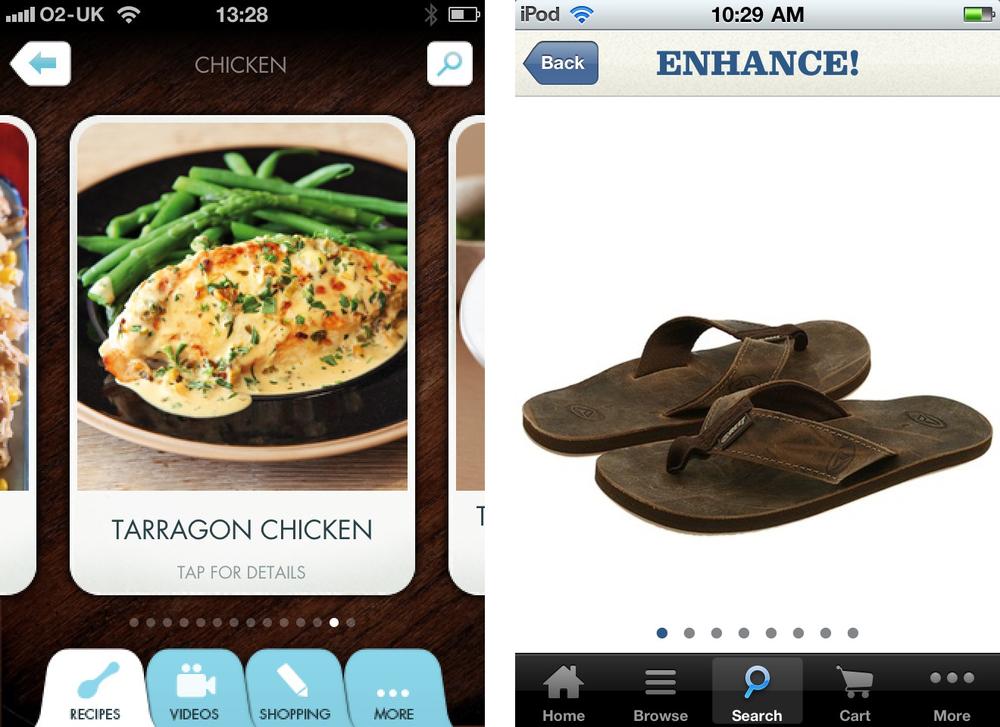
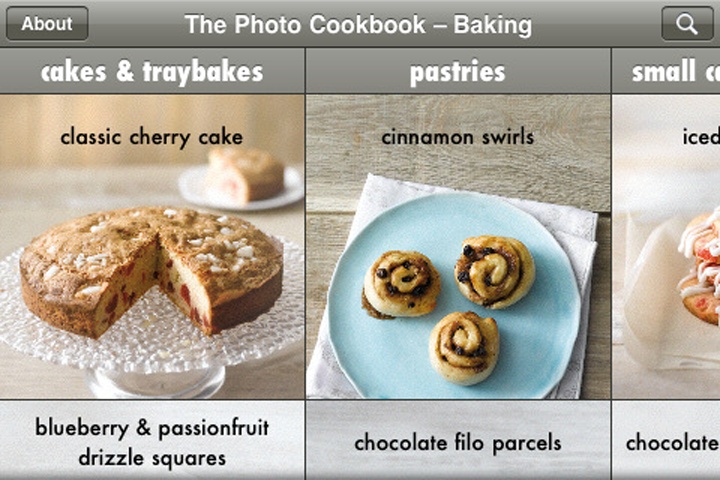
The image carousel may be a 2D carousel or more like the iTunes coverflow. IMDB uses the image carousel to surface the most viewed movies. We used it to display featured products in the retail application we designed for the Adobe Flex Showcase.
The Photo Cookbook is another example of the Image Carousel; however, the images are grouped in columns by recipe type.
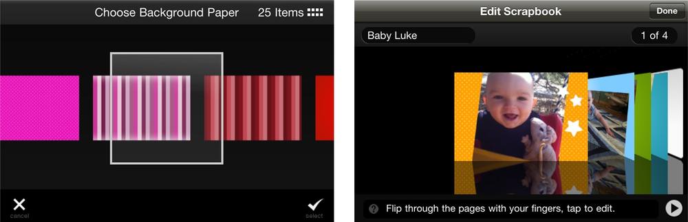
Tap’n’Scrap has good examples of both styles. They use a 2D carousel for background and frame selection, and the coverflow style scrapbook viewing.
ANZ’s banking app displays account information payment sources in a coverflow. While this is attractive and probably demos well, the excitement of flicking through cards to make a payment probably wears thin after the first few uses.

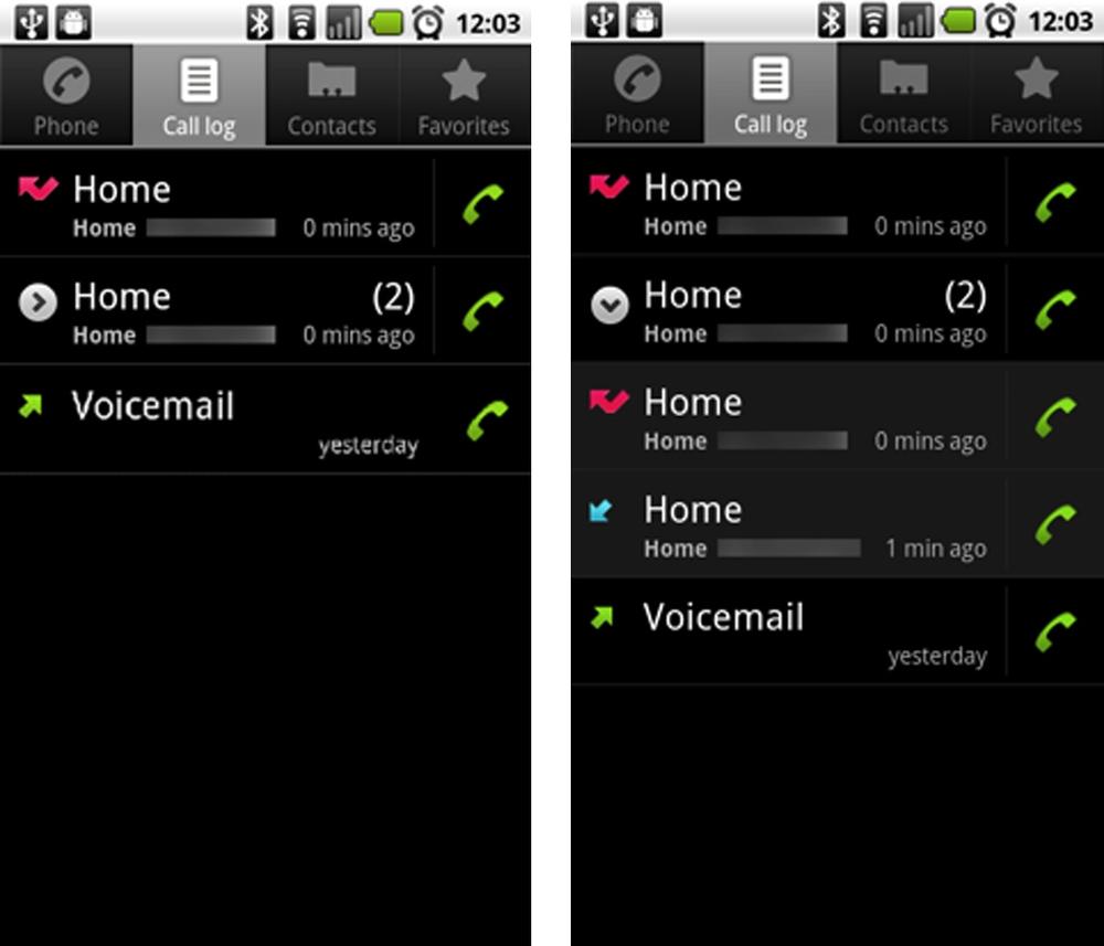
The Expanding List allows a single screen drill down to reveal more information. Android Gingerbread uses this pattern in the call log. All calls from the same number are collapsed into one row. Tapping the icon expands the list to show the individual instances.
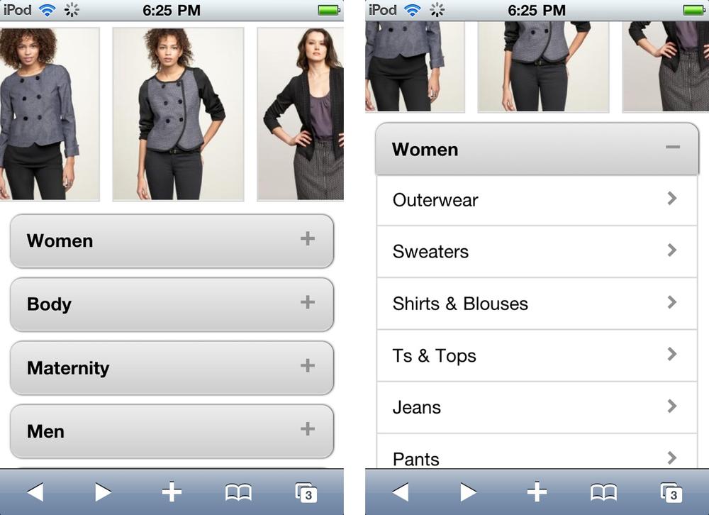
This pattern is more common in mobile optimized websites than mobile applications, but can work well in both cases. Take for example the Gap.com mobile site. The Expanding List is used instead of a Cascading List to disclose all of the Women’s clothing categories.
Get Mobile Design Pattern Gallery, Color Edition now with the O’Reilly learning platform.
O’Reilly members experience books, live events, courses curated by job role, and more from O’Reilly and nearly 200 top publishers.

