Reworking Content
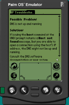
Because of the small size and bandwidth, we also ran into issues with writing style and screen format. Long narrative is less effective than short steps and sequenced commands. The interface for the learner/technician is designed to give them the right information, at the right time, in the fewest number of clicks, and with the minimum amount of extraneous information. Screen size and color depth (white, black, and two grays) also was an issue that we had to work around. Large diagrams had to be broken down into smaller, linked units. Some had to be turned sideways so that they could be scrolled across.
Get mLearning: Mobile Learning and Performance in the Palm of Your Hand now with the O’Reilly learning platform.
O’Reilly members experience books, live events, courses curated by job role, and more from O’Reilly and nearly 200 top publishers.

