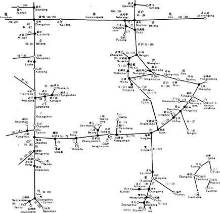
Figure 2-1: Train timetable.
Two examples
I’d like to show you two examples which illustrate effective visualisation. They are effective because they provide associations and insights that are not possible with description alone. The objects in the figures quickly allow the viewer to notice associations.
Figure 2-1 (taken from: www.aattc.org.au/Times_December_1999W.pdf
) shows a rail timetable from 1985 in the People’s Republic of China. Edward Tufte describes it in his book Envisioning Information as a clever multifunctional combination of a map and data table. The diagram is a mixture of route map and index. The numbers in the figure refer to pages of the 200-page timetable catalogue so the reader can look up precise departure times. It also provides a complete geographical overview of all destinations and estimates of distance.
However, sometimes visualisation also needs additional clarification in the form of text, at least when the visualisation has not been produced by you yourself.
Figure 2-2 displays an ‘innovation portfolio’, a method allowing innovative projects to be evaluated from market and business perspectives. The diagram enables you to see at a glance the differences between projects and makes it easier to decide which projects should be followed up.
Figure 2-2: Innovation portfolio.
Visualising Information as a Core Skill
You are aware of it every day: the ...
Get Mind Mapping For Dummies now with the O’Reilly learning platform.
O’Reilly members experience books, live events, courses curated by job role, and more from O’Reilly and nearly 200 top publishers.

