14.2. Understanding SharePoint Navigation Elements
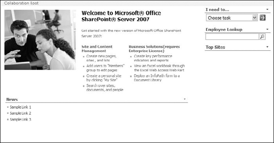
SharePoint out of the box offers a number of controls that facilitate navigation across the Web site. Features such as Quick Launch bars, global navigation menus and tab controls, breadcrumb Web parts, etc., provide Web site designers with a number of ways to allow users to access content located across a Web site. The home page of a SharePoint Web site, as shown in Figure 14.4, has navigation controls and Web parts scattered all over the default Web page.
The Quick Launch bar is on the left pane, the site breadcrumb control is just above the content area, and the top navigation bar is just under the title of the Web page. Later in this chapter, I discuss how you can use these controls to your advantage while designing Web pages for SharePoint sites. Right now, though, I discuss the SharePoint interface for managing the navigation settings.
Figure 14.4. A SharePoint Web site using the Collaboration site template (available with MOSS)
14.2.1. Working with the Quick Launch bar
Whenever you create a new list, document library, or other forms of containers in SharePoint Designer, you have the option to add it to the Quick Launch bar. This bar is situated by default in many site templates on the left pane of the Web pages. Later in this section, the Quick Launch bar is implemented by using a set of controls (namely <asp:SiteMapDataSource> ...
Get Microsoft® Office SharePoint® Designer 2007 Bible now with the O’Reilly learning platform.
O’Reilly members experience books, live events, courses curated by job role, and more from O’Reilly and nearly 200 top publishers.

