Creating Meaningful Charts
Sometimes it is useful to display data in a chart instead of in a table. In Excel 2007 and Excel 2010, the options for creating bar charts, pie charts, and other charts have been enhanced.
Creating a Column Chart
To convert our example table into a simple but informative column chart, perform the following steps:
Select the table cells starting from Month to the profit margin December (see Figure 1-38).
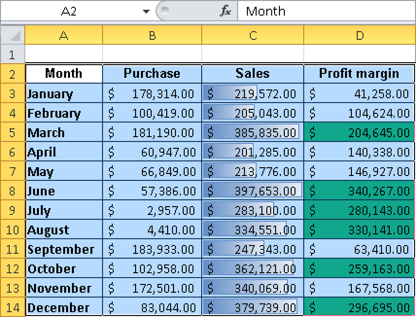
Figure 1-38. Selecting a value to create a chart.
On the Insert tab in the Chart group, click the Column button and select the first chart under 2D Column (see Figure 1-39).
Figure 1-39. Selecting the chart format.
The chart is ...
Get Microsoft® Excel® 2010 Formulas & Functions Inside Out now with the O’Reilly learning platform.
O’Reilly members experience books, live events, courses curated by job role, and more from O’Reilly and nearly 200 top publishers.

