Plotting pie charts
To compare the relative importance of quantities, nothing like a good old pie—pie chart, that is.
How to do it...
The dedicated pie-plotting function pyplot.pie() will do the job. We will use this function in the following code:
import matplotlib.pyplot as plt

data = [5, 25, 50, 20]

  plt.pie(data)
plt.show()
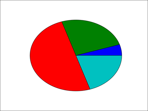
The preceding simple script will display the following pie diagram:
How it works...
The pyplot.pie() function simply takes a list of values as the input. Note that the input data is a list; it could be a NumPy array. You do not have to adjust the data so that it adds up to 1 or 100. You just have to give values to matplolib and ...
Get matplotlib Plotting Cookbook now with the O’Reilly learning platform.
O’Reilly members experience books, live events, courses curated by job role, and more from O’Reilly and nearly 200 top publishers.

