Plotting multiple curves
One of the reasons we plot curves is to compare those curves. Are they matching? Where do they match? Where do they not match? Are they correlated? A graph can help to form a quick judgment for more thorough investigations.
How to do it...
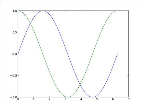
Let's show both sin(x) and cos(x) in the [0, 2pi] interval as follows:
import numpy as np
import matplotlib.pyplot as plt

X = np.linspace(0, 2 * np.pi, 100)
Ya = np.sin(X)
Yb = np.cos(X)

plt.plot(X, Ya)
plt.plot(X, Yb)
plt.show()
The preceding script will give us the result shown in the following graph:
How it works...
The two curves show up with a different color automatically picked up by ...
Get matplotlib Plotting Cookbook now with the O’Reilly learning platform.
O’Reilly members experience books, live events, courses curated by job role, and more from O’Reilly and nearly 200 top publishers.

