By default,
a Button looks like it’s raised slightly off the surface of the
window. By using the -relief option, you can
change the style of the Button edges:
-relief => 'flat'|'groove'|'raised'|'ridge'|'sunken'|'solid'The default for a Button widget is 'raised' and
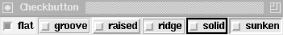
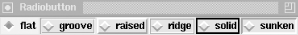
for Checkbuttons and Radiobuttons it is 'flat'.
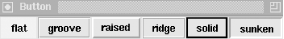
Each value changes the look of the Button slightly, as you can see in Figure 4-20. Here is a list of the styles:
-
flat No edges are drawn around the Button at all. Makes it look like only text is present in the window.
-
groove Gives a slightly depressed look to the edge (as if there were a ditch around the text).
-
raised Gives a 3D look with a shadow on the lower and right sides of the Button, which causes it to look higher than the window surface. This is the default.
-
ridge Makes it look like a ridge is around the text. The opposite of
'groove'.-
solid Draws a solid line around the widget.
-
sunken Gives the 3D effect of being below the surface of the window. The opposite of
'raised'.
No matter which value is specified for the -relief
option, when the Button is pressed with the mouse, its relief will
change to 'sunken'.
The Checkbutton and Radiobutton start with flat
relief. Figure 4-21 and Figure 4-22 show these.
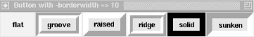
In addition to changing the type of
edge drawn around a Button, you can change the thickness of the edge
by using -borderwidth:
-borderwidth => amountThe default -borderwidth for a Button is 2 and for
a Checkbutton and a Radiobutton is 0. The wider the
-borderwidth, the more dramatic the effects of the
-relief option become. Figure 4-23 shows what a -borderwidth
of 10 does to each relief type for a Button. When changing the
-borderwidth on a Checkbutton or Radiobutton, be
careful you don’t use too large a value, because the indicators
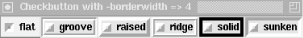
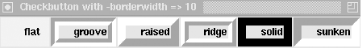
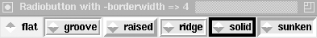
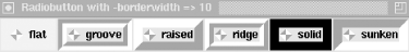
do funny things at larger values. Take a look at Figures Figure 4-24 through Figure 4-27 for
clarification. Hopefully seeing how silly these look here, you
won’t waste time wondering why your own indicators don’t
work.
Note that using
-borderwidth with values greater than 4 makes
widgets look extremely odd. In each of the widget chapters,
you’ll find a screenshot showing what happens to the widget
with a larger -borderwidth value for each of the
possible -relief values. The best use of
-borderwidth is making one widget stand out more
than the others temporarily during development. (You can also use
this trick with Frames to figure out where the Frame is. Normally
they are invisible. See Chapter 11 for more on
this.)
Get Mastering Perl/Tk now with the O’Reilly learning platform.
O’Reilly members experience books, live events, courses curated by job role, and more from O’Reilly and nearly 200 top publishers.

