This report will show users, apps, and versions for the Outlook email applications. Although you're entitled to your own opinion, we find the Apps panel to be more comprehensible, as the Users panel tends to overwhelm with data for which we were hard pressed to find a use case. Whichever you prefer, these charts give us a sense of which methods of checking email are most popular, and they can also highlight excessive use of some of the less savory methods such as POP3 and SMTP we may wish to discourage, except when absolutely necessary of course:
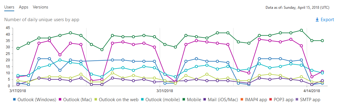 |
Exchange Email App Usage Charts
Finally, the Version panel will give you ...

