A filled map visual includes several of the same formatting properties of a bubble map but utilizes color as its primary means to contrast the locations. In the following filled map, a diverging color scheme has been applied via the Data colors formatting card to highlight individual states based on their online net sales:
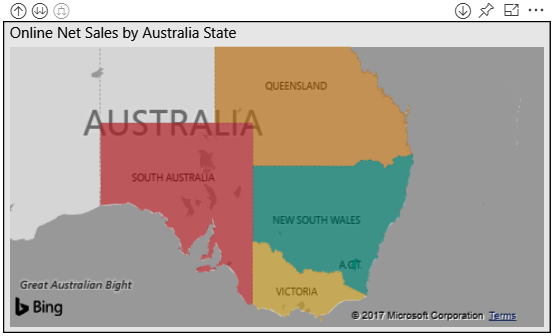
Filled map visual with diverging colors
Exactly like the color scheme described in the column and line chart conditional formatting section, three distinct numeric values and colors are assigned to the Minimum, Center, and Maximum properties. For this visual, the values of $1M, $2M, and $3M are associated with ...

