The waterfall chart is one of the most powerful standard visuals in Power BI given its ability to compute and format the variances of individual items between two periods by default. The items representing the largest variances are displayed as columns of varying length, sorted and formatted with either an increase (green) or decrease (red) color. This built-in logic and conditional formatting makes waterfall charts both easy to create and intuitive for users.
In the following example, the Internet Sales of the last two completed months is broken down by Sales Territory Country:
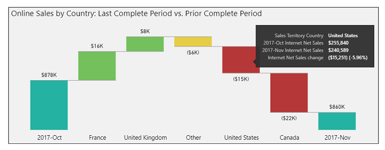
Waterfall chart with breakdown
The ...

