The rest of the charts are just variations of a line chart. You can use the same code to show most of them, like in the next screenshot:
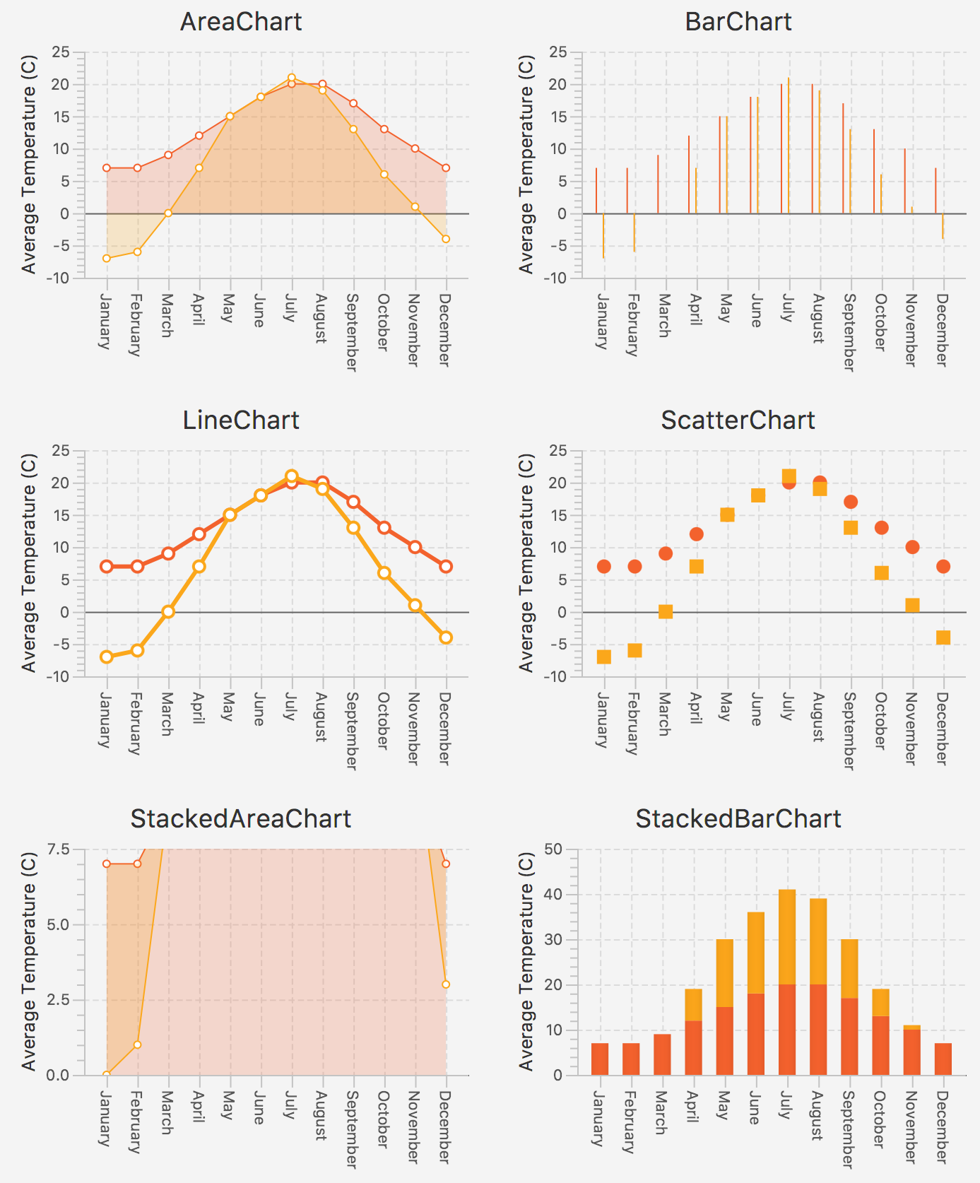
There are these interesting points in the code for this example:
- We are using CategoryAxis for months to show a new API and because bar charts don't work with a horizontal NumberAxis
- You need to provide a separate instance of axes and series for each chart
- Charts monitor their data through binding, so to add new data you just need to update the series lists
- All new data will be animated
Refer to the following code snippet:
// chapter10/chart/XYChartsDemo.javapublic void start(Stage ...

